Everybody says up, right? While I can’t predict the future, I thought it would be interesting to see what the historical tax rates were for different income groups. Here is some data taken from the Congressional Budget Office about historical federal tax rates as a percentage of “comprehensive household income”, defined as pretax cash income plus income from other sources like rental income and dividends. Note that this isn’t the same as your marginal income tax rate, which is the tax rate on your last dollar earned; This is a percentage of all your income.
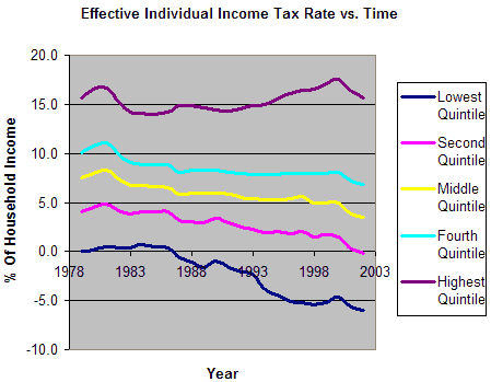
As a reference, here are the quintiles for annual household income as defined by the US Census Bureau in 2005:
1st Quintile: $0 – $18,500
2nd Quintile: $18,500 – $34,738
3rd Quintile: $34,738 – $55,331 (Median: $46,326)
4th Quintile: $55,331 – $88,030
5th Quintile: Over $88,030
Looking at the chart, it seems that the top quintile has paid about the same amount overall, while the overall effective federal income tax rate has actually fallen for the rest.
Now, what about social insurance payroll taxes that go towards Social Security and Medicare? These have been going up over time for just about everybody:
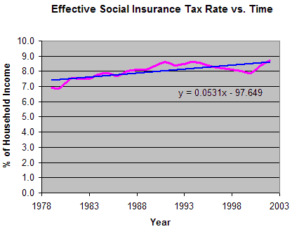
I even added a linear trendline, which although completely unscientific, suggests that if such a trend continues the effective percentage will increase approximately 1% every 20 years.


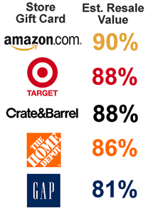 Instead of doing every store under the sun, I tried to take a small sample of different types of stores. Even with only 10 data points per store, the cards often sold in a tight price range, with the relative standard deviation of this small sample size being about 2%. The results are on the right.
 After doing my research, I ended up opening a
  The Best Credit Card Bonus Offers – 2025
 Big List of Free Stocks from Brokerage Apps
 Best Interest Rates on Cash - 2025
 Free Credit Scores x 3 + Free Credit Monitoring
 Best No Fee 0% APR Balance Transfer Offers
 Little-Known Cellular Data Plans That Can Save Big Money
 How To Haggle Your Cable or Direct TV Bill
 Big List of Free Consumer Data Reports (Credit, Rent, Work)