Credit Sesame’s New Interactive Mortgage Map

My Money Blog has partnered with CardRatings and may receive a commission from card issuers. Some or all of the card offers that appear on this site are from advertisers and may impact how and where card products appear on the site. MyMoneyBlog.com does not include all card companies or all available card offers. All opinions expressed are the author’s alone.

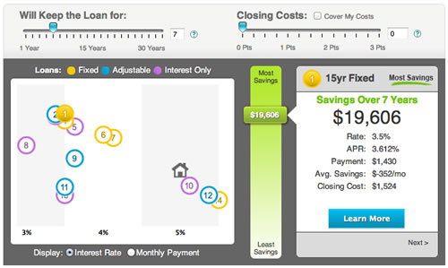
Credit Sesame might be best known for offering people a free credit score every month, but they make their money by providing mortgage quotes. That makes sense given how sensitive mortgage interest rates are to credit scores. They just rolled out a new tool called the Mortgage Map that lets you visually compare various mortgage loan options. Here’s an example screenshot:

The vertical axis appears to be savings (refinance) or cost (new loan), and the horizontal axis appears to be interest rates. Different colors denote fixed-rate, variable-rate, and interest only loans. A little house icon appears for refinance quotes to indicate your existing loan. Mortgage rates are still reaching new historic lows, so it’s good to be aware of the options out there.

Of course, I played around with it using my own numbers, even though I already refinanced last year into a new 15-year fixed mortgage. Almost all of the loan options given were worse than my existing loan, which I suppose made me happy. However, a 7/1 ARM or 10/1 ARM would save still save me money if I paid it off during the fixed initial term (makes sense, although these are lesser-known flavors). I noticed that the default setting for refinancing a 30-year mortgage is that you will only keep it for 7 years, my guess is that’s how often the average person changes houses. But you’ll want to remember to change that to better reflect your own situation.

All of the quotes that I wanted to “learn more” about seemed to be offered by First Choice Bank, which I am guessing is a mortgage broker? As a result, I don’t really know how many different lenders are behind this map, and how it would compare to something like LendingTree.

My Money Blog has partnered with CardRatings and may receive a commission from card issuers. Some or all of the card offers that appear on this site are from advertisers and may impact how and where card products appear on the site. MyMoneyBlog.com does not include all card companies or all available card offers. All opinions expressed are the author’s alone, and has not been provided nor approved by any of the companies mentioned.

MyMoneyBlog.com is also a member of the Amazon Associate Program, and if you click through to Amazon and make a purchase, I may earn a small commission. Thank you for your support.


Thoughts on Paying Extra Towards Mortgage Principal

My Money Blog has partnered with CardRatings and may receive a commission from card issuers. Some or all of the card offers that appear on this site are from advertisers and may impact how and where card products appear on the site. MyMoneyBlog.com does not include all card companies or all available card offers. All opinions expressed are the author’s alone.

I’ve been thinking more about whether I should commit some additional funds to pay down the principal on my mortgage and reduce my interest paid.
There is already a good deal of discussion on this topic in my posts Why Paying Down Your Mortgage Early Can Be A Smart Investment and 10 Reasons You Should Never Pay Off Your Mortgage, but I’ve tried to summarize and update all the pertinent points into something more coherent below.

Other Higher Priorities?
I don’t think paying extra towards a mortgage should be the highest priority. If you have no emergency fund, high-interest credit card debt, proper insurance, or don’t have your IRAs/401ks maxed out, then you probably should focus on those things before worry about paying extra towards your mortgage.

What is your tax situation?
Next is the topic of tax-deductibility of mortgage interest. Everyone already gets the standard deduction, which in 2012 is $5,950 for singles, and $11,900 for married filing jointly. Only the amount that your itemized deductions exceed this amount actually saves you money. If you have a $200,000 mortgage at 4%, your interest is only $8,000 the first year (and decreasing in subsequent years). If that’s your only deduction as a married couple, you’re not getting any real tax benefit at all.

However, some people have a big cushion of deductions, like high property taxes, state income taxes, charitable contributions, etc. Some don’t. Some people are in high marginal tax brackets, where saving 35% sounds really nice. Some are in the 15% or lower tax brackets. As for us, we are in a high marginal tax brackets, and pay a good deal of state income tax, so the deductibility is definitely in effect.

Paying 4% mortgage interest fully-deductible would be perfectly counteracted with a bond earning 4% interest fully-taxable.

Comparing with other investment options
One major argument against paying extra towards a mortgage is that you can earn a better return elsewhere. Who cares about saving 4% interest annually when your money could be earning 8% somewhere else? As we’ve seen recently, stock market returns are not guaranteed, and also not without lots of heartburn. Do you really want to invest in stocks using borrowed money? If anything, you should compare your mortgage interest with a high-quality bond or bank account interest.

Liquidity
Another argument against paying extra is that it is hard to access the equity in your house. You may not get a home equity line of credit, or it may be frozen later. However, if your alternative investments are in IRAs or 401k’s, then those aren’t exactly liquid either. Also, if you have an adequate cash cushion (as we do) and proper insurance, then liquidity will become a lesser concern. I don’t need to have access to every penny of my portfolio at all times.

Inflation hedge
A nice thing about mortgage payments is that if you have a fixed mortgage, the payment stays the same each month. Meanwhile, rents will increase with inflation. If inflation starts to rise significantly, you’ll be very happy to have a loan at 4-5%. But we also may stay in an era of prolonged low interest rates.

A possible strategy?
After all that, my idea is to simply look at the current yield of a comparable U.S. Treasury bond and compare it to my mortgage interest rate. If my mortgage interest rate is a lot higher than the bond rate, then I should pay extra towards the mortgage. Otherwise, if the Treasury rate is higher, then I should invest in bonds or bank accounts directly instead. If it’s close, stick with liquidity.

As of 2012, my mortgage rate is now slightly under 4%. I expect to pay off my mortgage in under 10 years, ideally closer to 5-7 years. This means that I’ll effectively be earning 4% a year for 10 years, whereas the Treasury rate for a 10-year bond is only 2%. If rates do rise, then I’ll stop paying extra toward the mortgage. In the meantime, since I already have bonds in my asset allocation, I’d much rather earn 4% by paying down the mortgage than 2% in the market. (Remember, I’m already maxing out both IRAs and 401ks for the year.)

I really don’t like the idea of staying in debt longer just for the possibility of investing for higher return elsewhere, especially as the difference for such a short time is minimal. I have plenty of money in stocks and if they go up 8% a year over the next 5-7 years, then I’ll still be fine.

(Posted originally in 2009, but I have updated the numbers for 2012.)

My Money Blog has partnered with CardRatings and may receive a commission from card issuers. Some or all of the card offers that appear on this site are from advertisers and may impact how and where card products appear on the site. MyMoneyBlog.com does not include all card companies or all available card offers. All opinions expressed are the author’s alone, and has not been provided nor approved by any of the companies mentioned.

MyMoneyBlog.com is also a member of the Amazon Associate Program, and if you click through to Amazon and make a purchase, I may earn a small commission. Thank you for your support.


Save Money On Housing: Live Well In Less Space

My Money Blog has partnered with CardRatings and may receive a commission from card issuers. Some or all of the card offers that appear on this site are from advertisers and may impact how and where card products appear on the site. MyMoneyBlog.com does not include all card companies or all available card offers. All opinions expressed are the author’s alone.

image credit:  governing.typepad.com

Speaking of internal frugality, I’d say one of the most basic ways to save on rent or mortgage payments is to… live in a smaller place. No, wait, really. Let’s think about it.

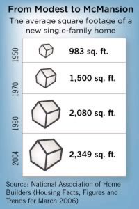
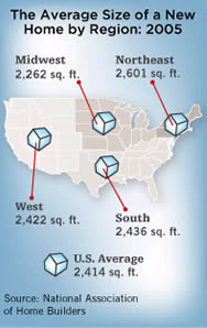
Even though it’s now easy to make fun of 10,000 square feet McMansions, they are only a side effect of an overall trend towards larger houses. According to this 2006 NPR article, the size of new houses has more than doubled since the 1950s. The average new home sold in 2007 was a whopping 2,629 square feet.

altext altext

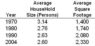
I know we’re getting fatter and need a bit more space to move around, but not by that much! In fact, the average family size has actually been decreasing over time. Here are some stats I pulled from the U.S. Census:

altext
Source: U.S. Census Bureau

From 1970 to 2004, the average household shrunk by 27%, but the average square footage grew by 66%. Using median numbers gave similar results.

There are several theories as to why this is happening. For starters, we may simply want a higher standard of living. (Sharing bathrooms? That’s for people in 3rd-world countries!) Perhaps it’s from us continually one-upping our neighbors. Maybe builders are pushing bigger homes through marketing. Or it may be a result of the breaking up of the American family, and how we don’t like spending time together anymore.

Most importantly, we don’t need the extra space. If a family of four could live well in 1,500 square feet back in 1950, there is no real reason they can’t do so today. It’s just a choice like any other, and we have to examine whether it is really worth the price. In cities like New York, Tokyo, or Hong Kong where space is at a great premium, families have long adapted to much smaller living spaces.

Finally, the extra costs don’t stop with the bigger sticker price. There’s the higher property taxes and insurance rates. A bigger home costs more to heat, cool, maintain, and repair. More rooms means more furniture, more wall decorations, more room for clothes, and just more stuff in general. More appliances mean more electricity used. The list goes on and on.

In my opinion, many people don’t even notice that they are stretching to buy homes that just keep getting bigger and bigger. They just follow the crowd. It’s hard to be different. This unconscious choice may partially explain why many of us feel so much more stressed financially than our parents.

Update: After the housing bust, there has been a growing counter-culture celebrating living well in smaller places. There is even the extreme end of buying tiny houses and the small house movement. We may not need to all live in 300 sf houses, but it’s good to explore our options.

This post has been added to my Expense Reduction Guide: Housing.

My Money Blog has partnered with CardRatings and may receive a commission from card issuers. Some or all of the card offers that appear on this site are from advertisers and may impact how and where card products appear on the site. MyMoneyBlog.com does not include all card companies or all available card offers. All opinions expressed are the author’s alone, and has not been provided nor approved by any of the companies mentioned.

MyMoneyBlog.com is also a member of the Amazon Associate Program, and if you click through to Amazon and make a purchase, I may earn a small commission. Thank you for your support.


Best Places To Live? Big Roundup of Major Top 10 Lists

My Money Blog has partnered with CardRatings and may receive a commission from card issuers. Some or all of the card offers that appear on this site are from advertisers and may impact how and where card products appear on the site. MyMoneyBlog.com does not include all card companies or all available card offers. All opinions expressed are the author’s alone.

Where are the best places to consider relocating to? I knew that almost every major financial media outlet had their own “best places to live” list, and my plan was to see which cities popped up most amongst them. Well, that was a bust as every list seemed to be so different; The top city on one list might not even be on the next list at all. Why? There is no one best place to live, it all depends on what criteria is important to you.

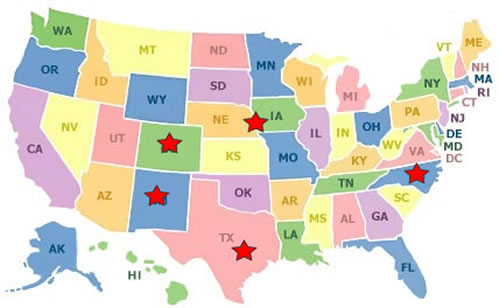
Instead, I’m just going to give you the direct links to all the major Top 10 lists (alphabetical-ish), and let you peruse at your leisure over the weekend. I listed the top city pick for each one – all in different spots across America!

Let me know if I missed one, but be careful since many other smaller lists are actually based on those above. In the end, choosing where to live is just one factor in your life, and you may already be happiest where you are right now. But why not make sure it’s a conscious decision? A good place for additional research is BestPlaces.net which I believe used to work with CNN Money on their list.

This post is part of my Expense Reduction Guide: Housing.

My Money Blog has partnered with CardRatings and may receive a commission from card issuers. Some or all of the card offers that appear on this site are from advertisers and may impact how and where card products appear on the site. MyMoneyBlog.com does not include all card companies or all available card offers. All opinions expressed are the author’s alone, and has not been provided nor approved by any of the companies mentioned.

MyMoneyBlog.com is also a member of the Amazon Associate Program, and if you click through to Amazon and make a purchase, I may earn a small commission. Thank you for your support.


How To Reduce Housing Expenses – Brainstorming / Request Ideas

My Money Blog has partnered with CardRatings and may receive a commission from card issuers. Some or all of the card offers that appear on this site are from advertisers and may impact how and where card products appear on the site. MyMoneyBlog.com does not include all card companies or all available card offers. All opinions expressed are the author’s alone.

One of my overall goals for 2012 is to make this site more of a permanent resource for information. As part of this, I want to create an “Expense Reduction Guide” that will provide an organized way to find ways to maximize personal value and make your spending efficient.
I would like this to be similar to my Favorite Posts on Investing page and Our First-Time Homebuying Experience guides (which also need to be cleaned up…).

Expense #1 – Housing

I am going to go through all the major categories, but let’s start with the biggest expense – housing. I’m keeping this part to ways to reduce either rent or mortgage PITI (principal, interest, taxes, and insurance). Things like reducing heating bills or furniture costs will be kept separate for later.

Move to a different city/state/location
Ideas for relocation: Roundup of Top 10 Lists
What cities are people actually moving to?
– international living (working or retired)

Renting
– Rent comparison sites
– rent vs buy calculators
– buying a house for psychological benefit vs. financial

Move to a different house
live in a smaller house
– neighborhood, location
– shared living, multigenerational living
– multiple units

Buying a house
– Getting a mortgage loan
– Credit scores, income, points, etc

Refinancing mortgages
– Rate comparison
– Mortgage types (fixed, ARM, length)
– Maximizing home appraisal

Homeowners Insurance
– Shopping for homeowner’s insurance
– Deductibles, options
– Renter’s insurance

Property Taxes
– Appealing assessment value
– Special rules in certain states

I’m just starting out and I know I’ll need to write several new posts to fill in the gaps. However, I want to make this an open brainstorming post so that you the reader can make sure I don’t forget anything. Got something to add? Please leave a comment with a tip, a link, or an idea to explore further.

My Money Blog has partnered with CardRatings and may receive a commission from card issuers. Some or all of the card offers that appear on this site are from advertisers and may impact how and where card products appear on the site. MyMoneyBlog.com does not include all card companies or all available card offers. All opinions expressed are the author’s alone, and has not been provided nor approved by any of the companies mentioned.

MyMoneyBlog.com is also a member of the Amazon Associate Program, and if you click through to Amazon and make a purchase, I may earn a small commission. Thank you for your support.


Investment Portfolio Asset Allocation & Performance Update of 2012

My Money Blog has partnered with CardRatings and may receive a commission from card issuers. Some or all of the card offers that appear on this site are from advertisers and may impact how and where card products appear on the site. MyMoneyBlog.com does not include all card companies or all available card offers. All opinions expressed are the author’s alone.

It’s time for a end-of-year checkup on the ole’ portfolio, as I’m afraid that I’ll forget about it between Christmas and New Year’s. There isn’t much change to my investment portfolio itself, the target asset allocation is the same, and the specific fund holdings are pretty much the same. I’m closer to 70% stocks and 30% bonds now. With only about 7 trading days left, I wanted to see how the various asset classes that I own performed in 2011.

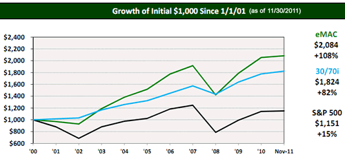
My portfolio is similar to the David Swensen model portfolio, which uses low-cost index funds to gain exposure to specific asset classes. Here is an implementation of the portfolio using actual ETFs in a recommended 70% stocks / 30% bonds breakdown.

30% Domestic US Equity (VTI)
15% Foreign Developed Equity (VEA)
10% Emerging Markets (VWO)
15% Real Estate (VNQ)
15% U.S. Treasury Bonds (IEF)
15% Inflation-Protected Securities (TIP)

The chart below shows the growth of $1,000 invested this way (eMAC) at the start of 2001 until the end of November 2011, as compiled by the financial advisory group ETF Portfolio Management for benchmark purposes.

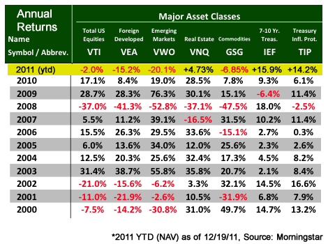
I have also taken the liberty of updating their annual returns table to including 2011 year-to-date total returns (see highlighted) using Morningstar data as of 12/19/2011.

The weighted year-to-date return of the overall model portfolio is 0.35%, essentially zero for 2011. But from the table, you see that each individual asset class may have moved a lot. European and Emerging Market stocks performed quite poorly (in case you don’t read the news), the S&P 500 looks like it will more or less go nowhere for the year, REITs (Real Estate) did okay, and Treasury bonds did very, very well considering this low-yield environment. Inflation-Protected bonds (TIPS) were the superstar in my portfolio, they saved my bacon.

Another year, another reminder that predicting short-term market movements is way beyond me. 🙂 I continue to be happy with owning various asset classes with long-term expected positive returns, but which tend not to move in sync and thus smooth out the ride.

Next year, I intend to learn more about an income-oriented portfolio as that may potentially work better – at least psychologically – for the early-retirement set. My secret crush, the Vanguard Wellesley Income Fund (VWINX) was up 7.91% in 2011 YTD. It’s a income-oriented actively-managed fund with about 35% in dividend stocks and 65% in corporate bonds – but with a tiny expense ratio of only 0.28% for investor shares, 0.21% for admiral shares.

My Money Blog has partnered with CardRatings and may receive a commission from card issuers. Some or all of the card offers that appear on this site are from advertisers and may impact how and where card products appear on the site. MyMoneyBlog.com does not include all card companies or all available card offers. All opinions expressed are the author’s alone, and has not been provided nor approved by any of the companies mentioned.

MyMoneyBlog.com is also a member of the Amazon Associate Program, and if you click through to Amazon and make a purchase, I may earn a small commission. Thank you for your support.


Mobility vs. Geography: Percent Born In State of Residence Map (2010)

My Money Blog has partnered with CardRatings and may receive a commission from card issuers. Some or all of the card offers that appear on this site are from advertisers and may impact how and where card products appear on the site. MyMoneyBlog.com does not include all card companies or all available card offers. All opinions expressed are the author’s alone.

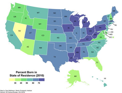
I can’t stop posting map infographics! They’re just so pretty. 🙂 Richard Florida of The Atlantic shared the map above, which shows the percentage of residents of each state that were born in that state. He then goes one step further and concludes that this map backs up his theory that America is being divided into two economic classes – the stuck and the mobile:

The mobile possess the resources and the inclination to seek out and move to locations where they pursue economic opportunity. Too many Americans are stuck in places with limited resources and opportunities. This geography of the stuck and mobile is a key axis of cleavage in the United States.

If mobility was once considered to be a quintessentially American attribute, it is now one that only an elite sliver of the population can lay claim to. It is both a significant shift and a sobering one. (source)

He cites the fact that fewer Americans are moving now than before, ostensibly because they are stuck in underwater homes. Still, using this particular map as proof of such a class divide seems like a stretch to me. There are many reasons why someone may or may not end up living in the state they were born. This map is the result of decades of complex interactions, not just what happened the last few years.

Just to throw out some examples, perhaps some states simply created significantly more job openings than could be filled by existing residents (DC Metro area, Alaska, Nevada). Some are retirement havens (Arizona, Florida). Also, I can’t tell if this map excludes residents born outside the US. Hundreds of thousands of immigrants came from around the world to settle in America – they were often both poor and mobile. Immigrants also tended to settle in coastal areas, which would affect the results above as they obviously weren’t born in the state they currently reside in.

In the end, I bet this map would have looked very similar even before the housing crash. A quick look at the same US Census data from 1990 confirms that states like Ohio, West Virginia, Kentucky, Pennsylvania, Mississippi, and Louisiana also had “low mobility” over 20 years ago, and states like Alaska, Arizona, Florida, and Washington DC had “high mobility”. I’m afraid I don’t see the evidence that mobility has been limited to an “elite sliver of the population”.

My Money Blog has partnered with CardRatings and may receive a commission from card issuers. Some or all of the card offers that appear on this site are from advertisers and may impact how and where card products appear on the site. MyMoneyBlog.com does not include all card companies or all available card offers. All opinions expressed are the author’s alone, and has not been provided nor approved by any of the companies mentioned.

MyMoneyBlog.com is also a member of the Amazon Associate Program, and if you click through to Amazon and make a purchase, I may earn a small commission. Thank you for your support.


Goal Update: Home Equity Historical Chart – Nov 2011

My Money Blog has partnered with CardRatings and may receive a commission from card issuers. Some or all of the card offers that appear on this site are from advertisers and may impact how and where card products appear on the site. MyMoneyBlog.com does not include all card companies or all available card offers. All opinions expressed are the author’s alone.

We closed on our mortgage refinance about a month ago, the old loan has been paid off, and we are just about to make our first payment on the new loan. Still, I always seem to go back and forth between different possible scenarios of paying down the house quickly or according the “minimum payment” as I call it. Technically, I could just about pay off the house now, if I chose to liquidate my taxable investments and empty out my emergency fund reserve.

I decided to go back and reconstruct a chart of our home equity over time, and compare it to a couple of alternate scenarios.

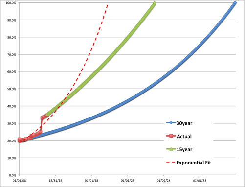
The red line represents our actual home equity, as a percentage of our purchase price. We use the purchase price because our home is currently worth about the same as when the bought it. An appraisal done for our refinance last month came in at 6% above our initial purchase price. Before the big refinance, we did a haphazard combination up of throwing in a few hundred extra bucks each month and one big lump sum prepayment. Currently, we’re right at 35% home equity.

Just for fun, the dotted red line is an exponential trendline of the red line. It has the loan being paid off somewhere around 2020.

The blue line represents our theoretical home equity if paid according to the normal 30-year payment schedule of our initial 6% fixed mortgage, starting from when we bought the house in the start of 2008. This would have had the loan paid off in 2038.

The green line represents our theoretical home equity if paid according to the normal 15-year schedule of our new sub-4% fixed mortgage, starting from this month. This would have the loan paid off in 2026.

I definitely still want to pay it off in under the current 15-year term, but as usual I like the flexibility. If children come into the picture, we’ll probably cut back on work and slow things down. But for now, I’m still hacking away. We hit the 401k cap already for 2011, so we have some extra cashflow.

By the way, I am only a proponent of paying extra towards your mortgage if you are maximizing your available tax-advantaged accounts like 401ks and IRAs as well as have a nice cash cushion. Although now I do think everyone should consider 15-year mortgages. Who wants to take 30 years to own a home? Most other countries don’t even offer 30-year mortgages, and the government support of 30-year mortgages here simply inflates property prices.

My Money Blog has partnered with CardRatings and may receive a commission from card issuers. Some or all of the card offers that appear on this site are from advertisers and may impact how and where card products appear on the site. MyMoneyBlog.com does not include all card companies or all available card offers. All opinions expressed are the author’s alone, and has not been provided nor approved by any of the companies mentioned.

MyMoneyBlog.com is also a member of the Amazon Associate Program, and if you click through to Amazon and make a purchase, I may earn a small commission. Thank you for your support.


Percentage of New Mortgages Backed By US Government = 90%+

My Money Blog has partnered with CardRatings and may receive a commission from card issuers. Some or all of the card offers that appear on this site are from advertisers and may impact how and where card products appear on the site. MyMoneyBlog.com does not include all card companies or all available card offers. All opinions expressed are the author’s alone.

Last week, the average rate for a 30-year fixed-rate mortgage fell below 4% for the first time in recorded history. Why? The Federal Reserve and the US Government.

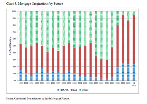
Check out this chart that breaks down the source of new mortgage originations for each year from 1990 to 2011. Blue is Federal Housing Authority (FHA) or Veteran’s Administration (VA), Red is Government Sponsored Enterprises (GSEs) including Fannie Mae and Freddie Mac, and Green is Other, presumably private sector mortgages held by banks and credit unions.

This is a fascinating and telling chart. In 1990 FHA/VA and GSE loans made up roughly 50 percent of all loan originations. This remained the story for the entire decade. The private sector got incredibly hungry with their toxic loans in 2004, 2005, 2006, and 2007. But look at 2008 up until today. For the last three full years, government backed loans made up over 90 percent of all loan originations.

Credit to Dr. Housing Bubble, found via AFM.

My Money Blog has partnered with CardRatings and may receive a commission from card issuers. Some or all of the card offers that appear on this site are from advertisers and may impact how and where card products appear on the site. MyMoneyBlog.com does not include all card companies or all available card offers. All opinions expressed are the author’s alone, and has not been provided nor approved by any of the companies mentioned.

MyMoneyBlog.com is also a member of the Amazon Associate Program, and if you click through to Amazon and make a purchase, I may earn a small commission. Thank you for your support.


15-Year Mortgage Refinance Experience and Thoughts 2011

My Money Blog has partnered with CardRatings and may receive a commission from card issuers. Some or all of the card offers that appear on this site are from advertisers and may impact how and where card products appear on the site. MyMoneyBlog.com does not include all card companies or all available card offers. All opinions expressed are the author’s alone.

Over the weekend, we signed the closing documents for our refinancing into a 15-year fixed rate loan. It’s hard to believe that less than four years ago we bought our first house with a 30-year loan at around 6%. Thanks to additional principal prepayments and lower interest rates, our new monthly payment is actually lower than the payment from our original loan. Our lender sounded swamped with loan applications, and we basically closed on the 45th day of our 45-day interest rate lock. Here are some thoughts about the process.

Mortgage Rates Still Dropping
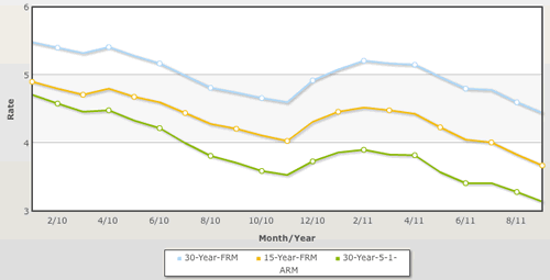
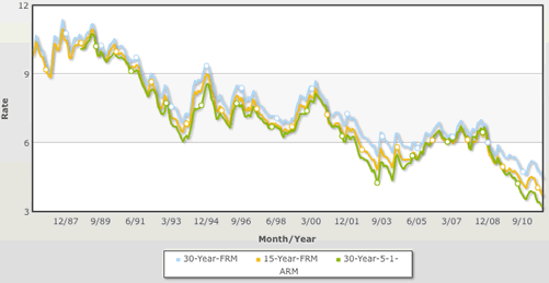
Here’s a chart of the historical mortgage rates, courtesy of HSH.com. It includes the 30-year fixed, 15-year fixed, and the 5/1 30-year adjustable. I’ve stopped trying to predict future rates, and just try to take advantage of what happens. National averages since 2010:

Since 1986:

Appraisal
It may be hard to believe, but the new appraisal for our house actually came in at 6% above our purchase price in late 2007. We have made several improvements to the house, including adding a small amount of square footage. But the main reason is simply that the prices in our neighborhood have held up well during the national price declines. Real estate is definitely local. As a percentage of our original purchase price, we have 35% equity.

Closing Documents
The new final HUD-1 settlement forms seemed to be clearer than what I remember last time. Charges are broken down more clearly, and the form compares side-by-side what was presented on the Good Faith Estimate (GFE) and what you were finally charged at closing. You can view a copy of the form at HUD.gov.

Mortgage Offset Account
Some people prefer 30-year mortgages because borrowing at low rates for a long period can act as a hedge against higher inflation. I personally would rather minimize my interest costs now and worry about higher rates if and when they come along. When the day arrives where I can invest in safe bonds or bank CDs that pay higher rates than my mortgage rate, then I plan on creating a mortgage offset account where I buy those CDs instead of paying down my mortgage. But either way, I’m still not satisfied with a 15-year payoff, our goal is to pay it off in 5-10 years.

Compare rate quotes from and Quicken Loans.

My Money Blog has partnered with CardRatings and may receive a commission from card issuers. Some or all of the card offers that appear on this site are from advertisers and may impact how and where card products appear on the site. MyMoneyBlog.com does not include all card companies or all available card offers. All opinions expressed are the author’s alone, and has not been provided nor approved by any of the companies mentioned.

MyMoneyBlog.com is also a member of the Amazon Associate Program, and if you click through to Amazon and make a purchase, I may earn a small commission. Thank you for your support.


Rising Rents, Flat Home Prices, and Owning REITs In My Portfolio

My Money Blog has partnered with CardRatings and may receive a commission from card issuers. Some or all of the card offers that appear on this site are from advertisers and may impact how and where card products appear on the site. MyMoneyBlog.com does not include all card companies or all available card offers. All opinions expressed are the author’s alone.

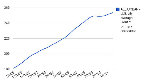
The NYT Economix blog points out that rents are rising again according to inflation data from the Bureau of Labor Statistics. The chart included doesn’t have zero on the y-scale, but a value of 100 corresponds to rent from 1982-1984. Rents nationwide are about 40% above their values in 2000. I recently saw the last house I used to rent on Craiglist and the rent was up 15% from 4 years ago.


Credit: NY Times, Bureau of Labor Statistics, IHS Global Insight

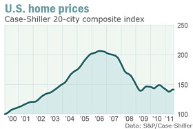
There is definitely an increase in the number of renters, and perhaps there is also an overall psychological shift in that less people think homeownership is a part of the American Dream. Perhaps this means it’s a better time to be landlord? Home prices are still hanging around 2003 levels:


Credit: Marketwatch, S&P/Case-Shiller Home Price Indices

Although I know many successful people who are landlords, I don’t now if I’m cut out for it. However, I do like buying real estate investment trust (REITs), which allows me to collect rent like I collect stock dividends. (Not familiar with them? Here’s a post all about REITs.) I even did a comparison post of rental property vs. REZ, a residential ETF. I see REZ has done quite well recently.

Now, I’m not pushing REZ, and don’t own it myself. I continue to get my real estate exposure through the low-cost, passively-managed Vanguard REIT Index Fund, available both as a mutual fund and ETF. It tracks the MSCI US REIT Index and includes all kinds of real estate, currently holding 20% in residential ETFs that own things like apartment complexes. It like the diversification of this fund, even though it can be a rough ride, and in a struggling economy things like commercial properties will be harder to rent out.

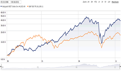
Here’s the growth of $10,000 chart of both the Vanguard REIT Index Fund and the S&P 500 index, from mid-1996 to today. This type of chart accounts for total return, including dividends.

The REIT fund has done better than the S&P 500, which some may find surprising (or not) given the housing bust. As you can also see, they don’t always move together, which is good. Including REITs and rebalancing has offered a way to achieve better returns even if you like a simple buy and hold portfolio. I can’t guarantee that this type of helpful diversification will continue in the future, but I’m happy with my current portfolio right now, and am glad to be a lazy “landlord” in this manner.

My Money Blog has partnered with CardRatings and may receive a commission from card issuers. Some or all of the card offers that appear on this site are from advertisers and may impact how and where card products appear on the site. MyMoneyBlog.com does not include all card companies or all available card offers. All opinions expressed are the author’s alone, and has not been provided nor approved by any of the companies mentioned.

MyMoneyBlog.com is also a member of the Amazon Associate Program, and if you click through to Amazon and make a purchase, I may earn a small commission. Thank you for your support.


Mortgage Comparison: 30-Year at 4.75% vs. 15-Year at 3.75%

My Money Blog has partnered with CardRatings and may receive a commission from card issuers. Some or all of the card offers that appear on this site are from advertisers and may impact how and where card products appear on the site. MyMoneyBlog.com does not include all card companies or all available card offers. All opinions expressed are the author’s alone.

After the interest rate drama last week, I managed to lock in a refinance of my current 30-year mortgage (with 26 years left) which had a 4.75% fixed rate into a new 15-year mortgage at a 3.875% fixed rate. You’ll probably see lower rates in ads and elsewhere, but it did come with negative points that offset my closing costs completely and then some. Anyhow, I wanted to run the numbers to see the potential financial benefit.

To simplify the numbers, I am just going to assume a new mortgage with a loan amount of $300,000. First, we have a 30-year fixed rate with a lower payment, but higher interest rate and longer period of paying interest. Now, we do have the option of making extra payments toward principal and making the loan end early. Alternatively, we have a 15-year fixed mortgage with lower interest rate but higher mandatory monthly payment. There are many calculators out there, but I still like the simple and familiar ones at Dinkytown.

The 30-year at 4.75% would have a monthly payment of $1,565, while the 15-year would have a monthly payment of $2,200. Now, what would happen if we simply paid the $2,200 towards the 30-year mortgage? Using the calculator, we would enter an additional monthly payment of $635. That tells us the 30-year plus extra mortgage would be paid off in 16 year and 5 months, requiring an additional 1.4 years and $36,000 in interest. However, the 30-year does allow me the flexibility to reduce my payment by $600 a month if needed.

A note on interest paid. Lots of people simply look at how much interest is paid on a 30-year and compare it to a 15-year. It’s a big difference! However, you have to remember that you could have done something the money saved each month from a lower monthly payment. Theoretically, if you went out and bought a bank certificate of deposit paying the same rate of interest as the mortgage, there would be no real difference. For example, currently Discover Bank has a 10-year CD yielding 2.25% APY (see CD Rates & Calculator tab). This makes the true interest gap less than what it may appear. Still, there isn’t anything available at anything higher than 4.75% or even 3.875%, so I’m still happy to pay off this house in 15 years.

My Money Blog has partnered with CardRatings and may receive a commission from card issuers. Some or all of the card offers that appear on this site are from advertisers and may impact how and where card products appear on the site. MyMoneyBlog.com does not include all card companies or all available card offers. All opinions expressed are the author’s alone, and has not been provided nor approved by any of the companies mentioned.

MyMoneyBlog.com is also a member of the Amazon Associate Program, and if you click through to Amazon and make a purchase, I may earn a small commission. Thank you for your support.