Dimensional Fund Advisors (DFA) ETF Lineup Keeps Expanding

My Money Blog has partnered with CardRatings and may receive a commission from card issuers. Some or all of the card offers that appear on this site are from advertisers and may impact how and where card products appear on the site. MyMoneyBlog.com does not include all card companies or all available card offers. All opinions expressed are the author’s alone.

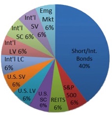
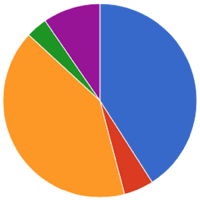
Some investors like to break down their portfolio into several different asset and sub-asset classes. One long-standing example of the “slice-and-dice” is the “Ultimate Buy-and-Hold Portfolio” recommended by Paul Merriman (see pie chart; expanded labels below). You don’t need to hold every one of these asset classes, but when held in combination they historically offer a higher return with lower volatility.

  • S&P 500 (US Large Cap Blend)
  • US Large Value
  • US Small
  • US Small Value
  • US REIT
  • International Large Cap Blend
  • International US Large Value
  • International Small
  • International Small Value
  • Emerging Markets
  • Short-term/Intermediate-term Bonds

For a long time, Dimensional Fund Advisors (DFA) offered some of the best lower-cost mutual funds tracking these types of sub-asset classes, but they also required you to invest through a DFA-affiliated financial advisor (and pay the accompanying management fees). Eventually, some former DFA executives and employees broke off and started Avantis ETFs, which are available to any investor with a brokerage accounts and offered a good DFA alternative. Avantis’ assets under management have been growing…

Lo and behold, DFA has just announced a big expansion of their DFA ETF lineup. Competition works!

Newly-listed DFA Bond ETFs

  • Dimensional Core Fixed Income ETF (DFCF)
  • Dimensional Short-Duration Fixed Income ETF (DFSD)
  • Dimensional National Municipal Bond ETF (DFNM)
  • Dimensional Inflation-Protected Securities ETF (DFIP)

Future DFA Equity ETFs

  • International Core Equity 2 ETF
  • Emerging Markets Core Equity 2 ETF
  • US Small Cap Value ETF
  • International Small Cap ETF
  • International Small Cap Value ETF
  • Emerging Markets Value ETF
  • US High Profitability ETF
  • International High Profitability ETF
  • Emerging Markets High Profitability ETF
  • US Real Estate ETF

Existing DFA ETFs

  • Dimensional US Core Equity Market ETF (DFAU)
  • Dimensional International Core Equity Market ETF (DFAI)
  • Dimensional Emerging Core Equity Market ETF (DFAE)
  • Dimensional US Core Equity 2 ETF (DFAC)
  • Dimensional US Equity ETF (DFUS)
  • Dimensional US Small Cap ETF (DFAS)
  • Dimensional US Targeted Value ETF (DFAT)
  • Dimensional International Value ETF (DFIV)
  • Dimensional World ex US Core Equity 2 ETF (DFAX)

Some of the confusing names are a result of these ETFs being conversions from the old mutual fund versions. Even though I try to keep things relatively simple and humble, I welcome these new investment options to the competitive marketplace along with their reasonably-low expense ratios. I may even switch my TIPS holdings to the DFA TIPS ETF (DFIP), as it is cheaper than the iShares TIPS Bond ETF (TIP).

I use Vanguard for my “core” index funds, but about 10% of my total portfolio is split between US Small Value and International/Emerging Small Value stocks. I recently bought/rebalanced into some of the new Avantis International Small Cap Value ETF (AVDV), but will keep an eye on the new DFA version. I suppose they could be a tax-loss harvesting ETF pair, but I have them inside a tax-sheltered account.

My Money Blog has partnered with CardRatings and may receive a commission from card issuers. Some or all of the card offers that appear on this site are from advertisers and may impact how and where card products appear on the site. MyMoneyBlog.com does not include all card companies or all available card offers. All opinions expressed are the author’s alone, and has not been provided nor approved by any of the companies mentioned.

MyMoneyBlog.com is also a member of the Amazon Associate Program, and if you click through to Amazon and make a purchase, I may earn a small commission. Thank you for your support.


Savings I Bonds November 2021 Interest Rate: 7.12% Inflation Rate

My Money Blog has partnered with CardRatings and may receive a commission from card issuers. Some or all of the card offers that appear on this site are from advertisers and may impact how and where card products appear on the site. MyMoneyBlog.com does not include all card companies or all available card offers. All opinions expressed are the author’s alone.

November 2021 rate confirmed at 7.12%. The variable inflation-indexed rate for I bonds bought from November 1, 2021 through April 30th, 2022 will indeed be 7.12% as predicted. Every single I bond will earn this rate eventually for 6 months, depending on the initial purchase month.

The fixed rate (real yield) is also 0% as predicted, but realize that the real yield on a 5-year TIPS right now is about negative 1.7%. There is significant demand for inflation protection right now. See you again in mid-April for the next early prediction for May 2022. Don’t forget that the purchase limits are based on calendar year, if you still wish to max out for 2021.

Original post 10/13/2021:

Savings I Bonds are a unique, low-risk investment backed by the US Treasury that pay out a variable interest rate linked to inflation. With a holding period from 12 months to 30 years, you could own them as an alternative to bank certificates of deposit (they are liquid after 12 months) or bonds in your portfolio.

New inflation numbers were just announced at BLS.gov, which allows us to make an early prediction of the November 2021 savings bond rates a couple of weeks before the official announcement on the 1st. This also allows the opportunity to know exactly what a October 2021 savings bond purchase will yield over the next 12 months, instead of just 6 months. You can then compare this against a November 2021 purchase.

New inflation rate prediction. March 2021 CPI-U was 264.877. September 2021 CPI-U was 274.310, for a semi-annual increase of 3.56%. Using the official formula, the variable component of interest rate for the next 6 month cycle will be 7.12%. You add the fixed and variable rates to get the total interest rate. If you have an older savings bond, your fixed rate may be up to 3.60%.

Tips on purchase and redemption. You can’t redeem until after 12 months of ownership, and any redemptions within 5 years incur an interest penalty of the last 3 months of interest. A simple “trick” with I-Bonds is that if you buy at the end of the month, you’ll still get all the interest for the entire month – same as if you bought it in the beginning of the month. It’s best to give yourself a few business days of buffer time. If you miss the cutoff, your effective purchase date will be bumped into the next month.

Buying in October 2021. If you buy before the end of October, the fixed rate portion of I-Bonds will be 0%. You will be guaranteed a total interest rate of 0.00 + 3.54 = 3.54% for the next 6 months. For the 6 months after that, the total rate will be 0.00 + 7.12 = 7.12%.

Let’s look at a worst-case scenario, where you hold for the minimum of one year and pay the 3-month interest penalty. If you theoretically buy on October 31st, 2021 and sell on October 1st, 2022, you’ll earn a ~3.87% annualized return for an 11-month holding period, for which the interest is also exempt from state income taxes. If you theoretically buy on October 31st, 2021 and sell on January 1, 2023, you’ll earn a ~4.57% annualized return for an 14-month holding period. Comparing with the best interest rates as of October 2021, you can see that this is much higher than a current top savings account rate or 12-month CD.

Buying in November 2021. If you buy in November 2021, you will get 7.12% plus a newly-set fixed rate for the first 6 months. The new fixed rate is officially unknown, but is loosely linked to the real yield of short-term TIPS, and is thus very, very, very likely to be 0%. Every six months after your purchase, your rate will adjust to your fixed rate (set at purchase) plus a variable rate based on inflation.

If you have an existing I-Bond, the rates reset every 6 months depending on your purchase month. Your bond rate = your specific fixed rate (set at purchase) + variable rate (total bond rate has a minimum floor of 0%). So if your fixed rate was 1%, you’ll be earning a 1.00 + 7.12 = 8.12% rate for six months.

Buy now or wait? Given that the current I bond rate is already much higher than the equivalent alternatives, I would personally buy in October to lock in the high rate for the longest possible time. Who knows what will happen on the next reset? Either way, it seems worthwhile to use up the purchase limit for 2021 either in October or November. You are also getting a much better “deal” than with TIPS, as the fixed rate is currently negative with short-term TIPS.

Unique features. I have a separate post on reasons to own Series I Savings Bonds, including inflation protection, tax deferral, exemption from state income taxes, and educational tax benefits.

Over the years, I have accumulated a nice pile of I-Bonds and consider it part of the inflation-linked bond allocation inside my long-term investment portfolio.

Annual purchase limits. The annual purchase limit is now $10,000 in online I-bonds per Social Security Number. For a couple, that’s $20,000 per year. You can only buy online at TreasuryDirect.gov, after making sure you’re okay with their security protocols and user-friendliness. You can also buy an additional $5,000 in paper I bonds using your tax refund with IRS Form 8888. If you have children, you may be able to buy additional savings bonds by using a minor’s Social Security Number.

Note: Opening a TreasuryDirect account can sometimes be a hassle as they may ask for a medallion signature guarantee which requires a visit to a physical bank or credit union and snail mail. Don’t expect to be able to open an account in 5 minutes on your phone.

Bottom line. Savings I bonds are a unique, low-risk investment that are linked to inflation and only available to individual investors. Right now, they promise to pay out a higher fixed rate above inflation than TIPS. You can only purchase them online at TreasuryDirect.gov, with the exception of paper bonds via tax refund. For more background, see the rest of my posts on savings bonds.

[Image: 1950 Savings Bond poster from US Treasury – source]

My Money Blog has partnered with CardRatings and may receive a commission from card issuers. Some or all of the card offers that appear on this site are from advertisers and may impact how and where card products appear on the site. MyMoneyBlog.com does not include all card companies or all available card offers. All opinions expressed are the author’s alone, and has not been provided nor approved by any of the companies mentioned.

MyMoneyBlog.com is also a member of the Amazon Associate Program, and if you click through to Amazon and make a purchase, I may earn a small commission. Thank you for your support.


MMB Portfolio Update October 2021 (Q3): Dividend and Interest Income

My Money Blog has partnered with CardRatings and may receive a commission from card issuers. Some or all of the card offers that appear on this site are from advertisers and may impact how and where card products appear on the site. MyMoneyBlog.com does not include all card companies or all available card offers. All opinions expressed are the author’s alone.

dividendmono225While my 3rd Quarter 2021 portfolio asset allocation is designed for total return, I also track the income produced quarterly. Stock dividends are the portion of profits that businesses have decided they don’t need to reinvest into their business. The dividends may suffer some short-term drops, but over the long run they have grown faster than inflation.

I track the “TTM” or “12-Month Yield” from Morningstar, which is the sum of the trailing 12 months of interest and dividend payments divided by the last month’s ending share price (NAV) plus any capital gains distributed over the same period. (ETFs rarely have to distribute capital gains.) I prefer this measure because it is based on historical distributions and not a forecast. Below is a rough approximation of my portfolio (2/3rd stocks and 1/3rd bonds).

Asset Class / Fund % of Portfolio Trailing 12-Month Yield (Taken 10/17/21) Yield Contribution
US Total Stock
Vanguard Total Stock Market Fund (VTI, VTSAX)
25% 1.28% 0.32%
US Small Value
Vanguard Small-Cap Value ETF (VBR)
5% 1.67% 0.08%
International Total Stock
Vanguard Total International Stock Market Fund (VXUS, VTIAX)
25% 2.56% 0.64%
Emerging Markets
Vanguard Emerging Markets ETF (VWO)
5% 2.25% 0.11%
US Real Estate
Vanguard REIT Index Fund (VNQ, VGSLX)
6% 2.65% 0.16%
Intermediate-Term High Quality Bonds
Vanguard Intermediate-Term Treasury ETF (VGIT)
17% 1.18% 0.20%
Inflation-Linked Treasury Bonds
Vanguard Short-Term Inflation-Protected Securities ETF (VTIP)
17% 2.26% 0.38%
Totals 100% 1.89%


Trailing 12-month yield history. Here is a chart showing how this 12-month trailing income rate has varied since I started tracking it in 2014.

Maintaining perspective on portfolio value. One of the things I like about using this number is that when stock prices drop, this percentage metric usually goes up – which makes me feel better in a bear market. When stock prices go up, this percentage metric usually goes down, which keeps me from getting too euphoric during a bull market.

Here’s a related quote from Jack Bogle (source):

The true investor will do better if he forgets about the stock market and pays attention to his dividend returns and to the operating results of his companies.

Absolute dividend income. This quarter’s trailing income yield of 1.89% is still near the all-time lows since 2014. At the same time, both the portfolio value and the absolute income produced is higher than in 2014. If you retired back in 2014 and have been living off your stock/bond portfolio, you’ve been doing fine.

Here is the historical growth of the S&P 500 absolute dividend, updated as of Q3 2021 (source):

This means that if you owned enough of the S&P 500 to produce an annual dividend income of about $13,000 a year in 1999, then today those same shares would be worth a lot more AND your annual dividend income would have increased to over $50,000 a year, even if you had spent every penny of dividend income every year.

As a result, I prefer looking at absolute income produced rather than portfolio value or dividend yield percentages. Total income goes up much more gradually and consistently, encouraging me as I keep plowing more of my savings into more stock purchases. I imagine them as a factory that just churns out more dollar bills.

via GIPHY

Big picture and rules of thumb. If you are not close to retirement, there is not much use worrying about these decimal points. Your time is better spent focusing on earning potential via better career moves, improving in your skillset, and/or looking for entrepreneurial opportunities where you can have an ownership interest.

I support the common 4% or 3% rule of thumb, which equates to a target of accumulating roughly 25 to 30 times your annual expenses. I would lean towards a 3% withdrawal rate if you want to retire young (before age 50) and a 4% withdrawal rate if retiring at a more traditional age (closer to 65). Build in some spending flexibility to make your portfolio more resilient in the real world, and that’s perfectly good goal to put on your wall.

How we handle this income. Our dividends and interest income are not automatically reinvested. I treat this money as part of our “paycheck”. Then, as with a traditional paycheck, we can choose to either spend it or invest it again. Even if still working, you could use this money to cut back working hours, pursue new interests, start a new business, spend more time with your family and loved ones, travel, perform charity or volunteer work, and so on. This is your one life and it only lasts about 4,000 weeks.

My Money Blog has partnered with CardRatings and may receive a commission from card issuers. Some or all of the card offers that appear on this site are from advertisers and may impact how and where card products appear on the site. MyMoneyBlog.com does not include all card companies or all available card offers. All opinions expressed are the author’s alone, and has not been provided nor approved by any of the companies mentioned.

MyMoneyBlog.com is also a member of the Amazon Associate Program, and if you click through to Amazon and make a purchase, I may earn a small commission. Thank you for your support.


MMB Portfolio Update October 2021 (Q3): Asset Allocation & Performance

My Money Blog has partnered with CardRatings and may receive a commission from card issuers. Some or all of the card offers that appear on this site are from advertisers and may impact how and where card products appear on the site. MyMoneyBlog.com does not include all card companies or all available card offers. All opinions expressed are the author’s alone.

portpie_blank200
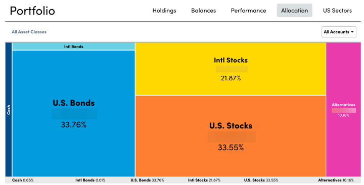
Here’s my quarterly update on my current investment holdings as of October 2021, including our 401k/403b/IRAs and taxable brokerage accounts but excluding our house, “emergency fund” cash reserves, and a side portfolio of self-directed investments. Following the concept of skin in the game, the following is not a recommendation, but just to share an actual, low-cost, diversified DIY portfolio complete with some real-world messiness. The goal of this portfolio is to create sustainable income that keeps up with inflation to cover our household expenses.

Actual Asset Allocation and Holdings
I use both Personal Capital and a custom Google Spreadsheet to track my investment holdings. The Personal Capital financial tracking app (free, my review) automatically logs into my different accounts, adds up my various balances, tracks my performance, and calculates my overall asset allocation. Once a quarter, I also update my manual Google Spreadsheet (free, instructions) because it helps me calculate how much I need in each asset class to rebalance back towards my target asset allocation.

Here are updated performance and asset allocation charts, per the “Allocation” and “Holdings” tabs of my Personal Capital account, respectively. (The blue line went flat for a while because the synchronization stopped and I don’t checked my performance constantly.)

Stock Holdings
Vanguard Total Stock Market (VTI, VTSAX)
Vanguard Total International Stock Market (VXUS, VTIAX)
Vanguard Small Value (VBR)
Vanguard Emerging Markets (VWO)
Avantis International Small Cap Value ETF (AVDV)
Cambria Emerging Shareholder Yield ETF (EYLD)
Vanguard REIT Index (VNQ, VGSLX)

Bond Holdings
Vanguard Limited-Term Tax-Exempt (VMLTX, VMLUX)
Vanguard Intermediate-Term Tax-Exempt (VWITX, VWIUX)
Vanguard Intermediate-Term Treasury (VFITX, VFIUX)
Vanguard Inflation-Protected Securities (VIPSX, VAIPX)
Fidelity Inflation-Protected Bond Index (FIPDX)
iShares Barclays TIPS Bond (TIP)
Individual TIPS bonds
U.S. Savings Bonds (Series I)

Target Asset Allocation. This “Humble Portfolio” does not rely on my ability to pick specific stocks, sectors, trends, or countries. I own broad, low-cost exposure to asset classes that will provide long-term returns above inflation, distribute income via dividends and interest, and finally offer some historical tendencies to balance each other out. I have faith in the long-term benefit of owning publicly-traded US and international shares of businesses, as well as high-quality US federal and municipal debt. My stock holdings roughly follow the total world market cap breakdown at roughly 60% US and 40% ex-US. I also own real estate through REITs.

I strongly believe in the importance of doing your own research. Every asset class will eventually have a low period, and you must have strong faith during these periods to truly make your money. You have to keep owning and buying more stocks through the stock market crashes. You have to maintain and even buy more rental properties during a housing crunch, etc. A good sign is that if prices drop, you’ll want to buy more of that asset instead of less.

I do not spend a lot of time backtesting various model portfolios, as I don’t think picking through the details of the recent past will necessarily create superior future returns. Usually, whatever model portfolio is popular in the moment just happens to hold the asset class that has been the hottest recently as well. I’ve also realized that I don’t have strong faith in the long-term results of commodities, gold, or bitcoin. I’ve tried many times to wrap my head around it, but have failed. I prefer things that send me checks while I sleep.

This is not the optimal, perfect, ideal anything. It’s just what I came up with, and it’s done the job. You may have different beliefs based on your own research and psychological leanings. Holding a good asset that you understand is better than owning and selling the highest-return asset when it is at its temporary low point.

Stocks Breakdown

  • 45% US Total Market
  • 7% US Small-Cap Value
  • 31% International Total Market
  • 7% International Small-Cap Value
  • 10% US Real Estate (REIT)

Bonds Breakdown

  • 66% High-Quality bonds, Municipal, US Treasury or FDIC-insured deposits
  • 33% US Treasury Inflation-Protected Bonds (or I Savings Bonds)

I have settled into a long-term target ratio of 67% stocks and 33% bonds (2:1 ratio) within our investment strategy of buy, hold, and occasionally rebalance. This is more conservative than most people my age, but I am settling into a more “perpetual portfolio” as opposed to the more common accumulate/decumulate portfolio. I use the dividends and interest to rebalance whenever possible in order to avoid taxable gains. I plan to only manually rebalance past that if the stock/bond ratio is still off by more than 5% (i.e. less than 62% stocks, greater than 72% stocks). With a self-managed, simple portfolio of low-cost funds, we can minimize management fees, commissions, and taxes.

Holdings commentary. The fact that I did research about Shiba Inu coins today is the latest evidence that there is too much money sloshing around chasing speculative investments. Somehow, I own 4,000,000 SHIB from a recent Voyager referral promotion! You really have to wonder how 2021 events will be described in 2030 or 2040. All I can do is listen to the late Jack Bogle and “stay the course”. I remain optimistic that capitalism, human ingenuity, human resilience, human compassion, and our system of laws will continue to improve things over time.

My thought for the quarter is that there is all this focus on tech/crypto/cloud but I hope we still invest enough in physical things like farming/energy/infrastructure.

Performance numbers. According to Personal Capital, my portfolio is up +11.4% for 2021 YTD. I rolled my own benchmark for my portfolio using 50% Vanguard LifeStrategy Growth Fund and 50% Vanguard LifeStrategy Moderate Growth Fund – one is 60/40 and the other is 80/20 so it also works out to 70% stocks and 30% bonds. That benchmark would have a total return of +10.1% for 2021 YTD as of 10/15/2021.

I’ll share about more about the income aspect in a separate post.

My Money Blog has partnered with CardRatings and may receive a commission from card issuers. Some or all of the card offers that appear on this site are from advertisers and may impact how and where card products appear on the site. MyMoneyBlog.com does not include all card companies or all available card offers. All opinions expressed are the author’s alone, and has not been provided nor approved by any of the companies mentioned.

MyMoneyBlog.com is also a member of the Amazon Associate Program, and if you click through to Amazon and make a purchase, I may earn a small commission. Thank you for your support.


FIRE Starters: Profiles of 12 Individuals and Families Pursuing Early Financial Freedom

My Money Blog has partnered with CardRatings and may receive a commission from card issuers. Some or all of the card offers that appear on this site are from advertisers and may impact how and where card products appear on the site. MyMoneyBlog.com does not include all card companies or all available card offers. All opinions expressed are the author’s alone.

I enjoyed watching all 14 YouTube videos in the FIRE Starters interview series by Marketwatch. The videos were well-edited, in that they averaged only about 5-7 minutes each but still explained the individual and/or family’s unique path to financial independence. You can watch a single video during any small break, or you could watch them all in about an hour and a half. The profiles usually covered the initial spark, overall occupation and salary range, age timeframe, and a monthly budget breakdown. Some of the videos follow the same person(s) a couple of years apart (before and after the pandemic began).

Here a few embedded video examples (might not show up in e-mail):

A few observations:

  • Work. I saw a nurse, flight attendant, hourly IT consultant, lawyer, and energy trader. People who pursue Financial Independence are more likely to have an above-average income, sure, but are they also more likely to be paid on an hourly or shift basis? Maybe when there is a direct link between trading your time (life) for money, you quickly realize the power of dialing up and down your hours. Use the difference between income and spending to buy productive assets and create an supplemental income stream, and those are the primary variables of financial independence.
  • Possibilities. Seeing how other people have customized their lifestyles helps you visualize your own path. The more examples the better. Don’t blindly follow the perceived default of 40-50 hours a week times 40 years. You don’t have to spend like your friends. You don’t have to work the same hours as your friends. You might live in a tiny 500 sf urban condo. You might live on an off-grid 10-acre farm. You might not have kids. You might have 5 kids. You might invest in stocks. You might invest in real estate. You could work full-time, 50% time, or 8.562% time. There are so many ways to play the game.
  • FIRE is just a catchy but imperfect acronym. As someone who started on this journey before “FIRE” was a popular acronym, I’m not sure why “FIRE” is so catchy. I’d say 80% of successful FIRE folks end up saying “I really just focus on the Financial Independence part” and not the “Retire Early”. So why bother with the RE part? The word “retire” evokes a very specific idea, while “financial independence” doesn’t force itself to be black or white. “Grey” semi-retirement may offer a better path, allowing you to work less and live more while you are young and healthy.
  • The first $10,000 is the hardest. As I’ve said before… Only a small percentage of the population can save up $10,000. Even having that amount of money can change your life. If you can save up $10,000, you can save up $100,000. If you can save up $100,000 and add some time and productive investments, you can reach $1,000,000. The most important thing is to start. Let these videos inspire you.
My Money Blog has partnered with CardRatings and may receive a commission from card issuers. Some or all of the card offers that appear on this site are from advertisers and may impact how and where card products appear on the site. MyMoneyBlog.com does not include all card companies or all available card offers. All opinions expressed are the author’s alone, and has not been provided nor approved by any of the companies mentioned.

MyMoneyBlog.com is also a member of the Amazon Associate Program, and if you click through to Amazon and make a purchase, I may earn a small commission. Thank you for your support.


Vanguard Target Retirement Funds Update: Big Expense Ratio Drop in Early 2022

My Money Blog has partnered with CardRatings and may receive a commission from card issuers. Some or all of the card offers that appear on this site are from advertisers and may impact how and where card products appear on the site. MyMoneyBlog.com does not include all card companies or all available card offers. All opinions expressed are the author’s alone.

I always keep track of the Vanguard Target Retirement 20XX Funds (TRFs) because:

  • They are a low-cost, broadly-diversified, “all-in-one” fund that I believe are a good starting point for both beginning investors and all investors that desire simple effectiveness along with professional management.
  • I have recommended them to my own immediate family, and some of them hold Vanguard TRFs as a significant chunk of their retirement portfolios. I feel a responsibility to make sure they remain solid investments.
  • I view them as an indicator of what Vanguard executives think is the optimal asset allocation mix for most people.

For a while now, one of the primary “cons” of Target Retirement Funds was that it would be much cheaper to buy the individual component ETFs yourself. You could build your own simple portfolio with only three ETFs – VTI (US stocks), VXUS (Global non-US stocks), and BND (US Bonds) at any brokerage firm. Your combined annual expense ratio would be about 0.05% (5 basis points). Yet, the Target Retirement Funds line-up currently charges between 0.12% and 0.15%. You could sign-up for the Vanguard Digital Advisor Services and and only pay 0.20% “all-in” (0.15% for the advice plus 0.05% from ETFs).

Vanguard recently announced they were “streamlining” the Target Retirement Fund line-up and lowering the expense ratio to 0.08% (8 basis points) for each TRF, with an estimated completion date of February 2022. That would be a 47% fee reduction for the stock-heavy TRFs, and a 33% cost reduction for the bond-heavy TRFs. Vanguard estimates $190 million in aggregate savings in 2022 alone as a result of this cost reduction.

As a result, Target Retirement Funds are again safely amongst the cheapest “advised” option for individual investors. By this, I mean that an individual investor decides how much money to put in and an algorithm makes the investment decisions. You don’t have to worry about picking the asset allocation, adjusting as you age, remembering to buy/sell different ETFs every month, enter limit orders, rebalance, and so on. You just send them $100, $500, whatever and it gets put to work. This is essentially the same idea as robo-advisors like Wealthfront, Betterment, and other “guided investing” services. Fidelity and Schwab now also have very low-cost index-based target-date funds.

(If you hold Vanguard TRFs in your 401k or other employer-sponsored tax-deferred account, you may own the institutional shares with an even lower expense ratio.)

There will also be a new fund option, called the Vanguard Target Retirement Income and Growth Fund/Trust. This is a fund designed for those in retirement but would like a higher (50%) stock allocation due to various reasons (greater desire for growth, less need for income). This new option would work well for wealthier investors that don’t need/expect to spend it all down and can thus take on more risk. The default Vanguard Target Retirement Income Fund/Trust will remain with its 30% stock allocation.

Here is the current glide path for Vanguard TRFs. For younger investors, TRFs hold 90% stocks and 10% bonds.

For reference, here is a brief history of the major tweaks to Vanguard Target Retirement fund portfolios:

  • 2003: Target Retirement 20XX Funds are first introduced.
  • 2006: Overall total stock exposure is increased slightly for various Target dates. Emerging markets stocks are added to certain Target dates with longer time horizons.
  • 2010: International stocks as percentage of total stock allocation is increased from 20% to 30%. Three of the underlying funds (European Stock Index, Pacific Stock Index, and Emerging Markets Stock Index) were replaced by a single fund, Vanguard Total International Stock Index Fund.
  • 2013: International bonds are added as 20% of the total bond allocation. Vanguard Short-Term Inflation-Protected Securities Index Fund replaced the Vanguard Inflation-Protected Securities Fund for certain Target dates with shorter time horizons.
  • 2015: International stocks as percentage of total stock allocation increased from 30% to 40%. International bonds as percentage of total bond allocation increased from 20% to 30%.
My Money Blog has partnered with CardRatings and may receive a commission from card issuers. Some or all of the card offers that appear on this site are from advertisers and may impact how and where card products appear on the site. MyMoneyBlog.com does not include all card companies or all available card offers. All opinions expressed are the author’s alone, and has not been provided nor approved by any of the companies mentioned.

MyMoneyBlog.com is also a member of the Amazon Associate Program, and if you click through to Amazon and make a purchase, I may earn a small commission. Thank you for your support.


If Retail Investors Are Dumb Money, Who Is Raking Up All The Alpha?

My Money Blog has partnered with CardRatings and may receive a commission from card issuers. Some or all of the card offers that appear on this site are from advertisers and may impact how and where card products appear on the site. MyMoneyBlog.com does not include all card companies or all available card offers. All opinions expressed are the author’s alone.

Here’s a follow-up to my post about the return gap of retail investors due to poor timing. For every seller of a stock share, there is a buyer. Therefore, if the timing of retail investors is reliably a little worse than average, we also know that someone else is on the other side of all those trades. Is there a group of non-retail investors that is reliably making money off the “dumb money” trades of retail investors?

Larry Swedroe digs into this question in his Advisor Perspectives article The Suckers at the Investment Table:

New research confirms that institutional investors, such as mutual funds, outperform the market before fees, and they do so at the expense of retail investors. That is bad news for retail investors and for investors in active mutual funds, who underperform after fees.

The research finds that the stocks and bonds individual investors buy go on to underperform and the ones they sell go on to outperform – demonstrating that retail investors are “dumb money.”

Unfortunately for fund investors, the same large body of evidence demonstrates that while mutual funds generate gross alpha, their total expenses exceed gross alpha, resulting in negative alphas for their investors.

If on average, an actively-managed mutual fund generates 0.7% of gross alpha, but after you subtract the expense ratio and trading costs which add up to nearly 1%, the net alpha is still negative. The active manager is the winner, taking all of the alpha for themselves in the form of relentless fees taken as a percentage of the entire asset base. The retail investor/customer still loses out. An fairer fee structure would be to take a larger percentage, but of the alpha only.

People will continue to argue about this, but I’m not surprised to see that these studies found alpha. It’s just much, much harder to do than most people think, and that’s exactly why you almost never see a fee structure based on alpha (thought they do exist). Even Charlie Munger, who is famous for his stock-picking skills and disagreement against the “hard” form of Efficient Market Theory, only says that the top 3% to 4% of professional investment managers will outperform (source):

I think it is roughly right that the market is efficient, which makes it very hard to beat merely by being an intelligent investor. But I don’t think it’s totally efficient at all. And the difference between being totally efficient and somewhat efficient leaves an enormous opportunity for people like us to get these unusual records. It’s efficient enough, so it’s hard to have a great investment record. But it’s by no means impossible. Nor is it something that only a very few people can do. The top three or four percent of the investment management world will do fine.

In the end, costs always matter. If you find a genius to pick stocks but they cost more than they help, then you still lose. The only actively-managed mutual funds that I have seriously considered buying are from Vanguard, which improves the odds with substantially lower expense ratios and a history of investor-friendly practices. As a DIY individual investor buying index funds, you can keep your head down and “grind out” reliably above-average returns over time due to the rock-bottom costs. (There, I fit in my own poker reference!) Even as a DIY individual stock investor, as at least I understand what I own and don’t have to pay a 1% management fee every year.

My Money Blog has partnered with CardRatings and may receive a commission from card issuers. Some or all of the card offers that appear on this site are from advertisers and may impact how and where card products appear on the site. MyMoneyBlog.com does not include all card companies or all available card offers. All opinions expressed are the author’s alone, and has not been provided nor approved by any of the companies mentioned.

MyMoneyBlog.com is also a member of the Amazon Associate Program, and if you click through to Amazon and make a purchase, I may earn a small commission. Thank you for your support.


Mind The Gap: How Investor Timing Affects “Real-World” Returns

My Money Blog has partnered with CardRatings and may receive a commission from card issuers. Some or all of the card offers that appear on this site are from advertisers and may impact how and where card products appear on the site. MyMoneyBlog.com does not include all card companies or all available card offers. All opinions expressed are the author’s alone.

Morningstar has released the 2021 update to their annual Mind The Gap study, which measures the gap between reported investment returns (buy and hold throughout the entire period) and investor returns (actual returns experienced due the real-world timing of buy and sell transactions). How well does the average investor time their purchase and sell transactions?

For the 10-year period from 12/31/2010 to 12/31/2020, the average return gap was negative 1.7% annually, with negative gaps across the board:

Investors in US stock funds had a 10-year return gap of negative 1.2% annually. This gap has varied over past rolling 10-year periods, but has been consistently slightly negative:

Now, this is not completely due to performance chasing. Here’s a quick example of how steady dollar-cost averaging may also result in a return gap:

To use a simple example, let’s say an investor puts $1,000 into a fund at the beginning of each year. That fund earns a 10% return the first year, a 10% return the second year, and then suffers a 10% loss in the third year, for a 2.9% annual return over the full three-year period. But the investor’s dollar-weighted return is negative 0.4%, because there was less money in the fund during the first two years of positive returns and more money exposed to the loss during the third year. In this case, there was a 3.3-percentage-point per year gap between the investor’s return (negative 0.4%) and the fund’s (2.9%).

Morningstar ran some extra simulations and DCA does possibly account for some of the gap, but a perfectly-steady DCA investor still outperformed the real-world investor in 6 out of 7 fund categories. DCA can’t be helped if you are simply investing what you can, when you can, but there is still extra trading in and out that appears to only make things worse.

The most boring fund category that includes Target-Date funds has the smallest return gap. Target-date funds are included in the “Allocation” fund category as they include a managed mix of stocks, bonds, and other classes. These funds have the calmest trading activity, and we see that the return gap has been consistently smaller over time:

The fund categories with the most volatile cashflows in and out have the greatest return gaps. Alternative funds and sector equity funds did the worst.

Investing in a low-cost target-date fund (TDF) is easy to dismiss as “too simple” or for the “inexperienced newbies only”, but often the inaction of TDF investors work in their favor. Maybe we should give credit to the humble investors that knows they could do a lot worse by thinking they have skills that they don’t actually have. (Meanwhile, I’m also guilty of thinking that I can do better than a TDF.) From a Bloomberg article using Mind the Gap data from 2015:

But target-date funds have one big advantage over other kinds of mutual funds, the data show. The average mutual fund has a flaw, which is that the average investor hardly ever does as well as his or her funds. Investors tend to jump in and out of funds at the wrong time. They buy high, choosing funds only after they’ve done well. And they sell low, dumping underperforming funds just as they’re about to take off.

targetdategap

My Money Blog has partnered with CardRatings and may receive a commission from card issuers. Some or all of the card offers that appear on this site are from advertisers and may impact how and where card products appear on the site. MyMoneyBlog.com does not include all card companies or all available card offers. All opinions expressed are the author’s alone, and has not been provided nor approved by any of the companies mentioned.

MyMoneyBlog.com is also a member of the Amazon Associate Program, and if you click through to Amazon and make a purchase, I may earn a small commission. Thank you for your support.


Were Vanguard’s 10-Year Stock Market Return Forecasts Accurate? Or Really Wrong?

My Money Blog has partnered with CardRatings and may receive a commission from card issuers. Some or all of the card offers that appear on this site are from advertisers and may impact how and where card products appear on the site. MyMoneyBlog.com does not include all card companies or all available card offers. All opinions expressed are the author’s alone.

Periodically, Vanguard publishes asset class return forecasts for the next 10 years. Here is their most recent one for September 2021. To their credit, they have also published a recent follow-up post tracking both those forecasts alongside the actual returns in retrospect. This is a good lesson on the difficulty of any sort of short-term market prediction, even after allowing yourself 10 years and wide error bars.

Below is a chart tracking their forecasts for the future 10-year average annualized returns of US stocks. Eyeballing their chart, for 2010-2020 their range of confidence was somewhere between roughly 5% and 10% annually, for a median around 7.5%. This accounts for their model’s 25th percentile to 75th percentage range of possible outcomes. This is a pretty big range! $100,000 times 5% annualized returns after 10 years is $163,000. $100,000 times 10% annualized returns after 10 years is $259,000.

Even accounting for that wide range, their forecast for US stocks was off. While the curve looks vaguely similar, US stocks did significantly better than their forecast:

Again, even accounting for the huge range of guesses, their forecast for international stocks was also off. Global non-US stocks did significantly worse than their forecast:

Vanguard’s original chart focuses on their 60/40 portfolio, which happens to look a lot better. Why? Their 60/40 portfolio consists of 36% US equities, 24% global ex-US equities, 28% US bonds, and 12% ex-US bonds. For one, future bond returns are much more simple to predict than stock returns. Your current 10-year yield is going to be pretty close to your eventual 10-year return. In addition, their US equities forecast was really wrong in one direction (too low), while their international equity forecast was wrong in the other direction (too high), so they tended to offset each other. Is this diversification in action? Certainly, yes, but also luck in my opinion. Both could have also been wrong in the same direction.

Should we just ignore this stuff completely then? I keep thinking back to this illuminating chart comparing the contributions of earnings growth, dividends, and P/E ratio changes to the total return of the S&P 500. Earnings growth and dividends have been pretty consistent for over 70 years, but the overall swings in return have been mostly caused by P/E ratio expansion and contraction.

Consider the analogy that P/E ratio expansion and contraction behaves like a rubber band. It can stretch pretty far, much farther than you might expect, but as you keep stretching it, the stronger it will eventually want to come back. But you never really know how far it can stretch, or when it will snap back. Forecasts can be wrong for a long, long time. You have to balance knowing that the run will end eventually, but not knowing when. Someone will always be right in retrospect.

If only we could focus solely on the earnings growth and dividends. Those are what really matter in the long run. This is the behavioral benefit of remembering that dividends are a share of profits being distributed to you as a business owner. Even if prices on a screen are dropping, the businesses are still working hard, making profits, reinvesting some for more earnings growth, and sending some of it to you as cash.

My Money Blog has partnered with CardRatings and may receive a commission from card issuers. Some or all of the card offers that appear on this site are from advertisers and may impact how and where card products appear on the site. MyMoneyBlog.com does not include all card companies or all available card offers. All opinions expressed are the author’s alone, and has not been provided nor approved by any of the companies mentioned.

MyMoneyBlog.com is also a member of the Amazon Associate Program, and if you click through to Amazon and make a purchase, I may earn a small commission. Thank you for your support.


Don’t Die With Zero: Money Still Buys Better Experiences When You’re Old

My Money Blog has partnered with CardRatings and may receive a commission from card issuers. Some or all of the card offers that appear on this site are from advertisers and may impact how and where card products appear on the site. MyMoneyBlog.com does not include all card companies or all available card offers. All opinions expressed are the author’s alone.

The idea of “consumption smoothing” tries to balance how our income changes over time with our spending needs. In theory, it may be ideal to go into debt when you are really young, save heavily when you are middle-aged, and spend it down when you are old (source):

The book Die With Zero (my review) reminds us that when we are young, we tend to have little money but lots of health. When we are old, we tend to have lots of time and much less health. So we should spend most of our money during our younger “best years” instead of when we are old. Here is a graphic from the book:

I enthusiastically support the idea of creating a specific bucket list of items designed for each stage of your life. However, I don’t like the title “Die with Zero” because it suggests that your time at the end is not valuable. A young, healthy person might think – why bother saving too much when you’re too old to enjoy it? Well, I would say that you start to appreciate the bottom layers of Maslow’s Hierarchy of Needs when you see them missing in someone’s life. (image credit)

We help take care of an older relative, and she has recently gotten to the stage where she can no longer safely live independently. According to the Katz Index of Independence, here are the basic activities of daily living (ADLs):

  • Bathing and showering: the ability to bathe self and maintain dental, hair, and nail hygiene.
  • Continence: having complete control of bowels and bladder.
  • Dressing: the ability to select appropriate clothes and outerwear, and to dress self independently
  • Mobility: being able to walk or transfer from one place to another, specifically in and out of a bed or chair.
  • Feeding (excluding meal preparation): the ability to get food from plate to mouth, and to chew and swallow.
  • Toileting: the ability to get on and off the toilet and clean self without assistance.

You may be 100% there mentally and only be struggling with one of these things, but that’s enough that you can’t live independently. The next level of “instrumental” activities of daily living includes things like cleaning, laundry, paying the bills, managing medication, cooking, shopping, communicating via telephone/computer, or transportation.

According to AARP, nearly 80% of adults age 65 and older want to remain in their current residence as long as possible. Seniors vastly prefer “aging in place” to facility care, and why wouldn’t they? The standard of care in an average nursing home is simply not that great. You live on their schedule, ignored most of the time. They are only required to give two baths a week. There are no national laws or regulations for staff to resident ratios. You may face a ratio of 15 residents to 1 nurse aid or worse. Medicaid pays for 6 in 10 nursing home residents. In 2021, a single Medicaid user must have under $2,382 per month in income and less than $2,000 in countable assets to qualify financially. Truly having “zero” near the end is not fun.

However, if you have the financial means, you can hire your own personal home health aide. This 1:1 ratio gives you your freedom back. You get to live in your own house. You wake up and live on your own schedule. You get to choose the food that you eat. You bath every day. You have someone to drive you wherever you want. You can still do your own shopping. You can have lunch with your friends. You can go to social events (memories! experiences!). This can get expensive at $15 to $30 an hour (often less overnight), but I’ve discovered that 1-on-1 help is the “luxury good” that the wealthy buy at this stage of their lives.

One of the findings of behavioral psychology is that above a certain level of income (maybe $80k a year in 2021?), you don’t get that much happier. At a certain point, you have your needs met and you feel safe and relatively comfortable. Above that, it’s mostly a nicer house, fancier car, more expensive restaurants, etc. Earning more doesn’t give you a more loving family and group of friends. When you get older, I’ve now seen how extra money can get you back to that level of satisfied comfort if you have health issues. The difference that I see in happiness levels was surprising to me. It just reminds me that the freedom to spend our time how we wish is the true goal.

Upgrading from the “economy” to “business class” lifestyle in your 40s is nice, but so is upgrading from a nursing home to 1-on-1 personal attention in your 70s and 80s. The very wealthy can afford both. But for the rest of us, it’s something to think about. Maximize pleasure when you are younger, or minimize suffering when you are older?

My Money Blog has partnered with CardRatings and may receive a commission from card issuers. Some or all of the card offers that appear on this site are from advertisers and may impact how and where card products appear on the site. MyMoneyBlog.com does not include all card companies or all available card offers. All opinions expressed are the author’s alone, and has not been provided nor approved by any of the companies mentioned.

MyMoneyBlog.com is also a member of the Amazon Associate Program, and if you click through to Amazon and make a purchase, I may earn a small commission. Thank you for your support.


45 Years of the Vanguard S&P 500 Index Fund: The Power of Low Costs

My Money Blog has partnered with CardRatings and may receive a commission from card issuers. Some or all of the card offers that appear on this site are from advertisers and may impact how and where card products appear on the site. MyMoneyBlog.com does not include all card companies or all available card offers. All opinions expressed are the author’s alone.

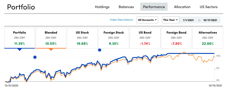
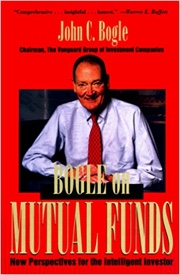
Just over 45 years ago on August 31st, 1976, the late Jack Bogle started the first index mutual fund at Vanguard. It nearly didn’t get off the ground, garnering only 7% of the initial funding goal – it wasn’t even enough to buy shares of all the stocks in the S&P 500! Read Bogle’s own take from exactly 10 years ago at this 9/3/2011 WSJ article to better appreciate it took determination and stubbornness to make this happen.

Industry leaders mocked “Bogle’s folly”, wondering aloud why anyone would voluntarily agree to be “just average”. Well, Bogle had common sense and simple math on his side. He knew that over time, his fund was guaranteed to be above average due to it’s low costs. Some active mutual funds would outperform for a while, sure, but would there be reliable persistence in those superior returns? It turns out, very little. These days, people worry more about too much index fund investment.

Over time, more and more investors have realized the power of low costs. They are running away from high-cost funds. Morningstar just released it 2020 U.S. Fund Fee Study (free with registration). From the Executive Summary:

The average expense ratio paid by fund investors is half of what it was two decades ago. Between 2000 and 2020, the asset-weighted average fee fell to 0.41% from 0.93%. Investors have saved billions as a result.

(Thank you, Mr. Bogle.)

This chart shows the new investments flows into the cheapest 20% of funds (blue) against the remaining 80% (red) over the last 20 years:

Morningstar research has demonstrated that fees are a reliable predictor of future returns. Low-cost funds generally have greater odds of surviving and outperforming their more-expensive peers. […] Since 2000, net flows into funds charging fees that rank within the cheapest 20% of their Morningstar Category group have trended higher. Flows for the remaining 80% of funds have been negative in nine of the past 10 years.

Vanguard and it’s dirt-cheap index clones are winning. If you look closer, it’s the really low-cost funds that are gathering the most new investment. These are mostly the big names that have started competing directly with Vanguard on cost – iShares, Schwab, Fidelity, SPDR.

Of the $445 billion that flowed into the cheapest 20% of funds and share classes in 2020, nearly all of it went into the cheapest of the cheap, as 93% of net new money flowed into the least costly 5% of all funds.

Investors voted with their money. Follow this trend and continue to effect change with your investment choices. Look for a low-cost fund option in your 401k, and ask why if you don’t see it.

My Money Blog has partnered with CardRatings and may receive a commission from card issuers. Some or all of the card offers that appear on this site are from advertisers and may impact how and where card products appear on the site. MyMoneyBlog.com does not include all card companies or all available card offers. All opinions expressed are the author’s alone, and has not been provided nor approved by any of the companies mentioned.

MyMoneyBlog.com is also a member of the Amazon Associate Program, and if you click through to Amazon and make a purchase, I may earn a small commission. Thank you for your support.


How Much of Historical Stock Returns Is Due To P/E Ratio Expansion?

My Money Blog has partnered with CardRatings and may receive a commission from card issuers. Some or all of the card offers that appear on this site are from advertisers and may impact how and where card products appear on the site. MyMoneyBlog.com does not include all card companies or all available card offers. All opinions expressed are the author’s alone.

According to Multpl.com, the P/E ratio of the S&P 500 is now 35, and the dividend yield is only 1.3%. The all-time low dividend yield was 1.11% back in August 2020. Even if you consider stock buybacks, the earnings yield is less than 3%! That means if corporations all distributed every penny of their profits as dividends, it still wouldn’t be higher than 3%. Before we go any further, I’m not advocating market timing, as people were saying that the S&P 500 was “overvalued” back in 2015 when the P/E ratio was 25 and the dividend yield was 2%. Nobody truly knows what will happen to prices in the short-term.

Even if the P/E ratio seems a lot higher now than the historical average, what has that actually meant? The Morningstar article How Much Has the Market Benefited from Investor Optimism? examines how much of the historical return of the S&P 500 from 1976 through March 2021 was from P/E expansion.

In January 1976, the P/E ratio was only 11.8. In March 2021, the P/E ratio was 31.5. That seems like a huge difference, and over that 45-year time period, it did add 2.2% to the overall historical average annual return. But we also got 3% from earning growth, and another 2.75% from dividends, for a total return of ~8% above inflation. 8% real return!

In a way, this is somewhat comforting, as if you look at the long-term, a shrinking P/E ratio won’t completely destroy your retirement by itself. Instead of adding 2%, it might subtract 2%.

Looking ahead, if you assume a generous 4% from earnings growth, 0% from a constant P/E ratio, and 1.3% from dividends, that’s roughly a 5% future real return. But if the P/E ratio goes back even partly back to historical averages, that will be closer to a 4% real return. The problem is that bonds are giving us 0% real return at best, so I’m sticking with owning productive businesses.

The numbers on my brokerage statements keep going up so perhaps I shouldn’t complain, but I sure hope the earnings start to catch up to the prices soon (as some predict). I like the idea of the P/E ratio going down due to higher earnings rather than lower prices!

My Money Blog has partnered with CardRatings and may receive a commission from card issuers. Some or all of the card offers that appear on this site are from advertisers and may impact how and where card products appear on the site. MyMoneyBlog.com does not include all card companies or all available card offers. All opinions expressed are the author’s alone, and has not been provided nor approved by any of the companies mentioned.

MyMoneyBlog.com is also a member of the Amazon Associate Program, and if you click through to Amazon and make a purchase, I may earn a small commission. Thank you for your support.