 Retirement income planning would be so much easier if you could buy a known amount of guaranteed lifetime income that automatically adjusted for inflation. However, the reality is that not a single insurance company in the entire world is willing to take on that long-term inflation risk. The only possibility left is to ladder inflation-linked bonds (TIPS) so that each year you would cash out some bonds and interest to create your own DIY inflation-adjusted income.
Thanks to the rising real yields of TIPS, you can now create a 30-year TIPS ladder that will create effectively a 4% guaranteed real withdrawal rate. If you put $1,000,000 into a 30-year TIPS ladder right now, you will get $40,000+ income for year 1 and then another $40,000 adjusted for inflation (CPI-U) annually for the next 29 years. All backed by the US government.
Allan Roth did the hark work and bought a 30-year TIPS ladder x 4.3% real withdrawal rate using $100,000 of his own money on the secondary market. He also introduced me to eyebonds.info, which has a lot of helpful spreadsheets for the hardcore DIY TIPS and Savings I bond investor.
Such a TIPS ladder will only go for 30 years, and you end up with nothing at the end, so it does have some limitations. If you retire at 65 and spend your 4% every year, this portfolio will be completely depleted by age 95. If you start at 55, it will end at 85. Therefore, this tool would work best as a supplement to your Social Security benefits and perhaps keeping some stocks for potential upside…
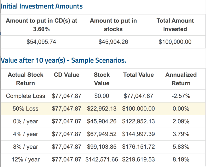
Now, Allan Roth also wrote about the “No Risk” portfolio where you put most of your money in zero coupon bonds that will guarantee you don’t lose any dollars but put the rest in stocks for upside potential. It feels good to know you’ll both start and end with at least, say $100,000. However, the reality is that you are still exposed to inflation risk, as $100,000 in 10 years may be worth a lot less than $100,000 today.
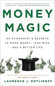
What if you simply replaced those traditional-style bonds with TIPS as your super-safe base? You’d remove the inflation risk while still keeping minimal credit risk. Enter the concept of Upside Investing by Lawrence Kotlikoff (author of Money Magic).
Upside Investing, as I described in recent Forbes and Seeking Alpha columns, is simple as pie.
– You invest in the S&P and TIPS/I-Bonds and specify a period during which you’ll convert your stocks to TIPS/I-Bonds.
– You build a base living standard floor assuming all stock investments are lost.
– You increase your living standard floor only when and if you convert stocks to TIPS/I-Bonds.
If you can lock in your TIPS ladder at a decent real yield, you could have an intriguing combination of a very safe base income, while still giving you a very good chance of a higher income with stock returns anywhere close to historical averages.
In rough terms, what if a 75% TIPS/25% stock portfolio offered a minimal guaranteed withdrawal rate of 3% real for 30 years (only this low if stocks go to zero!) with the good probability that you would likely be able to withdrawal 4% and quite possibly more. For a conservative investor, knowing you have a rock-solid safe floor would allow you to spend freely with the rest. 🥳 Something to investigate further while TIPS real yields are decent again.
 Inflation still 🚀 😬 Savings I Bonds are a unique, low-risk investment backed by the US Treasury that pay out a variable interest rate linked to inflation. With a holding period from 12 months to 30 years, you could own them as an alternative to bank certificates of deposit (they are liquid after 12 months) or bonds in your portfolio.
 Here’s my quarterly income update for my
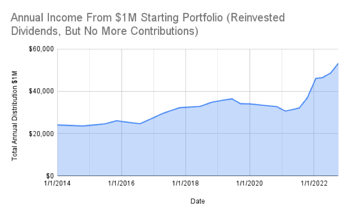
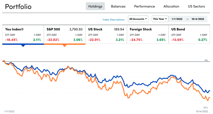
 Here’s my quarterly update on my current investment holdings as of 10/4/22, including our 401k/403b/IRAs and taxable brokerage accounts but excluding real estate and side portfolio of self-directed investments. Following the concept of
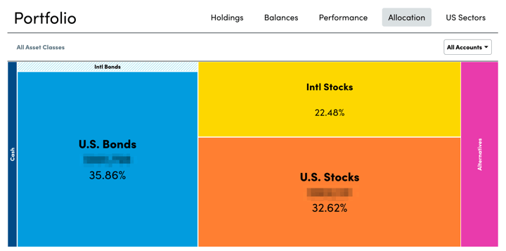
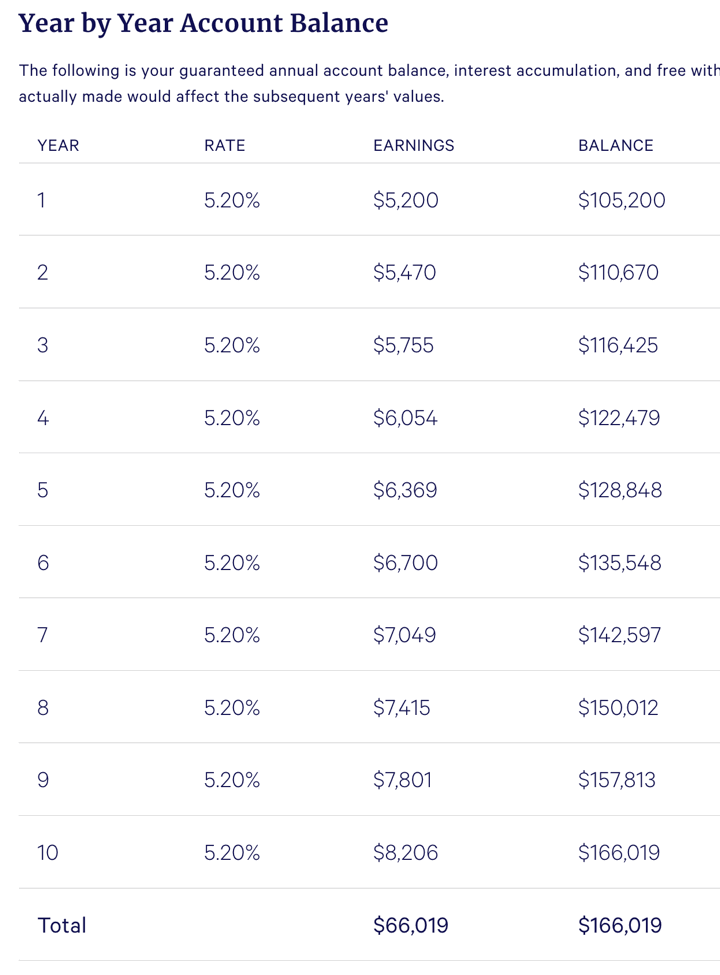
 Everyone loves a 100% money-back guarantee. A popular option on insurance policies is the “Return of Premium” rider. Let’s say you buy a $1,000,000 term life insurance for 30 years at $1,000 a year. At the end of 30 years, if you’re still alive, the insurance policy will no longer pay you the $1,000,000 if you die, but it will return all the premium you paid ($30,000). In your mind, you could think of it as “no risk” because you’ll get your $30,000 back no matter what!
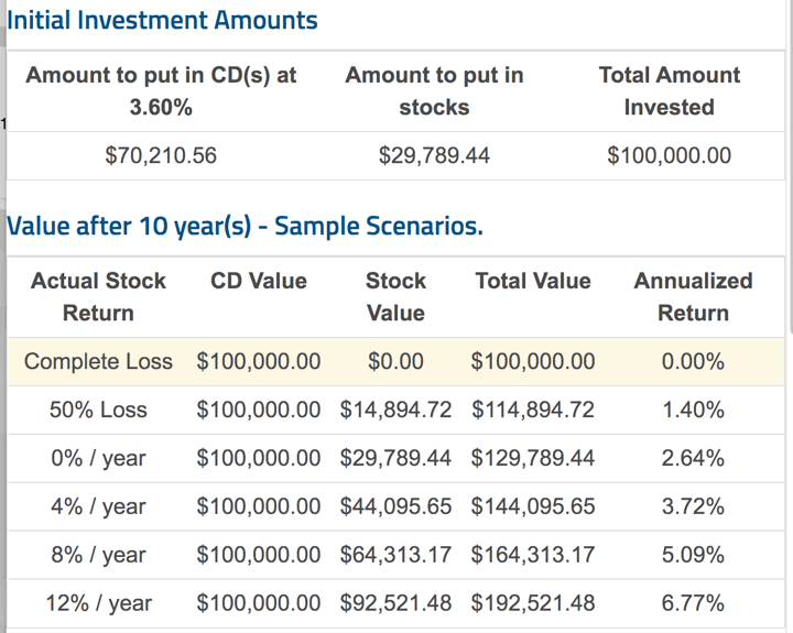


 The Best Credit Card Bonus Offers – 2025
 Big List of Free Stocks from Brokerage Apps
 Best Interest Rates on Cash - 2025
 Free Credit Scores x 3 + Free Credit Monitoring
 Best No Fee 0% APR Balance Transfer Offers
 Little-Known Cellular Data Plans That Can Save Big Money
 How To Haggle Your Cable or Direct TV Bill
 Big List of Free Consumer Data Reports (Credit, Rent, Work)