Portfolio Charts Visualization Tool: Returns vs. Time (Holding Period)

My Money Blog has partnered with CardRatings and may receive a commission from card issuers. Some or all of the card offers that appear on this site are from advertisers and may impact how and where card products appear on the site. MyMoneyBlog.com does not include all card companies or all available card offers. All opinions expressed are the author’s alone.

When investing in stocks and bonds, it is important to take a long-term perspective. We’ve all heard that phrase. A new tool called PortfolioCharts.com lets you create charts that make it easier to visualize the relationship between returns and holding periods. Created by a fellow named Tyler, found via The Reformed Broker.

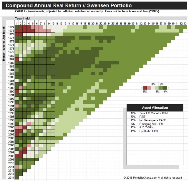
With the Pixel chart, you can customize any asset allocation and see that portfolio mix’s returns over a multitude of timeframes. Here’s the chart for The Swensen Portfolio, which is the closest “lazy portfolio” to my personal portfolio – 30% US Total, 15% Foreign Developed, 5% Emerging Market, 20 US REIT, 15% 5-Year Treasuries, 15% TIPS.

portchart1

You can see that depending on your starting year, the returns over the next 1-9 year period could be pretty rough. But as long as you held for 10 years or more, you always got a positive real return above inflation. You can also see that the often-promised 5% real returns aren’t always guaranteed, although historically if you held on for 20+ years your odds were pretty good.

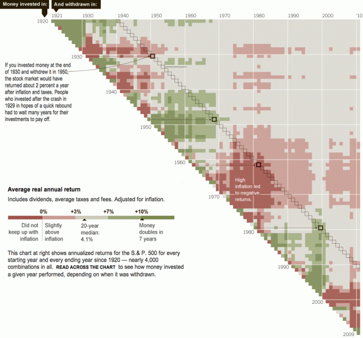
You may recall a similar style of chart from the NYT and Crestmont Research which includes additional data going back to 1920:
nytcrestmont

My favorite style is the Funnel chart:

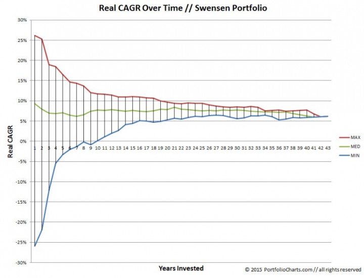
The Funnel chart shows the changing uncertainty of compound annual growth rates over time. This demonstrates how long you may need to hold a portfolio to experience the average long-term returns it advertises. It also provides a nice snapshot of the range of 1-year volatility.

Here’s the Funnel for the same Swensen Portfolio:

portchart2

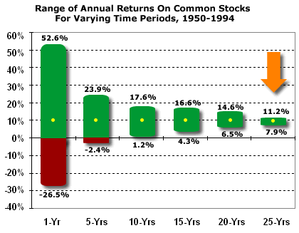
The funnel chart also supports the notion – in an even simpler way – that if you can take a long-term perspective, your risk of losing money should decrease. Here’s a similar chart from the classic investing book A Random Walk Down Wall Street that was one of my early blog posts:
randomwalk_stocktime

Finally, the Hurricane chart allows you to simulate what would have happened to your portfolio balance if you made annual withdrawals, such as in a retirement scenario.

Warren Buffett is another famous supporter of taking the long-term view. From a recent CNBC interview:

Buffett, who looks to buy stocks or business for their long-term prospects, said recent weakness in the market does not concern him.

“Stocks are going to be higher, and perhaps a lot higher 10 years from now, 20 years from now,” he said, adding that’s why he does not try to time the market.

Hopefully for those investors with a long runway ahead of them, this new tool will help you view your portfolio in a more patient manner. I’ll try to remember it when the next market panic arrives.
My Money Blog has partnered with CardRatings and may receive a commission from card issuers. Some or all of the card offers that appear on this site are from advertisers and may impact how and where card products appear on the site. MyMoneyBlog.com does not include all card companies or all available card offers. All opinions expressed are the author’s alone, and has not been provided nor approved by any of the companies mentioned.

MyMoneyBlog.com is also a member of the Amazon Associate Program, and if you click through to Amazon and make a purchase, I may earn a small commission. Thank you for your support.


Expected Returns by Asset Class Tool by Research Affiliates

My Money Blog has partnered with CardRatings and may receive a commission from card issuers. Some or all of the card offers that appear on this site are from advertisers and may impact how and where card products appear on the site. MyMoneyBlog.com does not include all card companies or all available card offers. All opinions expressed are the author’s alone.

crystal_ball_hp

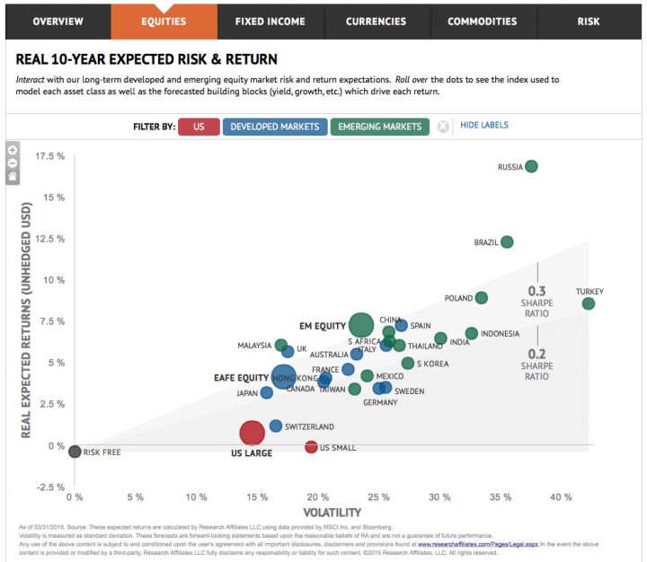
In the current environment of historically-high US stock valuations and historically-low interest rates, there is a lot of discussion about what investors should expect in regards to future returns. Predictions are a dime a dozen, but some are better supported than others. Research Affiliates has interactive Expected Returns tool where they freely share both their forecasts and detailed methodology. For example, here is a PDF of their equities methodology.

1st Quarter 2015 Equities 10-Year Forecast. Currently, their forecast for equities predicts that US Large-Cap and US Small-Cap stocks will have expected real (inflation-adjusted) returns of below 1% annually. Developed European and Asian Country stocks (MSCI EAFE) have significantly higher numbers, while Emerging Markets as a whole offer the best risk/return ratio (Sharpe ratio). I’m not into single-country bets, but it appears Russia is the one to take if you have a high appetite for risk.

ra_expected1

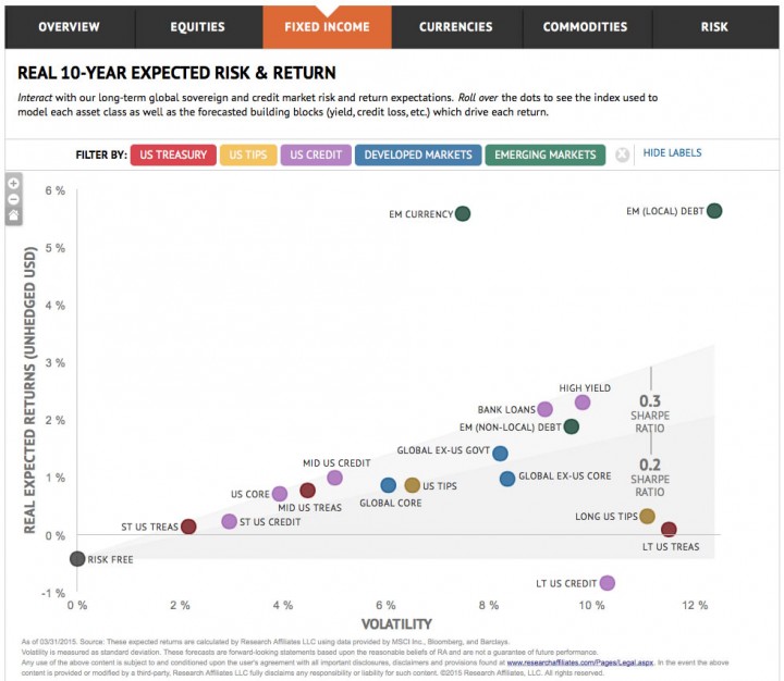
1st Quarter 2015 Fixed Income 10-Year Forecast. Currently, their forecast for fixed income predicts that both long and short US Treasuries will have expected real (inflation-adjusted) returns of basically zero. You might get under 1% real with a broad US bond fund like AGG or BND, or reach for a little more return with a high-yield junk bond fund but with roughly the same Sharpe ratio. The gambler’s choice appears to be Emerging Markets currencies (EM money market funds), which they predict will appreciate relative to the US dollar in the next decade. This is followed by Emerging Market bonds issued in local currency.

ra_expected2

I like reading the theories and fundamental arguments for these forecasts, and consider the numbers as part of the big picture but not necessarily something to act on directly. I also keep track of other forecasts, including the follow which were previously mentioned on this blog – Jeremy Grantham / GMO 7-Year Forecasts (free registration required) and the Rick Ferri / Portfolio Solutions 30-Year Forecasts. The most recent GMO numbers also give the expected-returns edge to Emerging Markets in both the stocks and bond worlds (risk is not directly assessed).

My Money Blog has partnered with CardRatings and may receive a commission from card issuers. Some or all of the card offers that appear on this site are from advertisers and may impact how and where card products appear on the site. MyMoneyBlog.com does not include all card companies or all available card offers. All opinions expressed are the author’s alone, and has not been provided nor approved by any of the companies mentioned.

MyMoneyBlog.com is also a member of the Amazon Associate Program, and if you click through to Amazon and make a purchase, I may earn a small commission. Thank you for your support.


Best Buy vs. Rent Calculator Ever? Interactive & Fully Customizable

My Money Blog has partnered with CardRatings and may receive a commission from card issuers. Some or all of the card offers that appear on this site are from advertisers and may impact how and where card products appear on the site. MyMoneyBlog.com does not include all card companies or all available card offers. All opinions expressed are the author’s alone.

nytrent

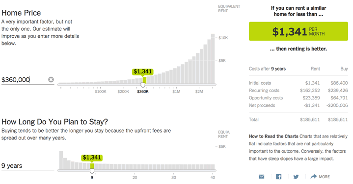
There are a plethora of buy vs. rent calculators out there, but virtually all of them make at least some fixed assumptions. They might assume that you could invest the difference between renting and buying in the stock market at 8% return while you disagree, or they might assume that your property tax rate is 3% when it is only 0.5%.

The New York Times already had a pretty good one, but their new Buy vs. Rent calculator is the most interactive, user-friendly, fully customizable version that I have ever seen. Here are the factors that it lets you adjust:

  • Home details (price, length of ownership)
  • Mortgage details (rate, downpayment size, length)
  • Future growth rates (Home price appreciation rate, rent appreciation rate, overall inflation rate, investment return rate)
  • Taxes (Property tax rate, your marginal income tax rate)
  • Transaction costs (closing costs on purchase, commission paid on selling)
  • Costs of homeownership (maintenance, HOA fees, utilities covered by landlord, homeowner’s insurance)
  • Costs of renting (security deposit, broker’s fee, renter’s insurance)

If I could find a flaw with the calculator, it would be that you now have the power to tweak your assumptions to reach your desired answer of renting or buying. “Well, if I adjust investment return a bit higher, and I reduce the commission to sell with a discount real estate agent, and stay in there a couple extra years… we should buy!”

Of course, an accompanying NYT article points out that buying a home isn’t all about the numbers.

My Money Blog has partnered with CardRatings and may receive a commission from card issuers. Some or all of the card offers that appear on this site are from advertisers and may impact how and where card products appear on the site. MyMoneyBlog.com does not include all card companies or all available card offers. All opinions expressed are the author’s alone, and has not been provided nor approved by any of the companies mentioned.

MyMoneyBlog.com is also a member of the Amazon Associate Program, and if you click through to Amazon and make a purchase, I may earn a small commission. Thank you for your support.


Estimate Your Portfolio Personal Rate of Return – Calculator

My Money Blog has partnered with CardRatings and may receive a commission from card issuers. Some or all of the card offers that appear on this site are from advertisers and may impact how and where card products appear on the site. MyMoneyBlog.com does not include all card companies or all available card offers. All opinions expressed are the author’s alone.

Updated and revised for 2014. Some of you may be wondering how well your specific portfolio performed last year (or over any specific period of time). Let’s say you started the year with $10,000 and put in another $5,000 through 10 different deposits spaced throughout the year, and ended up with $16,000. What was your rate of return? Your main goal is simply to separate the effect of new deposits (or withdrawals) and your actual return from investments.

Figuring out your exact personal rate of return requires you to know the exact dates of all your deposits and withdrawals, along with a financial calculator or spreadsheet program with an IRR function (example here). However, for a quick and simple estimate of your returns, try this calculator instead:

Initial Balance: $
Total Deposits: $
Total Withdrawals: $
Final Balance: $
Time period:   year(s)
Your estimated annualized rate of return:   %

Instructions

  1. Get your initial balance. This is probably from your brokerage statements. Try January of last year.
  2. Tally up any deposits or withdrawals. For example, let’s say you know you put $3,000 in your Roth IRA and also 5% of your $40,000 salary into a 401(k). That would be $3,000 + $2,000 = $5,000. That’s it, you don’t need to worry about looking up the specific dates and amounts.
  3. Get your final balance. Your December statement is probably available already.
  4. Find the time elapsed (in years) between your initial and final balances.
  5. Hit Calculate. An estimate of your annualized return is instantly given.

How Accurate Is This Estimate?
The calculator assumes that the inflows and outflows are spread evenly around the middle of the year. I originally saw this method in the book The Four Pillars of Investing (review). However, unless the deposits and withdrawals are very large as compared to the initial balance, the estimates are actually pretty good.

For example, let’s say that you start with $100,000 on 1/1/13, and end up with $120,000 on 1/1/14. If you had net deposits of $10,000 during the year, the calculator above would estimate your return at 9.52%. If the $10,000 was actually deposited all at once on one of these specific days, you would get the following exact returns:

Deposit Date Exact Return
1/1/13 (very first day) 9.1%
6/04/13 (middle of the year) 9.5%
1/1/14 (very last day) 10%
Estimate 9.5%


Also check out the rest of my Tools and Calculators.

My Money Blog has partnered with CardRatings and may receive a commission from card issuers. Some or all of the card offers that appear on this site are from advertisers and may impact how and where card products appear on the site. MyMoneyBlog.com does not include all card companies or all available card offers. All opinions expressed are the author’s alone, and has not been provided nor approved by any of the companies mentioned.

MyMoneyBlog.com is also a member of the Amazon Associate Program, and if you click through to Amazon and make a purchase, I may earn a small commission. Thank you for your support.


True Cost of Holiday Shopping Calculator

My Money Blog has partnered with CardRatings and may receive a commission from card issuers. Some or all of the card offers that appear on this site are from advertisers and may impact how and where card products appear on the site. MyMoneyBlog.com does not include all card companies or all available card offers. All opinions expressed are the author’s alone.

Time for my annual Black Friday Buzzkill calculator! 😉 Can you hear that sound? Sleigh bells a-jingling? Carol singers? No, it’s credit cards a-swiping as part of what is now officially BUY BUY BUY season.

Here’s a mental trick that I use to temper my “self-gifting” urges. We know that every dollar saved now will be worth much more in the future. I made this calculator to help visualize this fact and push me to forgo short-term (temporary) pleasure for long-term gain.

Step 1: Pick Your Purchase:


Name Your Own Impulse Buy Price

Step 2: Pick your estimated annual return (default is 6%):
4%     6%     8%
Step 3: Pick your time horizon (default is 30 years):
10 years    20 years    30 years    40 years
Assuming a 3% inflation rate, the inflation-adjusted TrueCost™ of your impulse buy in years is:   

$600 for a cashmere sweater? $7,000 Flatscreen TV? Ouch. This is not to say the occasional splurge is never worth it. (I do like me a steaming hot Peppermint Latte.) Perhaps it is. But I hope that this calculator can provide a little perspective while you are barraged by retailers to buy stuff you really don’t need. Who cares if you get 30% off when it’s so expensive?

My Money Blog has partnered with CardRatings and may receive a commission from card issuers. Some or all of the card offers that appear on this site are from advertisers and may impact how and where card products appear on the site. MyMoneyBlog.com does not include all card companies or all available card offers. All opinions expressed are the author’s alone, and has not been provided nor approved by any of the companies mentioned.

MyMoneyBlog.com is also a member of the Amazon Associate Program, and if you click through to Amazon and make a purchase, I may earn a small commission. Thank you for your support.


Tracking Inflation: Consumer Price Index vs. MIT Billion Prices Project

My Money Blog has partnered with CardRatings and may receive a commission from card issuers. Some or all of the card offers that appear on this site are from advertisers and may impact how and where card products appear on the site. MyMoneyBlog.com does not include all card companies or all available card offers. All opinions expressed are the author’s alone.

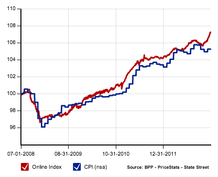
AFter calculating the new savings bond rate, I noticed that from March 2012 to March 2013 the inflation rate per the Consumer Price Index was only 1.5% over the past year. Whenever you see the government announce a relatively low inflation numbers, there will always be people shouting “the government manipulates the inflation data!”. I looked into this previously with my post Does The Government Underestimate Inflation Through The CPI? Short answer: Yes they do, but maybe not in the way you think.

Usually, this is followed by the anecdotal argument “Does gas ever go down? Does your rent ever go down?”. It certainly feels like prices are rising quicker than that. My water bill just got hiked another 10%. The thing is, we always notice the increases, but tend not to notice when prices drop. When something is cheaper, we just chalk it up to being great bargain hunters. Truth is, gas prices did go down for a while.

Another way to keep an eye on inflation is with MIT’s Billion Prices Project (previous post) which tracks prices in real-time by grabbing them from websites. By checking on 50,000+ different prices daily covering everything from prescription drugs to clothing to real estate, this alternative inflation measurement has the potential to keep governments “honest” with their numbers.

Index Values: CPI vs. BPP

[Read more…]

My Money Blog has partnered with CardRatings and may receive a commission from card issuers. Some or all of the card offers that appear on this site are from advertisers and may impact how and where card products appear on the site. MyMoneyBlog.com does not include all card companies or all available card offers. All opinions expressed are the author’s alone, and has not been provided nor approved by any of the companies mentioned.

MyMoneyBlog.com is also a member of the Amazon Associate Program, and if you click through to Amazon and make a purchase, I may earn a small commission. Thank you for your support.


Quicken Mac 2007 OS X Lion Compatible Version Released

My Money Blog has partnered with CardRatings and may receive a commission from card issuers. Some or all of the card offers that appear on this site are from advertisers and may impact how and where card products appear on the site. MyMoneyBlog.com does not include all card companies or all available card offers. All opinions expressed are the author’s alone.

I know that there was some noise when the Mac OS X 10.7 Lion was released and Quicken 2007 for Mac was reported by Intuit to be incompatible with any computer running the new operation system. Next, they release Quicken Essentials for Mac which was a neutered version of Quicken which quickly angered long-time customers even more. So they promised they would rewrite it to work on OS X Lion. Well, it has finally arrived. Cost is $15. Thanks to reader Paul for the tip.

Data migration. According to their FAQ, users can import data from Quicken 2005, 2006 or 2007 for Mac, as well as from Quicken Essentials for Mac. File conversion is not possible for Quicken 2004 for Mac and prior versions.

So now you can pay more to use their 5-year old software, hurray! I still think it’s pretty clear that Intuit isn’t going to spend too much more effort improving Quicken, instead they are spending more money on Mint.com which is online and free to users (ad-supported). Has anyone tried it out yet?

My Money Blog has partnered with CardRatings and may receive a commission from card issuers. Some or all of the card offers that appear on this site are from advertisers and may impact how and where card products appear on the site. MyMoneyBlog.com does not include all card companies or all available card offers. All opinions expressed are the author’s alone, and has not been provided nor approved by any of the companies mentioned.

MyMoneyBlog.com is also a member of the Amazon Associate Program, and if you click through to Amazon and make a purchase, I may earn a small commission. Thank you for your support.


The Problem With A Retirement Based On The Stock Market

My Money Blog has partnered with CardRatings and may receive a commission from card issuers. Some or all of the card offers that appear on this site are from advertisers and may impact how and where card products appear on the site. MyMoneyBlog.com does not include all card companies or all available card offers. All opinions expressed are the author’s alone.

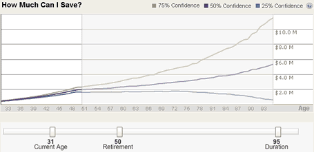
As far as retirement calculators go, the new one over at the Scottrade Knowledge Center is pretty nice. It does the whole Monte Carlo thing, running theoretical scenarios based on historical data. There are fancy interactive sliders that let you input your current portfolio balances, annual contributions, and your future expenses. The result is a pretty chart:

But the same problem always occurs whenever retirements depend heavily on market returns. If future returns are on the low side of history, I could end up broke* and eating dog food by age 90. If future market returns are high, then I could die with $10 million in the bank. What the heck do I need with that much money at age 90?

One way to avoid this is to have a very conservative portfolio of safe and short-term bonds (or TIPS). This has the slight inconvenient problem of requiring a very high savings rate. (Or lottery winnings, a large inheritance, or other windfall.)

Now, it would be nice to have a way to share the risk with others out over longer periods of time. Give up some of the potential upside, in return for some downside protection. This usually involves an insurance company (annuities) or the government (Social Security). Which do you want to trust with a big chunk of your hard-earned money? It’s a tough call. 🙂

* This isn’t technically true. I’m sure in reality, if my portfolio was doing so poorly, I would adjust my spending however I could. But I would have to decrease my standard of living.

My Money Blog has partnered with CardRatings and may receive a commission from card issuers. Some or all of the card offers that appear on this site are from advertisers and may impact how and where card products appear on the site. MyMoneyBlog.com does not include all card companies or all available card offers. All opinions expressed are the author’s alone, and has not been provided nor approved by any of the companies mentioned.

MyMoneyBlog.com is also a member of the Amazon Associate Program, and if you click through to Amazon and make a purchase, I may earn a small commission. Thank you for your support.


What Is Your Portfolio’s Current Asset Allocation?

My Money Blog has partnered with CardRatings and may receive a commission from card issuers. Some or all of the card offers that appear on this site are from advertisers and may impact how and where card products appear on the site. MyMoneyBlog.com does not include all card companies or all available card offers. All opinions expressed are the author’s alone.

If you haven’t been keeping close track of it, your portfolio’s asset allocation may have shifted significantly over the past year. Your relative mix of assets like stocks, bonds, or real estate has a great impact on the volatility and expected future return of your portfolio.

Morningstar has a bunch of helpful tools for managing your investment portfolio, but many of them require a paid membership. However, one handy trick is that anyone can use many of these premium features for free at the T. Rowe Price website by signing up for a free account with nothing but an e-mail address.

Portfolio Manager
This tool lets you enter all your portfolio holdings, which it then stores for you and allows you to track it with automatically updated prices. You can either track all your future transactions as you go, or just input your updated holdings every few months like I do.

Portfolio X-Ray
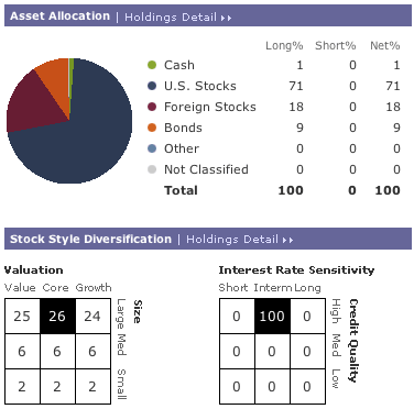
Once you enter your holdings, simply look for the Portfolio X-Ray tab and you’ll have a complete breakdown of the true asset allocation of your overall portfolio. Does your “small cap” fund really own a bunch of mid-caps and large-cap funds? X-Ray will reveal your true exposure to stock style (i.e. Small/Mid/Large, Growth/Blend/Value), geographical regions (i.e. Japan, US) , stock sectors (i.e. Telecom, Energy), average expense ratio, and more.

If you’d rather have a quick peek without needing to register at all – but also without the ability to save your portfolio – try the Morningstar Instant X-Ray tool.

If you already have a target asset allocation in mind, now might be a good time to to rebalance your assets back towards that target. Rebalancing is a way to maintain the risk/reward balance that you have chosen for your investments, and also forces you to buy temporarily under-performing assets and sell over-performing assets (buy low, sell high). If you are looking for a bit more guidance, here are my favorite posts on investing.

My Money Blog has partnered with CardRatings and may receive a commission from card issuers. Some or all of the card offers that appear on this site are from advertisers and may impact how and where card products appear on the site. MyMoneyBlog.com does not include all card companies or all available card offers. All opinions expressed are the author’s alone, and has not been provided nor approved by any of the companies mentioned.

MyMoneyBlog.com is also a member of the Amazon Associate Program, and if you click through to Amazon and make a purchase, I may earn a small commission. Thank you for your support.


MIT’s Real-time Inflation Calculator

My Money Blog has partnered with CardRatings and may receive a commission from card issuers. Some or all of the card offers that appear on this site are from advertisers and may impact how and where card products appear on the site. MyMoneyBlog.com does not include all card companies or all available card offers. All opinions expressed are the author’s alone.

A lot of people are worrying about inflation or deflation in the future. The most widely used definition of inflation is the Consumer Price Index, which is published monthly by the Bureau of Labor Statistics and is based on a basket of consumer goods using price surveys from cities around the country. This takes a while, so the CPI for December would be published in mid-January.

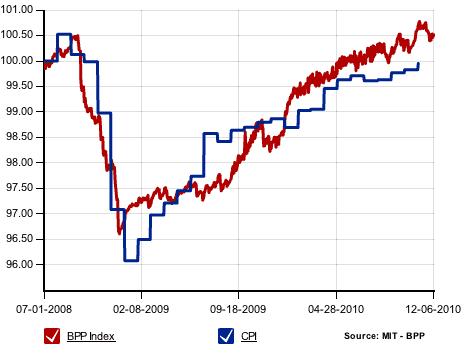
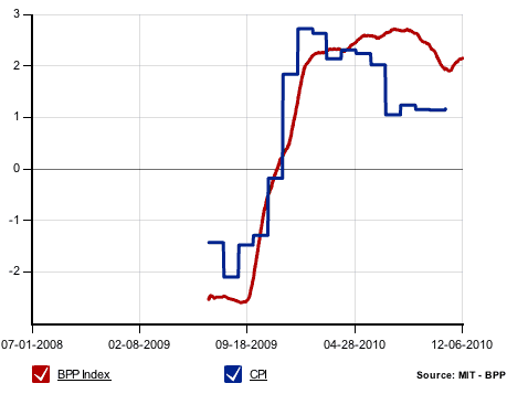
Professors Roberto Rigobon and Alberto Cavallo at the MIT Sloan School of Management started the Billion Prices Project which, directly pulls data from online retailers from around the world. In the US, the software is tracking 550,000 items from 53 retailers. The best part – since it’s all automated, the numbers are updated daily! The goal is to predict the CPI before they even announce it. You can see from the charts below that the two track reasonably well together.

Daily BPP Index vs. CPI

.

Annual Inflation (over last 365 days)

If they start to vary widely, which one should be considered inaccurate? Via the NY Times.

My Money Blog has partnered with CardRatings and may receive a commission from card issuers. Some or all of the card offers that appear on this site are from advertisers and may impact how and where card products appear on the site. MyMoneyBlog.com does not include all card companies or all available card offers. All opinions expressed are the author’s alone, and has not been provided nor approved by any of the companies mentioned.

MyMoneyBlog.com is also a member of the Amazon Associate Program, and if you click through to Amazon and make a purchase, I may earn a small commission. Thank you for your support.


ING Your Number: Retirement Calculator Assumptions and Factors

My Money Blog has partnered with CardRatings and may receive a commission from card issuers. Some or all of the card offers that appear on this site are from advertisers and may impact how and where card products appear on the site. MyMoneyBlog.com does not include all card companies or all available card offers. All opinions expressed are the author’s alone.

I was watching TV this weekend and kept seeing commercials about ING’s Your Number, which is an online calculator that supposedly helps you plan for retirement by telling you how much you need to save. Here’s one of them if you haven’t heard of them before:

After trying it out and finding out my 7-digit number, I wanted to see what was “under the hood”. Monte carlo simulations? Spits out random number to mess with your head? Maybe my Google-Fu is weak, but I couldn’t find anything except this Your Number worksheet [PDF] from ING dated 2009. The final numbers don’t match up, but it does provide some insight into how the current calculator works. Using this information and trying lots of permutations, I tried to backtrack how each question affects the final output.

Factors and Assumptions

Current age. This factor appears to be used solely to calculate how many years you have left until retirement. Since the ING Your Number is the amount of money you need at the time of retirement, it increases every year with inflation. This is an important fact to note, as needing $1 million today would be the same as needing $2 million 30 years from now due to inflation alone. (Inflation is assumed to be roughly 3% annually.)

Marital status. The calculator says “We’re not trying to pry into your personal life, but whether or not your married has an impact on your number.” Nosy or not, it actually doesn’t seem to matter. I tried all kinds of inputs, but I couldn’t find any that changed based on being married or not. Let me know if I missed something here.

Current household income. At first glance, you’d think your current household income wouldn’t affect Your Number necessarily, since it later on asks for the actual income required during retirement. I noticed that making slight changes in your current income doesn’t affect Your Number at all. However, large changes do – it appears that this number is used to estimate future social security benefits. If your current income is really low, then your future benefits will also be low, which increases Your Number.

Age at retirement. This factor is used twice – once along with your current age to find how long you have until retirement, and again with your death age to find years in retirement. The more years you plan to spend in retirement, the greater Your Number will need to be in order to maintain a margin of safety.

Annual income required during retirement. A recommended amount is 80% of your pre-retirement income, but I hate that rule-of-thumb. Instead, this is probably the hardest part of the calculator because it requires the most personal and in-depth thought. Is your house paid off and are you going to stay in it? How much of your current income goes towards work expenses? What activities do you plan to do in retirement?

Provide income through what age? As noted above, this “death age” is used to calculate the amount of years you’ll spend in retirement. I kind of wish they just assumed 100 or something for this, it seems a bit morbid to guess when you’ll die.

In the end, Your Number is essentially your annual retirement income multiplied by a factor ranging from 5 to 30, depending on how long your retirement horizon is. It could have just told people to multiply by 25 and be just as accurate (or inaccurate) . As you might expect with any calculator that tries to help plan your retirement by asking five questions, Your Number is mostly a marketing gimmick designed to connect you with ING-affiliated financial advisors and insurance salesmen. That doesn’t mean you still don’t want to try it, though, right? 🙂

What’s yours?

My Money Blog has partnered with CardRatings and may receive a commission from card issuers. Some or all of the card offers that appear on this site are from advertisers and may impact how and where card products appear on the site. MyMoneyBlog.com does not include all card companies or all available card offers. All opinions expressed are the author’s alone, and has not been provided nor approved by any of the companies mentioned.

MyMoneyBlog.com is also a member of the Amazon Associate Program, and if you click through to Amazon and make a purchase, I may earn a small commission. Thank you for your support.


Getting Organized In The Google Era (Book Summary)

My Money Blog has partnered with CardRatings and may receive a commission from card issuers. Some or all of the card offers that appear on this site are from advertisers and may impact how and where card products appear on the site. MyMoneyBlog.com does not include all card companies or all available card offers. All opinions expressed are the author’s alone.

I ran across Getting Organized in the Google Era in an airport bookstore last month, and while I wasn’t enamored enough to pay the $23 retail hardcover price, I did add it to my library want list. The author Douglas Merrill was formerly the Chief Information Officer at Google, so I figured he might know something on the topic of organizing data in the digital age. Here are my notes.

First of all, this is not a detailed organizational framework like that of the best-seller Getting Things Done by David Allen. It’s actually more like a series of blog posts that ended up being stretched into a book. Merrill uses a very casual, storytelling style of writing with lots of (sometimes awkward) personal stories and song lyrics mixed in. It skips around a lot, from high-level organizational philosophies to tips on using Gmail to how his girlfriend died of cancer.

Organizational Principles

In the end, the book’s overall theme did stick to the subtitle of “How to Get Stuff out of Your Head, Find It When You Need It, and Get It Done”, and I did write down a lot of good basic principles from the book. Here they are, paraphrasing:

  • Don’t keep stuff in your head, get it out as soon as possible. Write it, type it, say it, whatever. Either paper and digital might be better for any specific task.
  • Always trying to multitask can actually make you less efficient overall.
  • Stories make it easier to remember information.
  • Don’t spend forever organizing your information, just search for what you need. Desktop searching, Google web searches, Gmail e-mail search, online calendars – use them to simplify things.
  • When overwhelmed or hitting a roadblock, break big tasks into smaller ones.
  • Try to integrate work with life instead of trying to balance them together. When people say the want a “work-life balance”, that’s usually just code for wanting to work less.

Useful Tools and Services

Another good part of the book was his list of software and websites that he found useful in organizing his life. Most are free, but some do cost money. A few are only on Mac OS X. Like I said, this seems like it would make a nice blog post… and now it is one 😉 I’m only listing the favorites.

  • Google. His favorite search engine, what a surprise. There are lots of little shortcuts in Google that help save you time. Want flight info? Just type the flight number in. UPS Tracking number? Just type it in. Here’s a cheatsheet straight from the source.
  • Quicksilver. Desktop search/application management/launcher tool. Mac only. [download, free]
  • Gmail. The best feature of Gmail is that you can quickly search through every single one of your e-mails, reducing the need to carefully organize everything. However, using some simple labels and filters can still help you group conversations and topics. Also has good spam filters.
  • Adium / Pidgin. Connects to multiple instant messages services all at once. Free. Adium is for Mac, Pidgin is for Windows.
  • Dropbox. Easy to use, online shared hard drive in the “cloud”. Good for storing, sharing, and syncing across computers. 2GB free, 50GB for $10/month. [website]
  • Things. To-Do List / Task manager software. [download, $49.95]
  • Xmarks. Put your web browser bookmarks online so you can sync across computer and access anywhere. Works with Firefox, Internet Explorer, and Safari. [website, free]
  • Google Health. Allows you to store and manage all of your health information in one central place. Even though I use a lot of Google stuff, I am still wary of sharing this type of data with Google. [website]

A related book that I also plan on reading soon is Upgrade Your Life by Gina Trapani of Lifehacker.

My Money Blog has partnered with CardRatings and may receive a commission from card issuers. Some or all of the card offers that appear on this site are from advertisers and may impact how and where card products appear on the site. MyMoneyBlog.com does not include all card companies or all available card offers. All opinions expressed are the author’s alone, and has not been provided nor approved by any of the companies mentioned.

MyMoneyBlog.com is also a member of the Amazon Associate Program, and if you click through to Amazon and make a purchase, I may earn a small commission. Thank you for your support.