The 2011 edition of the Death and Taxes poster is out, which outlines in spectacular detail how the United States federal budget spends its (your?) tax dollars. View the huge image online, or buy it as a 2 ft. x 3 ft poster. If you haven’t seen it before, you really should check it out.
Due to what the creator deems complexity and size constraints, the poster focuses on the $1 Trillion discretionary portion of the budget. Discretionary spending refers to the portion of the budget which goes through the annual Congressional debates every year, and amounts to about 1/3rd of the total budget. Currently, the biggest chunk goes to defense spending. Want to know how much the V-22 Osprey gets? It’s on the poster ($2.2B).
The other 2/3rds of the federal budget is mandatory spending, which includes programs which are funded by eligibility rules or payment rules. An example is welfare. If you’re eligible, you get it. The only way to change how much is spent is by changing the eligibility rules.
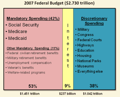
The poster does include a little chart on the bottom right about the total federal budget, but I think it tries to convey too much information in a very small space. Here’s a simpler breakdown from the 2007 budget, courtesy of PerotCharts. As you can see, entitlement programs like Social Security and Medicare are also huge expenses.

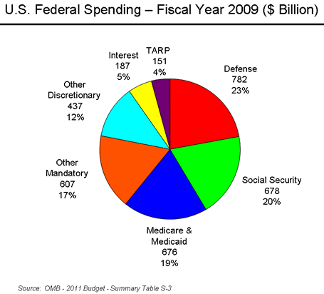
And here’s another breakdown of the 2009 total spending via Wikipedia.

As long as take all of this into perspective, this graphic does a great job of making a complex subject accessible. Not sure how long this will last, but right now with code BOGO you can get two posters for $24 + $1.50 shipping.
 The Best Credit Card Bonus Offers – 2025
 Big List of Free Stocks from Brokerage Apps
 Best Interest Rates on Cash - 2025
 Free Credit Scores x 3 + Free Credit Monitoring
 Best No Fee 0% APR Balance Transfer Offers
 Little-Known Cellular Data Plans That Can Save Big Money
 How To Haggle Your Cable or Direct TV Bill
 Big List of Free Consumer Data Reports (Credit, Rent, Work)