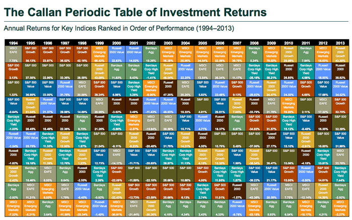
Reader Ben shared this in the comments, and I think it deserves a separate mention. Every year, investment consultant firm Callan Associates updates a neat visual representation of the relative performance of 8 major asset classes over the last 20 years. You can find the most recent one below (click to view PDF), which covers 1994 to 2013. Each year, the best performing asset class is listed at the top, and it sorts downward until you have the worst performing asset. You can find previous versions here.

You can try to find some patterns, but I doubt you’ll find anything significant. Sometimes an asset class has a hot streak that last a few years, and other times an asset class is on top one year and bottom the next. Most recently, Emerging markets equities were on top in 2012, and bottom in 2013.
Also, while the table compares relative performance, you can also note that absolute performance changes all the time as well. In 2013 the best asset class returned +43% while the worst asset class returned -2%. Contrast this with 2008, when the best asset class returned +5% while the worst asset class returned -53%. Sometimes you just can’t lose, and other times you just can’t win.
So I won’t bother predicting what will happen in 2014, and will instead continue owning multiple, less-correlating asset classes using low-cost passive investments. Oh, and I make sure to rebalance them regularly.
 The Best Credit Card Bonus Offers – 2025
 Big List of Free Stocks from Brokerage Apps
 Best Interest Rates on Cash - 2025
 Free Credit Scores x 3 + Free Credit Monitoring
 Best No Fee 0% APR Balance Transfer Offers
 Little-Known Cellular Data Plans That Can Save Big Money
 How To Haggle Your Cable or Direct TV Bill
 Big List of Free Consumer Data Reports (Credit, Rent, Work)
I agree that there’s probably not a whole lot to be learned from the graphic. But it’s still kind of cool to look at in a historical perspective. For example, AGG was stuck at the bottom from 2003-6, moved to the middle in 2007 and topped thing out as the stock market got destroyed in 2008.
Well, learning that there is no pattern to be learned is still learning something. 😉
I agree it can be fun to just pick a color and follow it visually through the years. Emerging markets (orange) always seems to be either at the very top or the very bottom.
I’ve always loved this graphic. It makes it quite clear that no one investment is always the best and makes a good case for diversifying and rebalancing.
I agree!
Jonathan,
Besides rebalancing do you also shift your allocation more towards bonds as the years go by? So as you grow older; change your asset allocation as well?
I think I first learned about this table several years ago from your blog and check it every year. Sometimes, I hear people say that diversification and buy/hold/rebalance doesn’t work anymore, that asset classes are behaving more and more alike. To them, I ask, have you ever seen the Callan Periodic Table of Investments?