In the post Foreign Stocks For The Long Run, author Rick Ferri recently revisited the topic of how much international stock exposure you should add to your portfolio’s asset allocation. I also have an older post about this – Choosing An Asset Allocation: Deciding On The Domestic/International Ratio – as part of my Rough Guide to Investing series.
One of the reasons to invest in international stocks is for the diversification benefit. While both have historical average returns of 8-10% annually before inflation, they don’t always move in sync (not perfectly correlated). As a result, Markowitz showed us you can attain a higher risk-adjusted return by holding some of both as opposed to just one or the other. So how much of each should you hold?
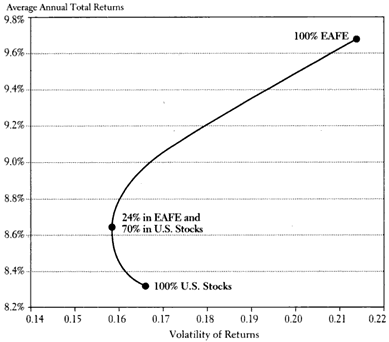
In my 2007 post, I posted this chart taken from the then-current edition of the bestseller A Random Walk Down Wall Street by Burton Malkiel. It maps the risk/return for portfolios that range from 100% US stocks to 100% EAFA (Non-US Developed countries) for the period January 1970 to June 2006:

From 1970-2006, foreign stocks outperformed US stocks, while the point of optimal risk-adjusted returns was a split of 76% US and 24% Foreign (70% is a typo).
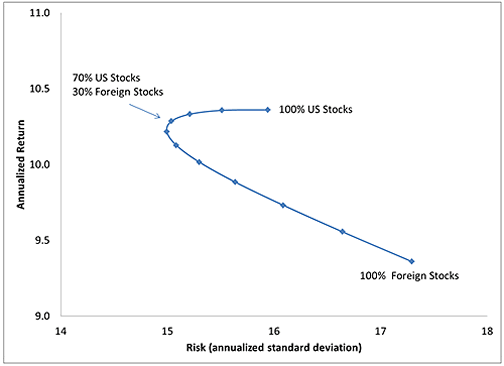
However, the updated data collected by Ferri shows a different yet similar story (see chart below). From 1970-2013, we see that now US stocks outperformed foreign stocks instead, with the point of optimal risk-adjusted returns at 70% US and 30% Foreign.

In both time periods, the overall return/risk ratio (Sharpe Ratio) didn’t change dramatically if you varied from say 60% to 80% US stocks, or even further out. (I haven’t looked deeply but there are many other similar charts out there, this old NBER paper has one covering 1985-1990.) I might also note that over time the optimal allocation went from 76% US to 70% US. Is this a trend?
Another point to consider is how the world’s publicly-traded markets are currently allocated by total market value (market capitalization). According the the holdings of the Vanguard Total World Stock ETF (VT) which tracks the FTSE Global All Cap Index, as of 10/31/2013 the breakdown was 48% US and 52% World excluding-US.
My non-expert opinion is that for US residents, anywhere from 50% to 75% US exposure (25% to 50% International exposure) is fine. I don’t think you can tell if US or International stocks will outperform from this point onward, but holding some of both will smooth out your returns as one can zig while the other zags. The important thing is to figure out what number works for you, write down the reason why, and stick with it even when one eventually outperforms the other for extended periods of time. My choice? Simple 50/50.
 The Best Credit Card Bonus Offers – 2025
 Big List of Free Stocks from Brokerage Apps
 Best Interest Rates on Cash - 2025
 Free Credit Scores x 3 + Free Credit Monitoring
 Best No Fee 0% APR Balance Transfer Offers
 Little-Known Cellular Data Plans That Can Save Big Money
 How To Haggle Your Cable or Direct TV Bill
 Big List of Free Consumer Data Reports (Credit, Rent, Work)
While neither is really overvalued at this point, currently international equities are considerably cheaper than U.S. equities on a P/E basis, with developed international cheaper and emerging markets much cheaper than domestic. I would argue that implies that international will outperform U.S. over the next five to ten years, or however long it takes for those valuations to converge somewhat.
Jeremy Grantham at GMO has a 7 year forecast that I always find interesting. While he is indeed just another talking head, he tends to be a bit on the conservative side in regard to estimates.
http://tinyurl.com/prjswhx
Actually, no.
The “bend” in the curve is not the “optimal risk-adjusted return” – it is the low risk portfolio. Everything above the bend has a higher return (and is efficient from a risk/return perspective). Everything below the bend is suboptimal.
Google “efficient frontier” for more.
@Andy – I’ll be happy to rebalance between them as it all works out. I expect hiccups for everyone over the next decade.
@Maury – I like to read Grantham’s stuff as well. I don’t like his “High Quality US stocks” portion when he doesn’t explicitly state what that means. Makes it hard to say if his prediction is right.
@Mat – You are correct, the top curve is the efficient frontier for these two asset classes alone, but the bend ends up being the point of highest Sharpe Ratio, or highest expected return-to-risk ratio. So it is “optimal” in that regard. From Fool.com:
“To provide that context, the Sharpe ratio compares the risk and return of a given investment with a baseline, low-risk investment such as Treasury bills. A high Sharpe ratio indicates that the investment is providing returns commensurate with its risk profile, while a low Sharpe ratio suggests that the risk is exceeding the expected reward.”
http://wiki.fool.com/Sharpe_ratio
I wouldn’t look for an efficient frontier until you include all the asset classes in which you want to invest in, like bonds.
Not to be persnickety, but I still don’t think that is true, at least for the top graph. The spot where the curve crosses the 8.8% EROA seems to have a higher Sharpe Ratio, at least for any reasonable risk-free return assumption.
(.0865-.03)/.158 = .358
(.088-.03)/.16 = .3625
I’m eyeballing the data of course, so could be off a bit.
Regardless of all the math, I agree with you that 50/50 is close enough to the “right” answer for all practical purposes.
I agree that the highest Sharpe ratio is more of the intersection with a slanted (45 degree-ish?) tangent line going from Southwest to Northeast. I just don’t know what that point is. It may be 72/28 or something, but it is close to 76/24. I should change the wording to reflect that the bend is “close to” the highest Sharpe ratio.
Similarly, the lowest risk point on the Ferri 2013 chart is closer to 60/40 but the highest Sharpe Ratio is closer to 70/30. As with your rough calcs, rounded to the hundredth place the Sharpe ratios for both are both 0.34 (also 0.34 for 80/20).
The point with the highest Sharpe ratio depends on your risk free rate. To be precise, it is the point where a line originating from the risk free rate, located at a point ON the y-axis at the level of the risk free rate, intersects the efficient frontier curve creating a tangent line.
In theory that is the so-called maximum efficient portfolio and if you could borrow or lend at the risk free rate you would be best off by owning that portfolio and levering it up or bundling it with a cash portfolio to add or subtract risk and return but maintain that maximum Sharpe ratio. That way you can attain whatever total risk or return you want and be above every other point on the efficient frontier.
It sounds like every reason you consider is ultimately some form of performance-chasing. The one option you don’t consider (at least not explicitly), is market cap weighting, which at the present time would be 48/52 (US/ex-US), according to the data you cite (which is also the data I use).
Now, you you do explicitly consider a 50/50 split, which is obviously very close to 48/52, but it’s only a contingent fact that, at this point in time, your 50/50 split happens to be practically the same as a market cap weighting. In 10 years, the market cap might be 27/73 (US/ex-US), for example. Your post doesn’t consider the option of tracking this movement over time, so I presume that, at that hypothetical future point in time, you would still be at a 50/50 split, perhaps looking at then-historical data (which will, of course, include what is presently “future data”) and considering a change. Or perhaps you would have already changed your allocation, but you would have done so based on then-current data about past performance.
There are many reasons to choose the index (i.e., the market cap weighting), and every deviation from it is essentially a zero-sum bet. (I’m not saying such bets are bad; I make some calculated long-term bets myself, e.g., 5% tilt toward small-cap value.) I know that you already know those reasons, so I won’t go into them. My question is: Why not even consider it?