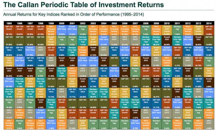
Every year, investment consultant firm Callan Associates updates a neat visual representation of the relative performance of 8 major asset classes over the last 20 years. You can find the most recent one below (view as PDF), which covers 1995 to 2014. For each year, the best performing asset class is listed at the top, and it sorts downward until you have the worst performing asset. You can find previous versions here.
The Callan Periodic Table of Investment Returns conveys the strong case for diversification across asset classes (stocks vs. bonds), investment styles (growth vs. value), capitalizations (large vs. small), and equity markets (U.S. vs. international). The Table highlights the uncertainty inherent in all capital markets. Rankings change every year. Also noteworthy is the difference between absolute and relative performance, as returns for the top-performing asset class span a wide range over the past 20 years.
I like focusing on a specific color (asset class) and then visually noting how its relative performance has bounced around for a few years. The ones that enjoy a stint at the very top are usually found on the bottom eventually.
So instead of trying to predict one asset class that will outperform this year, why not commit to holding a multiple, productive asset classes that will balance each other out over time. Pick ones that will have a long-term positive return, but in any given year might perform poorly. Hold them in a low-cost manner, and rebalance your holdings if they get out of whack.

 The Best Credit Card Bonus Offers – 2025
 Big List of Free Stocks from Brokerage Apps
 Best Interest Rates on Cash - 2025
 Free Credit Scores x 3 + Free Credit Monitoring
 Best No Fee 0% APR Balance Transfer Offers
 Little-Known Cellular Data Plans That Can Save Big Money
 How To Haggle Your Cable or Direct TV Bill
 Big List of Free Consumer Data Reports (Credit, Rent, Work)
That Russell 2000 seems to be consistently good. Kind of impressive really. I had never even really heard of them before.
Russell 2000 is simply a U.S. small cap index.
https://en.wikipedia.org/wiki/Russell_2000_Index
Basically: S&P500 (large cap) + Russell 2000 (small cap) = Wilshire 5000 (total U.S. market)
“I like focusing on a specific color (asset class) and then visually noting how its relative performance has bounced around for a few years.”
Yes, that interpretation is useful.
But honestly, this is a poorly designed infographic. The colors are hard to distinguish from each other. It would have been better just to be a line chart. Much easier to follow an asset class. that way.
Jonathan,
when I “rebalance” at the end of the year; I dont actually sell the winning holding but actually stop contributing to the winner and instead divert more funds to the loser over the next year so that at the end of next year my asset allocation is in line with plan.
Is this a viable strategy especially since most of holding are in a taxable account or do I actually need to sell and buy to reap the benefits of rebalancing?
Great Post. I agree with you. The best is not to speed up but slowly steady with great ETFs or solid dividend companies.
BeSmartRich
It would also be nice if there was a line or shading to quickly see where the positive and negative returns were. I see that 8 of the 20 years had all classes positive while 2 of the 20 years had only 1 class as positive (2002, 2008). Emerging markets seem to be feast or famine.