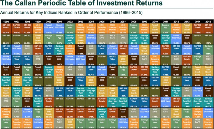
In case you haven’t noticed, nobody knows what the stock market will do in the next 12 months. Every year, investment consultant firm Callan Associates updates a neat visual representation of the relative performance of 8 major asset classes over the last 20 years. You can find the most recent one at their website Callan.com, with access to previous versions requiring free registration.
Every calendar year, the best performing asset class is listed at the top, and it sorts downward until you have the worst performing asset. Here is a snapshot of 1996-2015:
The Callan Periodic Table of Investment Returns conveys the strong case for diversification across asset classes (stocks vs. bonds), investment styles (growth vs. value), capitalizations (large vs. small), and equity markets (U.S. vs. non-U.S.). The Table highlights the uncertainty inherent in all capital markets. Rankings change every year. Also noteworthy is the difference between absolute and relative performance, as returns for the top-performing asset class span a wide range over the past 20 years.
I find it easiest to focus on a specific color (asset class) and then visually noting how its relative performance bounces around. The ones that enjoy a stint at the very top are usually found on the bottom for just as long.

 The Best Credit Card Bonus Offers – 2025
 Big List of Free Stocks from Brokerage Apps
 Best Interest Rates on Cash - 2025
 Free Credit Scores x 3 + Free Credit Monitoring
 Best No Fee 0% APR Balance Transfer Offers
 Little-Known Cellular Data Plans That Can Save Big Money
 How To Haggle Your Cable or Direct TV Bill
 Big List of Free Consumer Data Reports (Credit, Rent, Work)
Wow, nice eye-opening chart. This is just more proof that you can’t predict what will be on top one day and at the bottom the next.
I always enjoy seeing the updated table every year. Just goes to show you can’t predict the market returns.
Diversify. Keep costs super-low (thanks, Vanguard). Control taxes as much as possible. Understand your risk tolerance so you stay invested. It’s really that easy!
Thanks for your post!
John