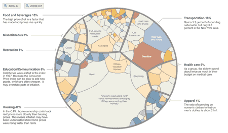
In my last post, reader Greg shared a better chart that illustrates the components of the Consumer Price Index, which is supposedly to track what the average consumer spends and thus is used to gauge inflation. Definitely worth archiving for later.
Source: New York Times. Click to visit. It’s interactive, so you can zoom in and out to see all the little details.

 The Best Credit Card Bonus Offers – 2025
 Big List of Free Stocks from Brokerage Apps
 Best Interest Rates on Cash - 2025
 Free Credit Scores x 3 + Free Credit Monitoring
 Best No Fee 0% APR Balance Transfer Offers
 Little-Known Cellular Data Plans That Can Save Big Money
 How To Haggle Your Cable or Direct TV Bill
 Big List of Free Consumer Data Reports (Credit, Rent, Work)
Jonathan, I think you’ve already posted this chart before.
This shows that CPI underweights health insurance. It shows health insurance is only 0.50% of spending. That seems way too low, at least for the self-employed.
http://www.shadowstats.com/
Ken, Yes the self employed pay signficantly more than average for health insurance compared to people with employers footing most of the bill.
Keep in mind that the CPI is an average of everyone including the people who have no insurance and pay $0. Single people who pay $600 a year. Retired people covered by Medicare. Poor people covered by Medicaid. So forth. So this averages in the over 40M people who have no health insurance and pay $0, plus all the people who have employer provided health insurance with both high and low employee contributions. Overall they show consumpers spending 6% on healtcare which sounds right to me. The government foots half the national healthcare costs between medicare, meddicaid and VA. Employers pay most of the other half.
“Definitely worth archiving for later.”
I’m really having a hard time understanding why this is interesting once, let alone interesting enough to archive for later. Apparently the cost of sewing was down 2.4% in 2008… ahhh!!!
On this week’s issue of Business Week there is an interesting article on the Billion Prices Project, a real-time inflation indicator that is supposed to check over 5 million products sold on 300 e-commerce sites.
Link:http://bpp.mit.edu/
@peter – CPI is still important since it’s used in so many calculations, even if I think it’s inaccurate. It’s good to know what’s inside without having to wade through a snoozefest report from the BLS.
@Camicia – Funny, I just read that article today as well. I wrote about BPP in December:
https://www.mymoneyblog.com/mits-real-time-inflation-calculator.html
@Scott – You are correct! I just saw it on my LinkWithin related posts. I guess I’m getting old…