 We’ve all been told that past performance is no guarantee of future returns, but it’s still hard to buy an investment that has been performing poorly. We should remember the historical power of diversification and that even though something may look horrible now, good news may be just around the corner. We also need to remember that whatever is hot today won’t stay that way forever.
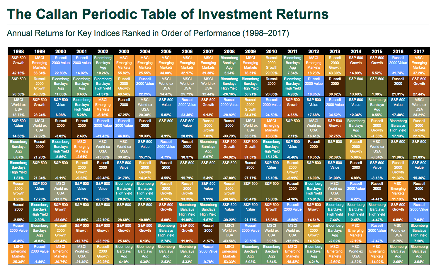
Callan Associates updates a “periodic table” annually with the relative performance of 8 major asset classes over the last 20 years. You can find the most recent one at their website Callan.com. The best performing asset class is listed at the top, and it sorts downward until you have the worst performing asset. Here is the most recent snapshot of 1998-2017:
The Callan Periodic Table of Investment Returns conveys the strong case for diversification across asset classes (stocks vs. bonds), investment styles (growth vs. value), capitalizations (large vs. small), and equity markets (U.S. vs. non-U.S.). The Table highlights the uncertainty inherent in all capital markets. Rankings change every year. Also noteworthy is the difference between absolute and relative performance, as returns for the top-performing asset class span a wide range over the past 20 years.
I find it easiest to focus on a specific asset class (Color) and then visually noting how its relative performance bounces around. Last year, I noted that Emerging Markets (Orange) and MSCI World ex-US (Light Grey) have been near the bottom for a while and I was still holding them and waiting for them to bounce back. In 2017, my diversification and patience paid off and they were indeed at the top again.


 The Best Credit Card Bonus Offers – 2025
 Big List of Free Stocks from Brokerage Apps
 Best Interest Rates on Cash - 2025
 Free Credit Scores x 3 + Free Credit Monitoring
 Best No Fee 0% APR Balance Transfer Offers
 Little-Known Cellular Data Plans That Can Save Big Money
 How To Haggle Your Cable or Direct TV Bill
 Big List of Free Consumer Data Reports (Credit, Rent, Work)
Thanks for sharing. It’s a reminder to diversify, re-balance and continue investing.