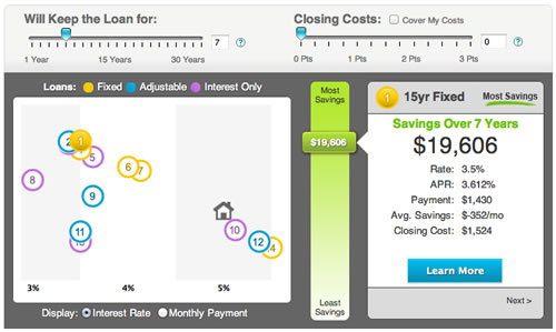
Credit Sesame might be best known for offering people a free credit score every month, but they make their money by providing mortgage quotes. That makes sense given how sensitive mortgage interest rates are to credit scores. They just rolled out a new tool called the Mortgage Map that lets you visually compare various mortgage loan options. Here’s an example screenshot:

The vertical axis appears to be savings (refinance) or cost (new loan), and the horizontal axis appears to be interest rates. Different colors denote fixed-rate, variable-rate, and interest only loans. A little house icon appears for refinance quotes to indicate your existing loan. Mortgage rates are still reaching new historic lows, so it’s good to be aware of the options out there.
Of course, I played around with it using my own numbers, even though I already refinanced last year into a new 15-year fixed mortgage. Almost all of the loan options given were worse than my existing loan, which I suppose made me happy. However, a 7/1 ARM or 10/1 ARM would save still save me money if I paid it off during the fixed initial term (makes sense, although these are lesser-known flavors). I noticed that the default setting for refinancing a 30-year mortgage is that you will only keep it for 7 years, my guess is that’s how often the average person changes houses. But you’ll want to remember to change that to better reflect your own situation.
All of the quotes that I wanted to “learn more” about seemed to be offered by First Choice Bank, which I am guessing is a mortgage broker? As a result, I don’t really know how many different lenders are behind this map, and how it would compare to something like LendingTree.
 The Best Credit Card Bonus Offers – 2025
 Big List of Free Stocks from Brokerage Apps
 Best Interest Rates on Cash - 2025
 Free Credit Scores x 3 + Free Credit Monitoring
 Best No Fee 0% APR Balance Transfer Offers
 Little-Known Cellular Data Plans That Can Save Big Money
 How To Haggle Your Cable or Direct TV Bill
 Big List of Free Consumer Data Reports (Credit, Rent, Work)
I guess opportunity costs are not factored in.