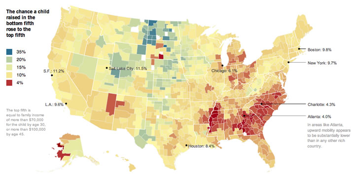
Infographic creation site Infogr.am recently gave the Best Data Story award (Data Journalism Awards 2014) to the interactive article In Climbing Income Ladder, Location Matters from the New York Times. Sometimes NYT articles have such a clean layout that you don’t even notice that many of the images and graphics can be manipulated and contain additional information.
For example, in the top graphic you can hover and find the specific value for the chance that a child raised in bottom-20% household will end up in a top-20% household. 6.9% in Austin, TX by the way, where I spent a significant part of my youth.

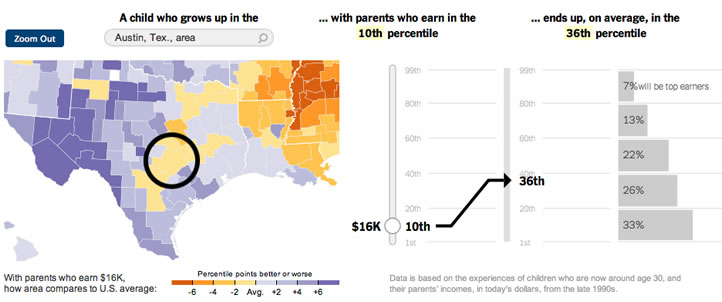
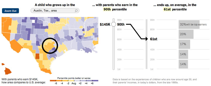
In the next graphic, you can actually toggle the value for parental income level. In Austin, you can see how the future income distribution changes from growing up in a 10th percentile household to a 90th percentile household.


 The Best Credit Card Bonus Offers – 2025
 Big List of Free Stocks from Brokerage Apps
 Best Interest Rates on Cash - 2025
 Free Credit Scores x 3 + Free Credit Monitoring
 Best No Fee 0% APR Balance Transfer Offers
 Little-Known Cellular Data Plans That Can Save Big Money
 How To Haggle Your Cable or Direct TV Bill
 Big List of Free Consumer Data Reports (Credit, Rent, Work)
Intersting. Does it say anywhere what the national averages are? I can’t find that.
The Northwest where I live does pretty good.
Yes the NW is described as a “land of opportunity” at least relative to many other parts of the country.
Would be interesting to see how this lines up with other megatrends. Two I can see potential correlation with visually are oil production/refining & income diversity spreads.
An interesting statistic would be to see how much effort the person had to do to get into the next level.