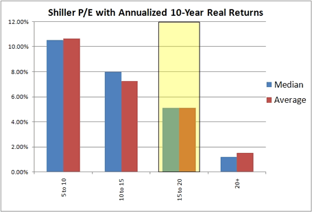
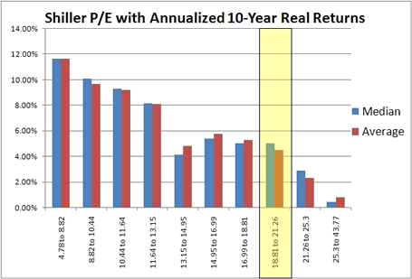
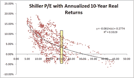
Here are another set of charts comparing the P/E10 Ratios for the S&P 500 and subsequent 10-year annualized real returns, courtesy of Mebane Faber based on Professor Shiller’s data. Can we really decide if the market is “overvalued” or “undervalued” by looking at one single number?
As noted in my earlier post about P/E ratios as a long-term predictive tool, the “P/E10 ratio” is the market’s current share price divided by average earnings over the last 10 years. By taking a long-term average as opposed to the more common single past year’s earnings, the idea is to smooth out the noise and bumps. The initial use of this ratio has been credited to famous value investor Benjamin Graham.

In the first chart above, you can see what appears to be a very strong relationship between lower P/E10 ratios and future 10-year returns. Everything is neat and tidy. High P/E10 = Bad. Low P/E10 = Good. The approximate current price of the S&P 500 is noted by the highlighted grouping. This would suggest that the median expected annualized real return for the market over the next decade would be about 5%.

In this next chart, Faber splits the data up into deciles instead. He notes a more precise trend of “great returns up to about 13, then decent returns up to about 20, then crappy returns over 20.” I personally just see a less convincing relationship. If there is such a strong correlation between lower ratios and higher returns, why should the fifth decile with P/E10 of 13 to 15 perform worse than P/E10s of 15 to 19? Hmm.

Finally, we have the actual data points. We see that although there is a nice trendline that can be created from such scattered data points, for any given P/E10 ratio there is a very wide variety of returns. Accordingly, in my humble opinion, I would be careful not to make P/E10 your main basis for setting asset allocations. It’s a nice idea that scores well in the common sense category, but in reality has been far from perfect.
 The Best Credit Card Bonus Offers – 2025
 Big List of Free Stocks from Brokerage Apps
 Best Interest Rates on Cash - 2025
 Free Credit Scores x 3 + Free Credit Monitoring
 Best No Fee 0% APR Balance Transfer Offers
 Little-Known Cellular Data Plans That Can Save Big Money
 How To Haggle Your Cable or Direct TV Bill
 Big List of Free Consumer Data Reports (Credit, Rent, Work)
The data you present appears to show a reliable though not perfectly consistent relationship. As you point out, it seems odd that the 13-15s perform worse than the 15-19s. The explanation for that is that 1) many other factors besides the PE ratio for the last ten years affect the future performance of stocks, 2) those factors fluctuate over time, and 3) those factors are randomly distributed over time, 4) the sample size of deciles is too small to even out the random distributions.
When you break the group only into quartiles, you have a larger sample size, and that helps even out the randomness attributed to other factors.
What can you do with this information? I think it presents a strong case for not selling your stocks at a point when PE10s are low. In those situations, I’d suggest holding on to them, even if you are at a stage in your life when you would otherwise reallocate to fixed income, because you likely have not seen much benefit from your equity investments over the prior ten years, and you are poised – though not guaranteed – for recovery.
Mebane Faber is an impressive guy who writes very helpful info, but he’s not a professor.
Trendlines can usually be generated for any data set regardless of their degree of correlation. An R^2 of 0.33 is extremely poor.
wait,
obviously this isn’t a for certain method, but the individual data points indicate that there has never been a year of positive returns when the PPE10 is over 40, and never been any good over 30 (above 4%). Never good seems like something worth avoiding. The trend line is quite clear that if you want good returns, buy low and sell high. Obviously, not as safe as treasuries, but still, looks like a good way to increase reward while decreasing risk!
I like the charts. Its very helpful to see that last scatter diagram with all the datapoints. If you didn’t see that and only saw the first column chart then you might think the correlation between PE10 and future returns is stronger, but clearly having a PE10 of say 12 doesn’t really tell us much.
The correlation between PE10 and future returns is just as strong as all of the charts communicate.
You notice that every single ten year period with real returns averaging annual over 10% happened when PE10 was under 20. If you are going to buy stocks based on timing, this clearly helps.
Yes, its not a license to print money, but having a PE10 of 12 means that your chances of a negative ten year return are very low, and your chances of having a ten year rate of returns over 10% are about 50%, judging from the historical rate of return.
Yes, I think at the extremes P/E10 is useful. But for say P/E10 of 14 to 18, that doesn’t seem to make as much difference. That range today would cover the S&P 500 from around 770 to 990.
Oops, for some reason thought I read somewhere Faber was a prof. Doesn’t even have a PhD it seems, though he did write a book called Ivy Portfolio, maybe that threw me off. Cambria also sounds like Cambridge. 😉