We’re still casually browsing for houses long-distance, and have been using many online tools to help gauge the market. At the house value site Cyberhomes.com, we also found that it offered a lot of good statistics at the local level. This is probably available elsewhere too, but it’s presented very clearly here. They offer charts such as:
- By Zip Code – Average sales price over time, Sales price vs. living area, Sales count by price range
- By Market – Average price over time, Sales volume over time, Sales price per square foot
- Market Fundamentals – Median sales price, Unemployment rate , Housing permits, Buy/sell indicators
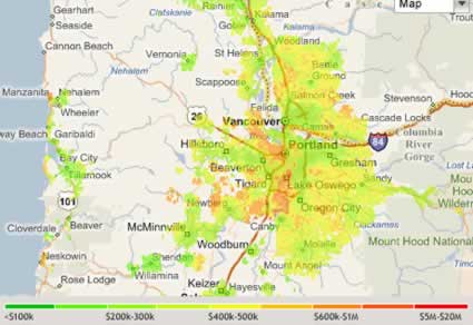
- Market Heat Maps – View geographical variations in housing price, house price changes, and housing density on a color-coded heat maps
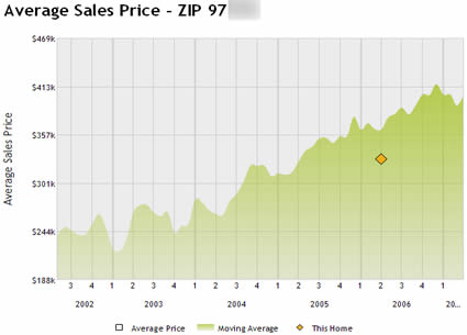
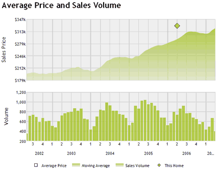
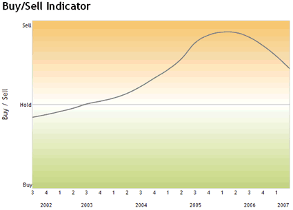
Just type in an address, click on View Details, and scroll down to the Charts & Graphs section. You can even zoom in on a specific time range. Here are four sample charts for my old house in Portland, Oregon:

Up, up, and away! A little stalling recently, though…

Notice the appreciable drops in volume during the winter months, along with slight dips in price as well.

Per the site, the chart above shows the relative degree to which the market this property is located in is a ?buyer?s market? or a ?seller?s market.? What does that even mean? I’m guessing this is based on how many months of housing inventory are currently for sale.
Home Value Heat Map

This is just kind of neat because you can see where the more expensive neighborhoods are, like downtown Portland and Lake Oswego. The price-change heat map wasn’t very helpful, as the map was so noisy that you couldn’t really determine any trends.
 The Best Credit Card Bonus Offers – 2025
 Big List of Free Stocks from Brokerage Apps
 Best Interest Rates on Cash - 2025
 Free Credit Scores x 3 + Free Credit Monitoring
 Best No Fee 0% APR Balance Transfer Offers
 Little-Known Cellular Data Plans That Can Save Big Money
 How To Haggle Your Cable or Direct TV Bill
 Big List of Free Consumer Data Reports (Credit, Rent, Work)
Please be smart and patient here…we are basically at all time highs where almost every market was pushed up way beyond fundamentals due to a massive credit bubble. If you don’t believe me or want to see why I feel so strongly, do a google search on the “Wells Fargo Housing Opportunity Index”. You will see that while incomes have moved up very modestly over the last 10 years, prices started skyrocketing in about 2001. The Opportunity Index levels in most areas are at or near record lows, meaning that incomes do not support these levels. As a result of my google search, I was able to get the data in Excel format at I graphed a couple regions I was interested in. I would highly recommend that you do this to get some perspective.
I have read your blog for a while and you really understand a lot of financial issues well. I am hoping that you will realize how unbelievably high prices are right now, and also that the “revision to the mean” process will be happening for quite some time now. Sticky prices on the way down make it hard to be patient but I really think that there is no reason not to wait it out while stacking more cash and renting for half (or less) of what it would cost to have a responsible 30 year mortgage.
Nice find! I also like to use Zillow.com to find a quick rough estimate of a house and also see what houses have recently sold for. It also includes prices for houses on the market right now.
Hello,
I’m french, and here, price are higher and higher. So you can buy here ;-).
Hmmmm… the cyberhomes.com site shows the current value of my home to worth over $100,000 more than estimate given by Zillow.
I’m not sure what exactly that proves, except that all these home price estimation websites are basically a crapsoot.
Thank you, thank you, this is exactly what I was looking for!
Thank you, thank you, this is exactly what I was looking for! I already forwarded your email (I am subscribed) to some friends. I have done that a few times, it makes it easier for me if I can just send people to your site and have you explain the cool you discovered.
Even with excellent work like yours, sometimes it is hard to get people blogging.
Thanks for putting it out there.
Agree with Craig… the only way you’ll see those prices being sustained is if we have massive inflation, i.e. salaries doubling, or something along those lines, which would cause rents to increase and make the own vs. rent calculation make more sense. I know that you know deep down in your gut that there is something wrong with these prices, and yet somehow feel like you should ignore it, and everything will be okay. Like Craig says, you make so many other good financial decisions… if it looks likely that houses would be stagnant or decline for years and years, why would you buy one if renting was cheaper? Do rent vs. buy and see what is best for your area! See thehousingbubbleblog.com for some interesting commentary on this issue – highly recommended.
What your graph doesn’t show is the “Other Side” of the huge spike. There’s always a downhill curve, too. Now take a look at this graph and that will tell you HOW BIG the fall will be:
http://www.nytimes.com/imagepages/2006/08/26/weekinreview/27leon_graph2.html
http://thehousingbubbleblog.com/
We bought both our homes in the winter. Less inventory, but better deals. (Less competition which is very important in high COL areas). It seems more people moving in the winter are a little more desperate too, sometime anyway.
Thanks for the great link.
Cyberhomes.com displays very high prices for the 3 houses that I have lived in, and sold. I do not think it’s reliable.
I’ve found you can usually do the same thing by going to any city’s GIS web site. Most have downloadable data by zip code, subdivision, street, etc. Also a good realtor should do this type of analysis for you.
For my house, it’s 5% above Zillow’s estimate and 10% above reality…
Nevertheless, the neighorhood data is nice.
The first comment by Craig is sage advice. We are nowhere near the “turnaround” the talking heads will continue to brainwash you into believing. Look at this chart:
http://research.stlouisfed.org/fred2/data/HOUST_Max_630_378.png
The turnaround is surprisingly consistent – over the past 40 years, the number of housing starts must fall to 800,000 units/month. This has happened – at that same number – five times since 1961. The other “low” is 1.1 million units – that’s happened twice.
The Fed probably will not (cannot) let housing starts fall that far without piling on more desperate measures – such as lowering interest rates (goodbye U.S. $).
The smartest thing you can do is save save save (preferably converting all that cash into a foreign currency – everbank.com) and wait until we see a true recession (re:foreclosure heaven) or lower interest rates (Neg-am / ARM anyone?)…
I’m surprised housing prices in over-priced areas aren’t dropping faster given all the negativity on sub-prime loans and the controversy on people borrowing more than they can handle.
I’d love for the Bay Area’s market to retreat back to normal levels. The suburban housing prices are completely wacky. People are buying beat-up homes at $800K, tearing them down and building mansions on the existing lot and selling them for 1.5 million. And people buy them despite the price because the school district is solid and somehow a million dollar house in the Bay Area suburbs is a bargain? I don’t know what kind of rationale people are using.
Portland’s got a high unemployment rate yet the housing prices don’t reflect the average wages people earn. Isn’t Portland a service economy mostly retail jobs or people pumping your gas? I guess that’s why people say Portland’s gotten expensive.
Does anyone know any websites that will do Condos and townhouses?
A house is a pretty expensive thing to have just because you want it sooner rather than later. I’ll pay $3 for a soda at a football game as opposed to waiting until the game is over, but that is very different than paying twice what you should for a house…
In other words, I wouldn’t be buying right now. Especially when you can rent a home and not take on the risk. The Shiller graph and accompanying article linked above make the point pretty vividly.
i’m looking to buy a house and your guide is really helpful. And your first commenter is a genius…
“I am hoping that you will realize how unbelievably high prices are right now, and also that the “revision to the mean” process will be happening for quite some time now. Sticky prices on the way down make it hard to be patient but I really think that there is no reason not to wait it out while stacking more cash and renting for half (or less) of what it would cost to have a responsible 30 year mortgage.”
He predicted exactly what happened at the end of 2008.