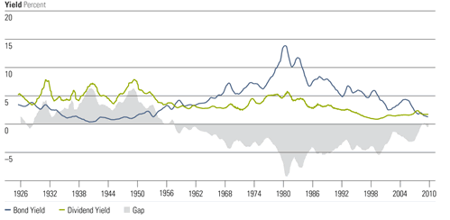
Here’s a chart from a Morninstar article on dividend stock ETFs that caught my eye. It shows the historical relationship between the yield on 10-year US Treasury bonds and the dividend yield on the S&P 500. I am not convinced that this means one should overweight dividend stocks over bonds, but it does provide some historical perspective. The last time the yield differential was around zero was in the 1950s.
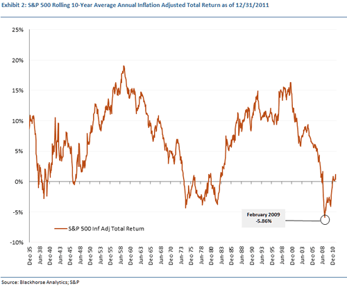
Since we are talking about such long time periods, let me throw in this chart showing (ready for this?) the rolling 10-year average annual inflation adjusted total return for the S&P 500 from 1926 through the end of 2011. Credit to Quant Monitor.


 The Best Credit Card Bonus Offers – 2025
 Big List of Free Stocks from Brokerage Apps
 Best Interest Rates on Cash - 2025
 Free Credit Scores x 3 + Free Credit Monitoring
 Best No Fee 0% APR Balance Transfer Offers
 Little-Known Cellular Data Plans That Can Save Big Money
 How To Haggle Your Cable or Direct TV Bill
 Big List of Free Consumer Data Reports (Credit, Rent, Work)
I have a feeling you’re trying to show us why I savings bonds are better than EE savings bonds, right?
I got a 403 error when trying to enlarge the second chart.
I got a 403 error from Jonathan’s link as well, but then when tried higher up the URL hierarchy I came back to the same image here:
http://www.quantmonitor.com/blog/wp-content/uploads/2012/01/Exhibit2_SP500_Rolling_10Yr_Inf_Adj-Annual_TR_201112311.png
(If this link doesn’t work, maybe try copy/pasting the URL?)
@adrian – Not really, although I bonds are better 😉 I just liked the graphs.
Image links should be fixed.
The graphs are telling me it’s a good time to be investing in equities.
Who’s Greenspan trying to kid? Bond yields will continue to fall until the end of the 2007 depression. And we’re nowhere close to the bottom of the bond yields, just look at the trend! The last time I see on that chart that was comparable to 2012 – is 1930! 1930! For all of Bernanke’s huffing and puffing and Greenspan’s playing with different types of porridge, things are still getting worse!
Hey now….. me thinks it’s best to get a triple leveraged “good time….” with the pasta pipe it de down thrown in…. and some “werkinits” on the side… such as a leveraged silver and gold fund….. if the average is around 7 % on the S & P INFLATION ADJUSTED….. why not TURBO BOOST that with some 3x good tymes…. sit back and enjoy the fun ride and get 21% no fuss or muss…….
So really smart dudes….. what tam I missing mon….. fardathen pyacka….