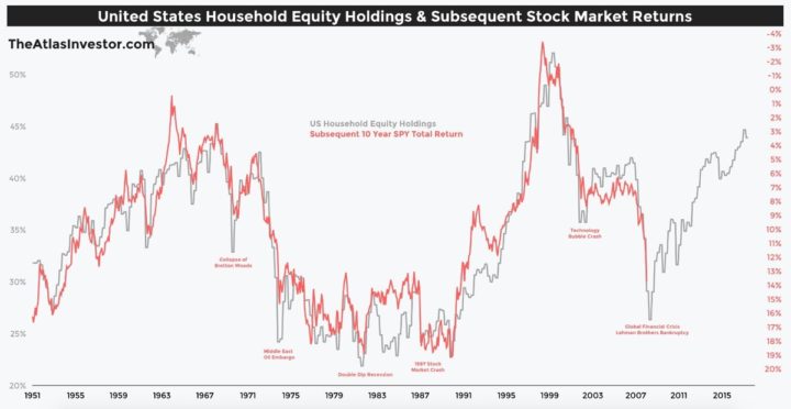
Below is a chart that tracks two simple numbers over the years, each with their own vertical scale (click to enlarge):
- The average household’s equity ownership share, as a percentage of total equity and credit (bond) assets. (Left-axis)
- The subsequent 10-year average annual return of the S&P 500 index. (Right-axis)
Kind of eery, right? As the relative demand for stocks goes up, their future return goes down. This is the most up-to-date version of the chart that I’ve seen – credit @TihoBrkan via Abnormal Returns. The first time I recall seeing this chart was 5 years ago in this in-depth Philosophical Economics article.
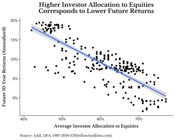
Since then, this 2016 academic paper by Yang and Zhang found that “Household Equity Share” was a better predictive tool than the CAPE or PE10 ratio. Most recently, OfDollarsandData had a thoughtful piece on why using this correlation to time the market would be very difficult (you’d have to be out of the market for a long time, and during some great bull markets). Here’s another way to show this relationship:

(I’m not sure the x-axis labels on this last chart are correct, as it doesn’t agree with the first chart that tops out at 55% household equity share.)
This will be an interesting chart to track over time. Overall, it is yet another indicator that points to the average return of US stocks for the next 10 years to be rather muted (in the low single digits!). But again, anything could happen – both higher or lower – in the short-term.

 The Best Credit Card Bonus Offers – 2025
 Big List of Free Stocks from Brokerage Apps
 Best Interest Rates on Cash - 2025
 Free Credit Scores x 3 + Free Credit Monitoring
 Best No Fee 0% APR Balance Transfer Offers
 Little-Known Cellular Data Plans That Can Save Big Money
 How To Haggle Your Cable or Direct TV Bill
 Big List of Free Consumer Data Reports (Credit, Rent, Work)
This was interesting enough to make me look into it more. The following Advisor Perspectives article makes a good case for how the relationship is not as eerie as it seems: https://bit.ly/2Q0VtvS.
The graphs move so closely because “Household Equity Ownership Percentage” is almost entirely the same thing as Stock Market Valuation. This is because the main factor in the former is the latter — i.e. when the market is up a lot relative to individual wealth, the equities portion of people’s portfolios grows to form a bigger percentage of their assets. And vice-verse.
It is still interesting (if not all that surprising) how well, then, that Market Valuation correlates against future returns. The article’s analysis doesn’t at all invalidate your point, that this is another indication we’re likely looking at lower-than-average returns over the next ~10 years. But it does offer a different and less surprising perspective than the (perhaps only assumed by me?) notion that it’s primarily the reaction of markets to valuation which drives this correlation.
I agree, valuation/price is certainly a big component of the story. But as the linked paper states, this indicator was a better predictor than even the CAPE ratio. Maybe the momentum of households buying more stocks when it’s hot or selling when things are cold adds in, or maybe households rebalance better than we think? (I would bet more on the former.)
I’m not sure those percentages are accurate. what is the source of the HH equity %?
I think you can get a lot of this data from FRED.
Hi. I just came across an article on marketwatch (https://www.marketwatch.com/story/the-single-greatest-predictor-of-future-stock-market-returns-has-a-message-for-us-from-2030-2020-06-19) and upon some googling found this blog post from 2018. What would be your views for current market condition especially the way there’s been a sharp V-shape “recovery” from March 23 lows? Is it time to be more scared than ever based on the current household equity ownership percentage? Thoughts?