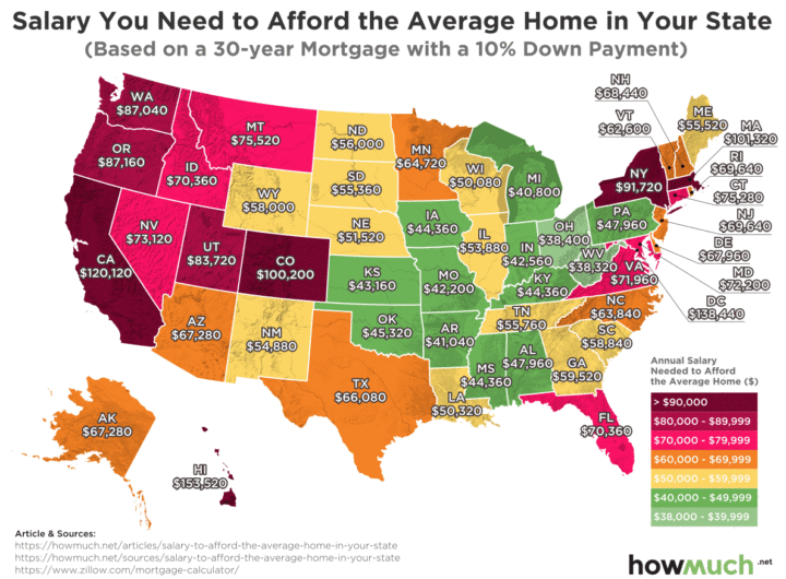
HowMuch.net compiled an infographic about the income you need to afford the average home in every US state. The key is that “afford” means that the total cost of housing take up no more than 30% of gross income. The highest income required is in Hawaii ($153,520 for a house worth $610,000) and the lowest is in West Virginia (West Virginia: $38,320 for a house worth $149,500).
I suppose the next level analysis would be to divide by the actual median income in each state to measure relative affordability. The same job can pay different salaries in different areas, so it can still make sense to move to a place with higher incomes and high real estate prices.

 The Best Credit Card Bonus Offers – 2025
 Big List of Free Stocks from Brokerage Apps
 Best Interest Rates on Cash - 2025
 Free Credit Scores x 3 + Free Credit Monitoring
 Best No Fee 0% APR Balance Transfer Offers
 Little-Known Cellular Data Plans That Can Save Big Money
 How To Haggle Your Cable or Direct TV Bill
 Big List of Free Consumer Data Reports (Credit, Rent, Work)
The annoying thing about this kind of data is that people interpret it as everyone should be able to afford a median priced home, when by definition, half of people have homes priced less than that. This data even says “average,” which I wouldn’t be surprised if that skews the numbers even higher.
Obviously, we’re all smart enough to just look at this as a comparative cost between states, but that’s not true for most people and the media are really bad when they write articles about such data.
Thanks for this information – it’s always interesting to compare where you live to housing in other states. However, I’d be interested in knowing how the “average” home price is developed. Does it take all housing sold in the year and take the average? Or does it look at the average sale price of say, a 3 bedroom throughout towns in the state? I live in Boston, and based on the $101,000 gross income affordability, the average home would be about $337,000. You would be hard pressed to find a one bedroom condo in the Boston area for that price, let alone a 3 bedroom home. I usually don’t put a lot of weight on these studies; the “average” usually doesn’t reflect the current housing market, especially in a rising market like Boston. But it’s still interesting – and the relative values are most likely more accurate.
This data seems a bit off, or misleading. Housing in WY costs more than in IL? Maybe I am just misinterpreting it.
This is interesting data – thanks for sharing. It may go without saying but a state-wide average obscures a TON of local variation. Seattle housing is much less affordable than Spokane or Olympia, for example.
I suspect they’re using the median home prices not the mean.
I *think* technically speaking the term average can be used for mean or median. But most of us think of mean when we hear average.
It says they got the averages from Zillow and I only see median values on Zillow. The chart makes more sense to me if you use median. Otherwise I can’t see how OR is more pricey than WA given the prices in Seattle.
The infographic seems more click-bait than useful. I don’t really see the value of comparison by state. New York is an obvious example. It’s ridiculous to average housing values for upstate with astronomically priced NYC. Comparisons of metro areas would be much more useful for most of the population.