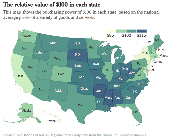
The NY Times has an article called What $100 Can Buy, State by State. You know I can’t resist a good 50-state infographic. The first chart is basically a cost-of-living comparison. The findings shouldn’t be too surprising.

- Stuff and services cost the most in District of Columbia, Hawaii, New York, New Jersey, California, and Maryland.
- Stuff and services cost the least in Mississippi, Arkansas, Alabama, South Dakota, and Kentucky.
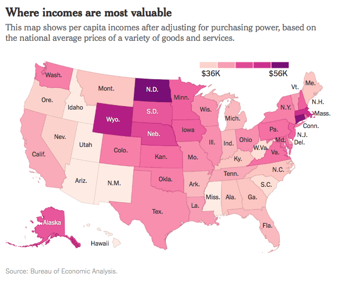
You would expect the states with higher cost-of-living to also have higher incomes. But the correlation isn’t always perfect. I found the second chart to be more interesting, as they adjusted for incomes. Some places had low-to-average income and high prices, while some states had average-to-high incomes and low prices.

- The states where per capita incomes have the most purchasing power were North Dakota, Connecticut, District of Columbia, Wyoming, Massachusetts, and Nebraska.
- The states where per capita incomes have the least purchasing power were Utah, New Mexico, Arizona, Idaho, and Hawaii.
 The Best Credit Card Bonus Offers – 2025
 Big List of Free Stocks from Brokerage Apps
 Best Interest Rates on Cash - 2025
 Free Credit Scores x 3 + Free Credit Monitoring
 Best No Fee 0% APR Balance Transfer Offers
 Little-Known Cellular Data Plans That Can Save Big Money
 How To Haggle Your Cable or Direct TV Bill
 Big List of Free Consumer Data Reports (Credit, Rent, Work)
This is awesome. Could you make one with Europe as well?
I think this is interesting, though this data misses two key things
1. Taxes. I don’t believe state taxes such as property or income are included in this, so that can make a big difference
2. While it looks at rents, it doesn’t look at real estate prices. For example, rents may be 2x difference between states, but values could be 4x (i.e. the higher cost statge tolerates lower rental yields).
I think those two additions would make this skew even more…
Jim makes some great points. I’ve looked at cost of living in various states when considering taking jobs, and it’s a really complicated thing to figure.
I love this infographic. I thought Georgia and Louisiana would have been blue though. This reminds me of those MSN features which used to look at how much house you can get for X dollars. The ranges are shocking.