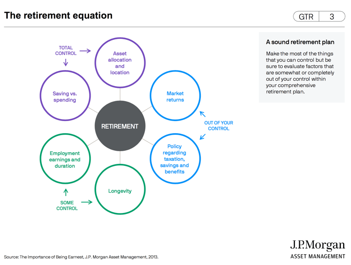
The JP Morgan Guide to Retirement slide deck is provided to its advisors to discuss retirement planning with clients. Updated annually, they kindly share this document publicly and it contains many useful charts and graphs, like the one above that reminds us to focus on what you can control, and to not waste time and energy on what you can’t. Below are a few more highlights from the 52-page 2022 edition that I found most helpful.
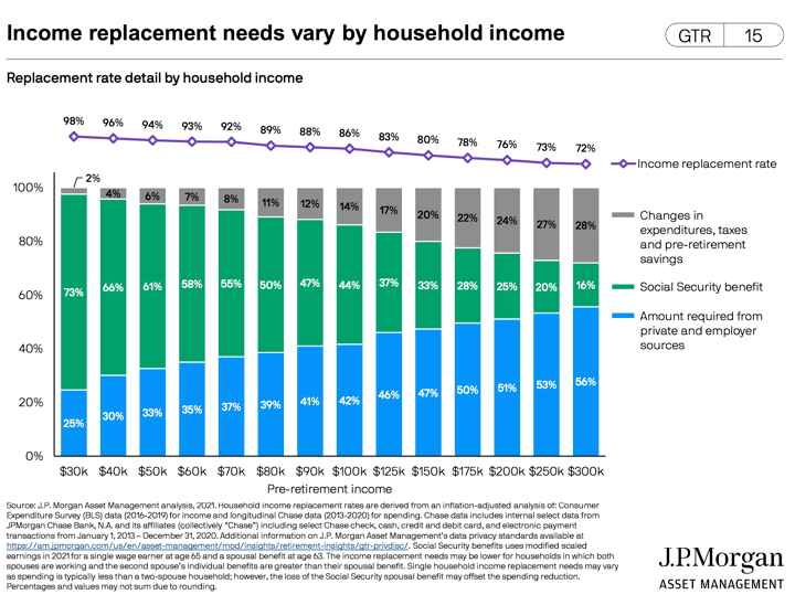
How does everyone else manage given all the news of low savings balances? Well, the reason it is called “Social Security” is because without it, there would be widespread poverty amongst seniors. The higher your spending, the more you must rely on your other assets to replace your current income in retirement.
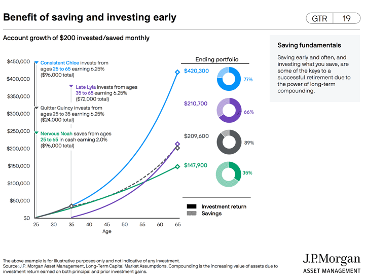
You may have seen variations of this chart elsewhere, where “Quitter Quincy” who starts early but completely stops after only 10 years ends up at the same place as “Late Lyla” who starts late but contributes for another 30 years (triple the time).
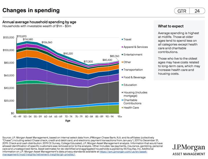
How the average household spending changes by age (amongst relatively well-off households).
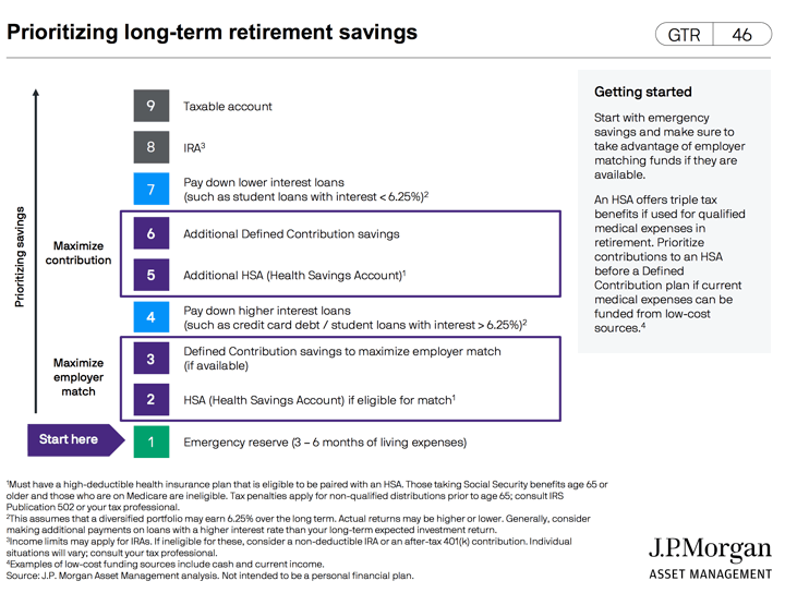
How to prioritize your savings.
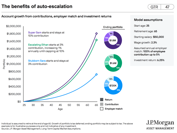
Look how “Escalating Ethan” does nearly as well by allowing a 1% auto-escalation once a year.
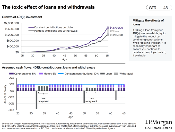
You might think that because you pay 401k loans back into the original account plus interest that it won’t hurt your final retirement balance, but the missed compounding growth can really impact things.
 The Best Credit Card Bonus Offers – 2025
 Big List of Free Stocks from Brokerage Apps
 Best Interest Rates on Cash - 2025
 Free Credit Scores x 3 + Free Credit Monitoring
 Best No Fee 0% APR Balance Transfer Offers
 Little-Known Cellular Data Plans That Can Save Big Money
 How To Haggle Your Cable or Direct TV Bill
 Big List of Free Consumer Data Reports (Credit, Rent, Work)
I just saw this from a Booglehead forum, and thought it was great…seconds before I saw your email!
Thank you, Jonathan.
At 75, few of the charts will change my actions, but many of the charts are invaluable for my children and adult grandchildren.
Thanks also to JP Morgan for providing their research to all of us, not just their members.