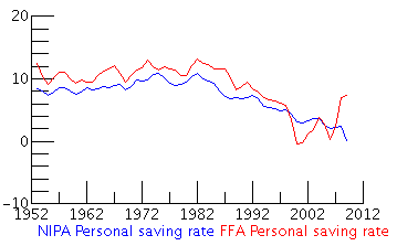
In looking up some stats for personal savings rates, I found that the Bureau of Economic Analysis (BEA) provides a chart of two separate calculations that track the personal savings rates of US taxpayers:
- The National Income and Product Accounts (NIPAs) method, and
- The Flow of Funds Accounts (FFAs) method
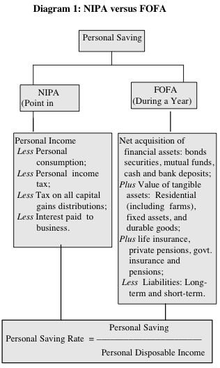
You may find either of these quoted in mainstream media articles whenever there is a big shift or one goes negative temporarily. Both methods have been criticized for the accuracy, in which I won’t go into detail here. The main differences between the NIPA and FoFA methods are outlined in this chart from the AARP paper [pdf] “The Declining Personal Saving Rate: Is There Cause for Alarm?”:

A few things to note:
- When I read “disposable income”, I normally think of what’s left over after paying for food and shelter. In this case, disposable income is just personal income minus “personal contributions to social insurance and personal taxes”.
- Both NIPA and FoFA exclude capital gains on investments, which some say contributes to a “wealth effect” where people will spend more because they feel richer due to growth of investments. (not as much recently…)
- From the chart, FoFA includes the purchase of new assets and investments as personal savings. NIPA includes employee 401(k) and pension contributions as wage income.
- FoFA treats the purchase of consumer durables (cars, major appliances) as a form of savings, while NIPA treats it as consumption.
- NIPA says that paying your mortgage (owner-occupied housing) is savings as imputed rent, while FoFA counts your added home equity as an asset, but your mortgage payment as a liability.
Confused yet? Well, I hope at least you came away with something. The AARP paper goes on to explore various theories for the long-term decline of the personal savings rate. If you’re looking for more, here’s another paper that explores the differences.

 The Best Credit Card Bonus Offers – 2025
 Big List of Free Stocks from Brokerage Apps
 Best Interest Rates on Cash - 2025
 Free Credit Scores x 3 + Free Credit Monitoring
 Best No Fee 0% APR Balance Transfer Offers
 Little-Known Cellular Data Plans That Can Save Big Money
 How To Haggle Your Cable or Direct TV Bill
 Big List of Free Consumer Data Reports (Credit, Rent, Work)
Speak Your Mind