 We all know that the longer the commute from where everyone works, the lower the rent. In many cities during the housing boom, the saying went “just keep driving until you can afford something”. But what if the relationship between commute time and rental price wasn’t steady? What if a few minutes of extra commute time would save you several hundred dollars a month?
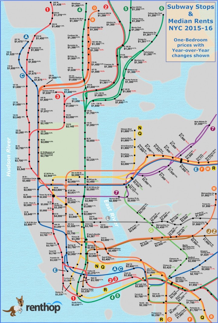
There are indeed some great relative values in New York City, according to the results of a study by apartment listing site Renthop, via This Is New York. Here are the median rents for one-bedroom apartments nearest every subway stop in New York City:
Highlights from their analysis:
The extra few blocks from 66th St to 72nd St could save you $845 per month. Granted you might really like the Lincoln Center area, but that’s enough extra dough for a trip or two to the NY Philharmonic, the Met Opera, or even dinner at Jean-Georges.
A good rule of thumb is that each stop is about two minutes apart (except express stops and when crossing a bridge), assuming there’s no “debris on the track” or “train traffic ahead”. Consider this when calculating what your time and commute is worth to you. An extra stop on the J/M/Z train past Marcy Ave will save you about $175, and each subsequent stop saves another $100 or more. The same holds true heading into Queens.
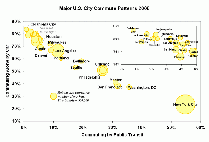
Someone should make a similar graphic for all the of the major cities with high usage of public transportation: Washington DC, Boston, San Francisco Bay Area, Chicago, and Philadelphia. From Wikipedia:


 The Best Credit Card Bonus Offers – 2025
 Big List of Free Stocks from Brokerage Apps
 Best Interest Rates on Cash - 2025
 Free Credit Scores x 3 + Free Credit Monitoring
 Best No Fee 0% APR Balance Transfer Offers
 Little-Known Cellular Data Plans That Can Save Big Money
 How To Haggle Your Cable or Direct TV Bill
 Big List of Free Consumer Data Reports (Credit, Rent, Work)
The New Yorker has an interactive graphic comparing average income levels by subway stops that’s interesting to read side-by-side with the chart from Renthop. For instance, the average income at the 66th street stop is $145,542 and drops considerably to $115,833 at 72nd street. That’s a pretty big gap in income equality for six blocks!
http://projects.newyorker.com/story/subway/
Very interesting, thanks for sharing.
Income equality and income inequality have become such ubiquitous terms that your just added the word “equality” behind “income” for absolutely no reason right there. This is getting scary. [Nothing meant against you personally]
I’ve seen a pretty recent one for the Boston subway system, although it’s a bit less relevant because Boston/Cambridge isn’t as subway stop dense: http://realestate.boston.com/buying/2016/05/03/map-how-much-costs-mbta-stops/
I think I’ve also seen one for DC.
Thanks for sharing, I hadn’t seen that one before either.
This seems like a silly way to look at it. Yeah distance to the city center is one variable. But theres a whole host of other ones. One stop may save you hundreds on rent at the expense of a slightly longer commute, but it may also put you in a different school district where the education is valued hundreds more, or in a less violent neighborhood where your chances of being mugged go down, or closer to a park, etc.
It would be a truly interesting analysis if all these other variable were taken into account.
That would be more realistic, but also would bring in a lot of subjective judgment.
Here’s the crazy map for San Francisco / Palo Alto:
http://www.estately.com/bay-area-home-affordability-transit-stop
I like this one a little bit better because price per square foot seems to make a little more sense as a metric than monthly rental price of a 1 bedroom apartment. There might be too many properties left out of the 1BR metric for it to be as accurate a representation of rents, but I don’t doubt the overall conclusions are true.