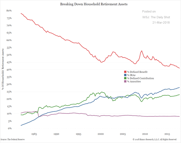
Above is a historical chart of US household retirement assets that helps visualize the shift from mostly pensions to mostly a combination of defined contribution plans (401k, 403b, etc) and IRAs. Pension share has gone from nearly 80% of total assets in the 1980s to about 40% today. The blips upwards in 2001 and 2009 are more a function of stock market drops than anything else. I find it interesting that annuity use is not increasing at all, i.e. people are not creating more “DIY pensions”. Found via WSJ Daily Shot.
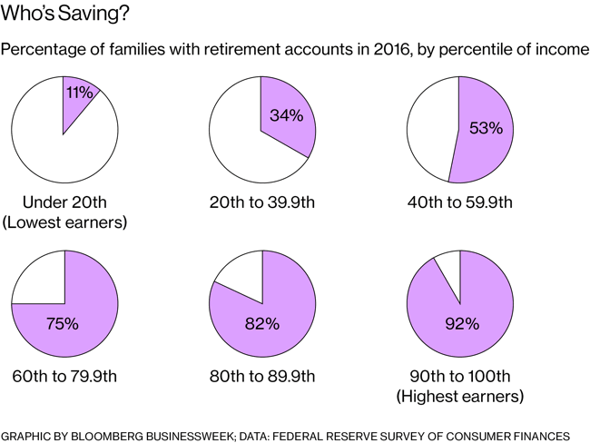
Below is a graphic of the percentage of households who have any retirement plan at all, grouped by income percentile. This means it counts any family with one person with any retirement plan of any type with any amount saved. Via Bloomberg article about state-mandated Roth IRAs.

My big-picture concern is – What happens when those who started jobs in the 1980s and 1990s retire in the 2030s and 2040s with no pensions? As shown above, the majority of the lowest-income workers have no retirement plan at all. If you include the highest-paid workers, the average 401(k) at retirement age is currently about $100,000. In contrast, I ran an annuity quote and a pension that pays $50,000 a year inflation-adjusted is roughly the equivalent of having $1,000,000 saved in a 401(k).
More individuals are finding themselves in charge of their own retirement every day, whether they like it or not. This is a very serious responsibility. Warren Buffett has a plaque in his office with the following saying on it:
A fool and his money are soon invited everywhere.
Lots of money floating around means lots of “helpers” will pop up. Big banks. Start-up smartphone apps. Even Overstock.com now wants to help you with investing. Read the Gotrocks parable and beware high-fee helpers.
 The Best Credit Card Bonus Offers – 2025
 Big List of Free Stocks from Brokerage Apps
 Best Interest Rates on Cash - 2025
 Free Credit Scores x 3 + Free Credit Monitoring
 Best No Fee 0% APR Balance Transfer Offers
 Little-Known Cellular Data Plans That Can Save Big Money
 How To Haggle Your Cable or Direct TV Bill
 Big List of Free Consumer Data Reports (Credit, Rent, Work)
Interesting line graphic, but as I think I understand it — it’s something of an apples to oranges comparison. The top line, pension assets, would represent those funds currently held by corporations (and possibly governmental agencies — that was not clear) to meet pension obligations. This is a smaller number of households than the bottom lines which are more broad-based — that is those households which might have both pensions and defined contribution/individual plans. Unfortunately I think this is the kind of information seized upon by those who have a political/economic ax to grind — that at one time “everyone” had a great pension which has now been taken away by the greedy corporations (that is the 80% of assets is being misinterpreted as 80% of households). Granted that has indeed gone on, but the truth is most Americans HHs have never had pensions. According to this dated, but accurate, citation from the Employee Benefits Research Institute — private sector pension peaked at 45% of the workforce in the 1970s.
https://www.ebri.org/publications/facts/index.cfm?fa=0398afact
That’s an impressive number to be sure, but still a minority. A good parallel graphic to have gone with this one would have to track percentage of households over the same time period having each type of retirement asset. The trend would have been the same no doubt, but it would have more of an “apples to apples” view.
I actually like the graphic broken down my asset % more than % of households. It’s hard to quantify “has a pension” vs “has a 401k” vs “eligible for pension” against the relative size of those accounts. In 1980, 80% of retirement assets were in pensions, which means that was what was paying the bills in retirement. People got their checks, and they spent it. No thinking about asset allocation or P/E ratios. My main point is that more and more money is now “self-directed”, and I wonder how that will play out in the future. Now, I do have some split feelings as a lot of those “professionally run” pensions are underfunded, so it’s not like they are perfect.
I’m a bit surprised to see that nearly 10% of people have annuities for retirement. You don’t hear about that.
To clarify, 10% of assets are in annuities, not 10% of people have them.
Jonathan, Can you share the calculator or formula you used to figure out the 401k equivalent of what the $50,000 a year pension is worth? Thanks!!
I used ImmediateAnnuities.com to get a quote for a 65 year old person wanting $50,000 in annual, inflation-adjusted income. (Inflation protection is valuable and makes the initial income a lot lower than traditional immediate annuities.) There are other annuity quote providers, but I like that one because it doesn’t ask for too much personal information upfront.
Thank you!