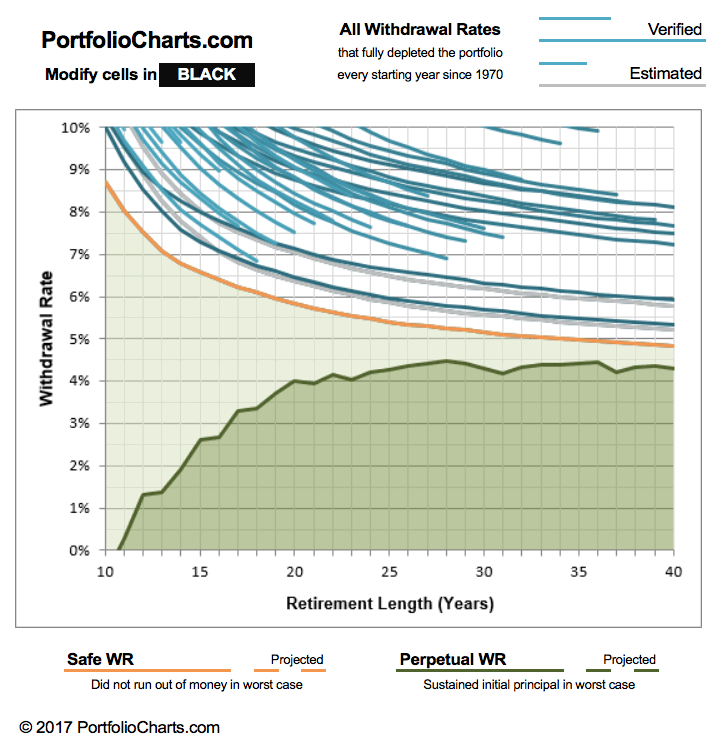
 I just noticed that PortfolioCharts.com has updated their Withdrawal Rate Calculator. It has improved visualizations and as a personal finance geek I even found it fun. You can enter your specific asset allocation slices down to 1% and see customized results.
The Withdrawal Rates calculator shows the safe withdrawal rate for any asset allocation over a variety of retirement durations based on real-life sequence of returns. Those looking to retire early or leave money to heirs can also see the perpetual withdrawal rate that protected the original inflation-adjusted principal.
You can read about the specifics behind these improvements here. You should also read all the assumptions here. For example:
The withdrawal rate is the percentage of the original portfolio value used for one year of retirement expenses. Each year, expenses are adjusted for inflation (not for portfolio size) to maintain constant purchasing power.
Briefly, a “safe” withdrawal rate (orange) allowed a portfolio to go as low as $1 but never hit zero at the end of the timeframe. In other words, the ride could have still gotten quite hairy for a while. A “perpetual” withdrawal rate (green) never ended up less than the initial principal, even adjusted for inflation. The author Tyler recommends the perpetual WR for early retirees or for people who desire to leave an inheritance for heirs.
Here is the specific chart for my current portfolio asset allocation:

I would be quite happy with being able to confidently withdraw over 4% (+ inflation adjustments) of my portfolio for the next 40 years. The short-term drawdown paths can still be scary though. The usual caveats with using backtested data also apply.
Playing around, I noticed that the simplest way to change things up was by adding a healthy chunk (~20%) of gold instead of stocks. This seemed to significantly improve the perpetual withdrawal rates in the short-term (0 to 15 years). It’s too bad I still don’t have a firm fundamental understanding of gold. If you can’t maintain faith in it when things are scary, then you shouldn’t own it in your portfolio.
 The Best Credit Card Bonus Offers – 2025
 Big List of Free Stocks from Brokerage Apps
 Best Interest Rates on Cash - 2025
 Free Credit Scores x 3 + Free Credit Monitoring
 Best No Fee 0% APR Balance Transfer Offers
 Little-Known Cellular Data Plans That Can Save Big Money
 How To Haggle Your Cable or Direct TV Bill
 Big List of Free Consumer Data Reports (Credit, Rent, Work)
I would be wary of having 20% gold in a portfolio with the expectation that it would stabilize it. They don’t have a long history of real performance data on gold and gold can be very volatile. I suspect they’ve got data thats skewed by a couple run ups in gold values making gold look better than what I’d expect long term.
I agree that caution is wise – it was just an observation of what this calculator was spitting out. Many of the portfolios that look “good” in terms of low drawdowns on the Portfolio Charts site have a big chunk of gold in them.
I really like Portfolio Charts. They allow you to consider so many factors of a portfolio that I would have never thought of before. They also give some example portfolios to compare. It opened my eyes to the value of a truly diversified portfolio rather than chasing the absolute return. We must remember that past returns do not indicate the future.
Definitely agree, especially with the last point. What looks perfect at the moment while looking backwards will keep on changing.
How do you interpret the the blue lines in these graphs? What does the different blue shading mean?
For example, if retirement length is 20 years, the blue line that terminates there is at y=7.5%. Does that means that over all 20 year periods, a withdrawal rate of >=7.5% fully depleted the portfolio? What does the shape of the curve to the left of x=20 mean?