The Vanguard Blog for Advisors has a recent post about how we’re now in the 3rd biggest bull market since 1929, which followed the 2008 financial crisis, also known as the 3rd biggest bear market since 1929. The takeaway is that none of us know the future, so advisors need to convince their clients to rebalance their portfolios both in good times and bad.
Remember, rebalancing is not about maximizing returns, reversion to the mean, or market forecasts—it is about maintaining the risk-and-return characteristics of the portfolio an investor selected based on his or her unique time horizon, risk tolerance, and financial goals. In contrast to market predictions, rebalancing is within your clients’ control.
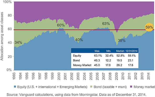
That’s all well and good, but included was this curious chart with the title “Rebalancing: Asset allocations show trend following”:

This chart confuses me. I assume it is supposed to show that when stocks go up, people buy more stocks and when stocks go down, people sell off their stock allocations. But if for every trade there is both a buyer and a seller, then who is taking the other side of all these trades? For instance, if everyone is buying stocks now, who are they buying it from? Is this only retail investors and the other buyers are institutional investors? Or is this chart mostly just showing changes in overall market-cap?
 The Best Credit Card Bonus Offers – 2025
 Big List of Free Stocks from Brokerage Apps
 Best Interest Rates on Cash - 2025
 Free Credit Scores x 3 + Free Credit Monitoring
 Best No Fee 0% APR Balance Transfer Offers
 Little-Known Cellular Data Plans That Can Save Big Money
 How To Haggle Your Cable or Direct TV Bill
 Big List of Free Consumer Data Reports (Credit, Rent, Work)
At first glance: In a static world, the chart would only be showing you the relative performance of the various asset classes, because asset ownership is a zero sum game. But we do not live in a static world. So as investor appetite for stocks increases, issuers can issue equity on more favorable terms than before, more M&A deals will be done for stock instead of cash, etc. So this allocation chart gives you a more complete and nuanced view of investors’ relative appetites for the various asset classes.
Jonathan you really can’t figure out whose on the sell side? The criminal elite and all the people with inside information of course? As Eliot Spitzer so aptly said years ago in reference to the stock market: You can’t win….so don’t play.
I believe it shows the relative amounts of assets in mutual funds grouped by asset class.
It is very poorly explained and they should have overlaid the the sp500 to help make their intended point: which I believe was that retail investors tend not to rebalance and instead let their asset allocation drift with the market.
I think its saying, that when stocks are up, they represent a larger portion of the market, and when they are down, they represent a smaller portion of all publicly trade-able investments.
Yes I agree.
Hmm… but isn’t that always true? The article seems to suggest that if investors were “smart” on average the chart would be much more consistent over time. If they were just showing market cap, that wouldn’t be possible.
I agree with Nuri and will add that the conclusion they appear to draw is that instead of simply riding out the down times doing nothing, you should rebalance to keep your porfolio at the proper ratios. That would mean buying equities during those down times which usually people are scared to do.
The chart is confusing. I think the best way to look at is that when people elect to put their money in Equity, Bonds, or Money Market accounts…this shows you how they allocated those assets over time. People, however, can elect to do other things with their money, such as real estate investment, precious metals/art purchases, small business start-up, spending it, etc, which would vary the magnitude of the total assets shown in this chart.
For example, a drop in Equity percentage in this chart does not necessarily mean a corresponding increase in Bonds or Money Market percentage…as the money could flow to different investments or purchases.
I said “For example, a drop in Equity percentage in this chart does not necessarily mean a corresponding increase in Bonds or Money Market percentage…as the money could flow to different investments or purchases.” This is wrong…I guess I was writing to quickly.
What I meant was…if an investor sells their equity holdings they don’t necessarily have to buy Bonds or put them in a Money Market account, as they could buy a different asset not shown in this chart or simply spend their money.
If they just made it clear whether or not the data was based on mutual fund flows owned by retail investors, I’d have an easier time wrapping my head around it. I *think* that is what it is showing.
In that case, stocks are just about as popular now as they have been for the last 20 years.
It’s asset allocation of global wealth. It’s not fund flows. If I have $25 in cash, $25 in bonds, and $50 in stocks to start…i am 25% cash. If stocks decline by 50%, now I am 33% cash. Indeed this happened on a global scale..wiping out trillions of dollars of global wealth (for a time at least) and altering the global asset allocation even if no transactions were ever made.