 As we stand today in early 2017, the performance of the US stock market since 2009 has been pretty impressive with only a few minor hiccups. I am not calling a market drop, but the best time to prepare is before an emergency or crisis occurs. Humans have a well-documented loss-aversion bias. We react to losing money much more severely than positive returns. Therefore, it is wise to remember that historically, the annual return of the S&P 500 index is negative approximately 1 out of every 3 years.
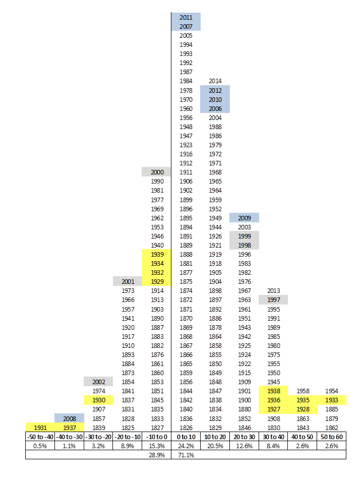
Here’s a histogram that organizes into “buckets” the historical annual returns of the S&P 500 Index* from 1825-2014. We see that negative returns occurred 29% of the time. Legend: DotCom bubble (grey), Great Depression (yellow), Housing bubble (blue). Source: Margin of Safety.

(* For periods before the S&P 500 existed, the S&P Market Index is used. Before that, I have no idea!)
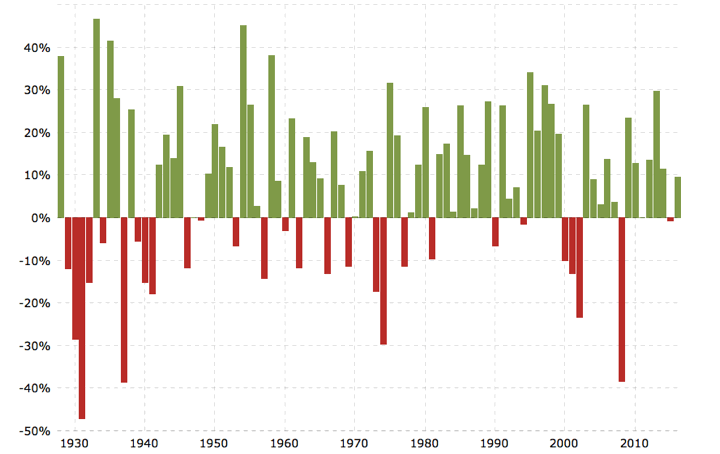
Here’s a similar chart that shows the annual percentage change of the S&P 500 index from 1927-2016. I counted that 28 out of 89 periods were negative (31.4%). Source: Macrotrends.

We should expect and accept that negative returns will come 1/3rd of the time. The drops are part of the package. Just like having a hurricane, tornado, or earthquake preparedness plan, you should have a market drop plan. Do you have a cash cushion so you don’t feel the need to sell temporarily-depressed shares? Do you have a high-quality bond or cash allocation that you can use to rebalance and buy even more stocks when they reach lower valuations?
 The Best Credit Card Bonus Offers – 2025
 Big List of Free Stocks from Brokerage Apps
 Best Interest Rates on Cash - 2025
 Free Credit Scores x 3 + Free Credit Monitoring
 Best No Fee 0% APR Balance Transfer Offers
 Little-Known Cellular Data Plans That Can Save Big Money
 How To Haggle Your Cable or Direct TV Bill
 Big List of Free Consumer Data Reports (Credit, Rent, Work)
The Shiller P/E ratio looks scary these days, but with such low interest rates worldwide, history may not be a useful guide.