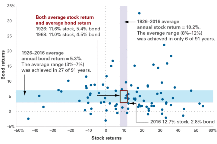
The Vanguard Blog has an interesting scatter plot of annual stock and bond returns from 1926-2016. The vertical axis is bond returns (broad US bond indexes), with the blue shaded areas indicating bond returns between 3% and 7%. The horizontal axis is stock returns (broad US stock indexes), with the purple shaded areas indicating stock returns between 8% and 12%. Click to enlarge.
I don’t remember seeing this data presented in such a manner before. I think this is a good chart to keep in your head. Here’s why:
While we often keep an idea of “average” in our heads, the actual return in any given year could be all over the place. You could also have low stock returns and low bond returns, or high stock returns and high bond returns. It’s much more common to be “not” average than average.
Stock returns are much wilder than bond returns. Bond returns were in the 3% to 7% band only 30% of the time (27 out of 91 years). However, stock returns were in the 8% to 12% band only 7% of the time (6 out of 91 years). Also, the bond scale only goes from -5% to +35%. The stock scale goes from -50% to +60%.
While I liked the graphic, I didn’t really agree with the text of the linked post. Neither “desired return” nor “required return” would seem to be good benchmarks. The market doesn’t care what you want or need. You take what you get and you deal with it. I think using an appropriate Vanguard Target Retirement or LifeCycle all-in-one fund as a benchmark is reasonable because it is a real-world alternative to whatever custom mix of investments you decide to hold. Such a benchmark can help keep you honest with yourself.

 The Best Credit Card Bonus Offers – 2025
 Big List of Free Stocks from Brokerage Apps
 Best Interest Rates on Cash - 2025
 Free Credit Scores x 3 + Free Credit Monitoring
 Best No Fee 0% APR Balance Transfer Offers
 Little-Known Cellular Data Plans That Can Save Big Money
 How To Haggle Your Cable or Direct TV Bill
 Big List of Free Consumer Data Reports (Credit, Rent, Work)
So if I’m understanding this graphic correctly, there have only been 2 times in 91 years where both the bond & stock markets were “average” at the same time?
Another nice visual output would be a plot with the timeline as the horizontal and both the stocks + bonds on the vertical, where one color is chosen for the stock returns and another for bond returns. This might be a nicer way to see the timeline represented and see in which two years the stocks were average at the same time as the bonds.
Yes, the two years are 1926 and 1968 (see text in chart). 2016 was close.
Very cool. It would be nice if each datapoint was labeled with the year. Also, we focus on averages, but it would be nice if folks reported the median returns too …