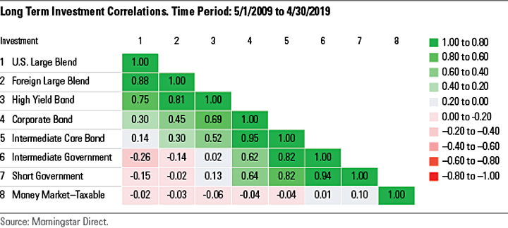
Morningstar has an educational series on How and Why to Invest in Bonds, and one of the included articles What Role Do Bonds Play in a Portfolio? had an interesting chart of the correlations between several major asset classes for the past decade up to mid-2019:

You can see above that US and international stocks are closely (but not perfectly) correlated, which means that they tend to move in the same direction. However, junk bonds also tend to move very closely with US stocks.
The least correlated asset against US stocks was intermediate government bonds. In fact, they actually tended to go up a little when stocks go down. This is one of the reasons why I own short and intermediate Treasury bonds as part of my bond portfolio, while at the same time avoiding high-yield or investment-grade corporates.
There is also another correlation chart of the Great Financial Crisis of October 2007 to February 2009, which had similar overall results. The least correlated assets were again short-term and intermediate-term government bonds.
You can also explain this diversification intuitively without numbers. I love my shares of businesses (stocks), and much of them time they are going to chug along nicely. However, we know that there will be periods when they are in big trouble and the outlook is bleak. Weak companies will be going bankrupt, while many others teeter dangerously close to the edge. Do you want to own debt backed by those same companies at the same time? It’s a double-whammy when both your stock and bond holdings are going down at the same time.
I am also concerned by recent reports of record amounts of “barely” investment-grade debt. There is a thin line between being rated investment-grade and
“junk”. Do the ratings tend to land on the investment-grade side of that line because the ratings agencies themselves are being paid by those same companies? (Again, remember those mortgage-backed securities of the financial crisis.) I’d rather not to have to worry about that possibility. I like the simplicity and the “sleep better at night” safety of owning bonds backed by the US government instead. I do also own municipal bonds in my taxable accounts, which for some reason were not included in this chart.
Related past posts:
 The Best Credit Card Bonus Offers – 2025
 Big List of Free Stocks from Brokerage Apps
 Best Interest Rates on Cash - 2025
 Free Credit Scores x 3 + Free Credit Monitoring
 Best No Fee 0% APR Balance Transfer Offers
 Little-Known Cellular Data Plans That Can Save Big Money
 How To Haggle Your Cable or Direct TV Bill
 Big List of Free Consumer Data Reports (Credit, Rent, Work)
I think you had a typo: “There is also another correlation chart of the Great Financial Crisis of October 2007 to February 2009”. Shouldn’t that be October 2007 to February 2019 and still on going?
The chart in question just focused on the time from 2007 to 2009 when the markets were in greatest turmoil.