StarCapital Research has shared a series of interesting long-term charts comparing the long-term returns, drawdowns, and volatility of stocks, bonds, and gold over the last 220 years. There are also some stats on relative market valuations and forward return expectation for different countries and regions. You must accept some terms before viewing, but it is available to US individual investors.
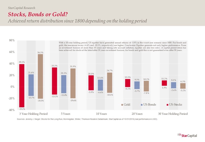
Here is a sample chart of the return distributions of stocks, bonds, and gold since 1800, depending on holding period, along with their takeaway, via Norbert Keimling @CAPE_invest:
Conclusion: For periods of 10 years or more, stocks are safer than bonds or gold!
This is because for a 10-year holding, the worst inflation-adjusted performance of stocks (-5.9% annually) was better than the worst performance for bonds (-6.4%) and gold (-10.1%). The problem is that during a specific 10-year timeframe where stocks did that poorly, it’s quite likely that bonds or gold did great! Which means that it would still be quite difficult to keep holding stocks through such a period of poor performance. In a fearful environment, “sell stocks and wait things out” will start sounding like much wiser advice than “buy and hold”.
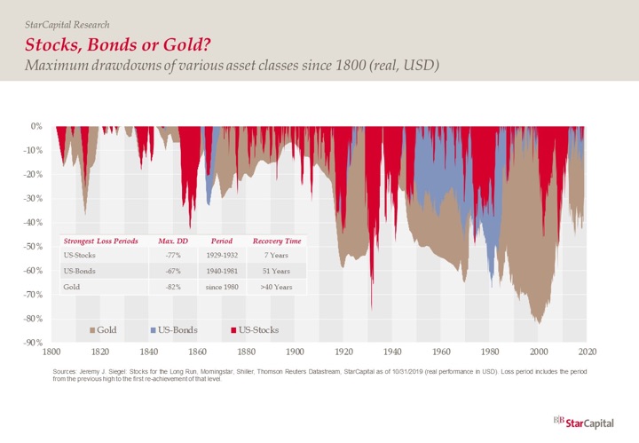
Of course, stocks can recover quite quickly and you might miss it while you’re waiting:
(There is also an ongoing debate about the validity of “time diversification”. Do stocks really become “safer” the longer you hold them? They can still go down 50% at any given time, so if you need to sell in the near future, they are never really safe.)
After doing this for a while, I don’t know if someone can simply read a book and “learn” how to keep the faith during the scary bits. It takes some time and making some mistakes to develop a portfolio where you understand its limitations and how long and how badly it can act in the short-term. I’m still learning.


 The Best Credit Card Bonus Offers – 2025
 Big List of Free Stocks from Brokerage Apps
 Best Interest Rates on Cash - 2025
 Free Credit Scores x 3 + Free Credit Monitoring
 Best No Fee 0% APR Balance Transfer Offers
 Little-Known Cellular Data Plans That Can Save Big Money
 How To Haggle Your Cable or Direct TV Bill
 Big List of Free Consumer Data Reports (Credit, Rent, Work)
I think you meant to say over 20 years as the bond and gold numbers are for 20 years but the stock returns listed in your text is for 10 years.
Sorry, I meant to convey the reasoning behind their conclusion that “For periods of 10 years or more, stocks are safer than bonds or gold!”. I have edited it to:
I think you have a typo on worst bond percentage. I got confused!
Thanks for the great content over the years, Jonathan.
Thanks, fixed!
I don’t understand the first chart. It is labeled as a “distribution”, but appears to only be the max and min return over a 10 yr period. Assuming this is the case, this seems like a bad way to determine investing performance–we’d really want to see the distribution of all the middle years between the min and max.
I suspect gold is actually a much worse investment then we would draw from this chart.
Gold definitely didn’t come out looking great in this one:
https://twitter.com/CAPE_invest/status/1202608263566680064/photo/1