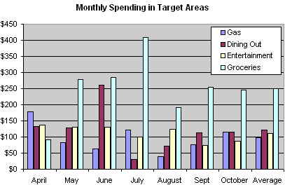
Here is a bar graph showing our family spending in certain target areas that I’ve chosen to focus on for the last 7 months (past budget results). This is exactly the cool stuff I wanted to get when I bought Quicken and Money for comparison a while back, and now I finally have it. Our average monthly spending for each area is also included:

So it looks like we more or less are in line with our planned budget, and that makes me happy. I’m not going to focus aggressively on reducing the areas any further, but I will continue to track our spending. For example, I’m not going to sweat an extra $25 a month on food, we end up saving enough in other areas to cover it. Besides, I like food too much and there are so many good restaurants out there!
I encourage everyone to track their spending, if only to know where it all goes. I’m still using my simplified budgeting process with monthly tallies.
 The Best Credit Card Bonus Offers – 2025
 Big List of Free Stocks from Brokerage Apps
 Best Interest Rates on Cash - 2025
 Free Credit Scores x 3 + Free Credit Monitoring
 Best No Fee 0% APR Balance Transfer Offers
 Little-Known Cellular Data Plans That Can Save Big Money
 How To Haggle Your Cable or Direct TV Bill
 Big List of Free Consumer Data Reports (Credit, Rent, Work)
I was wondering about the grocery spike in july till I saw the dinning out bar totally gone.
did the spike occur cuz you totally didn’t eat out, or kinda went overboard on the grocery buying? cuz recent months seem pretty stable..
Explanation for July. Sister came to town, and instead of eating out we Bar-B-Qed a ton with friends. =) I think it saved us money in the end.