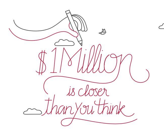
Vanguard has a new full-page interactive ad in the NY Times online with the heading $1 Million Is Closer Than You Think. This is one of those expensive ads that I feel ambivalent about as a investor-owner of Vanguard. I’d rather they rely on word-of-mouth (like from yours truly) and focus more on the customer experience. Will the slick design attract new money and lower expense ratios? At least it promotes the types of things that I support:
- Save more. Increase your regular contributions. Track your overall saving rate.
- Keep costs low. Watch your management fees and other costs affecting your portfolio.
- Stay the course. Don’t react to the market and chase what’s hot.
 The Best Credit Card Bonus Offers – 2025
 Big List of Free Stocks from Brokerage Apps
 Best Interest Rates on Cash - 2025
 Free Credit Scores x 3 + Free Credit Monitoring
 Best No Fee 0% APR Balance Transfer Offers
 Little-Known Cellular Data Plans That Can Save Big Money
 How To Haggle Your Cable or Direct TV Bill
 Big List of Free Consumer Data Reports (Credit, Rent, Work)
This is not a good ad at all. They could have made it so much more interesting. And am I supposed to be impressed when I click the button and it says my odds improve from 80% to 82% by using Vanguard?
Horrible ad. I couldn’t remove the keyboard from the screen. I found the text difficult to understand and the examples annoying. By using Vanguard my chances go up by 2%. Waste of time.