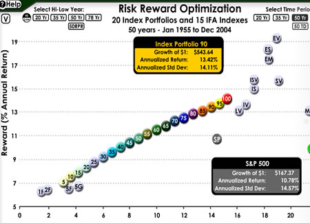
When I talk about maximizing your return (reward) for a given amount of risk, that is called being on the Efficient Frontier. For a very neat illustration of this, check out this Interactive Risk/Reward Chart from IFA, which lists 15 index portfolios as well as 20 of their suggested portfolios.
The individual index portfolios illustrate that individual asset classes like 1-Yr Bonds, Emerging Markets, or Micro Cap each have their own risk/reward characteristics. But, if you combine a bit of each, you can make a nice happy combination to optimize your risk/reward ratio. Why take any extra risk without more reward? That nice sloping line is the Efficient Frontier. My portfolio options are somewhat similar to the #80 dot, but with some tweaks to minimize expenses and complexity.
Here is just a screenshot (click to go to actual page):

For, example, take the dot labelled ‘SP’. It represents the popular S&P 500 Index, which from 1995-2005 has had an annualized return (reward) of 10.78%, and a standard deviation (risk) of 14.57%. Standard deviation is a way of measuring how volatile something is, or how much it may go up or down in a year.
Now look at the orange Portfolio #90 dot. Over the same time period, it would have given you a higher return of 13.42%, while at the same time leaving you with a lower risk of 14.11%. Now who wouldn’t want that? More money and less roller coaster? Sign me up! All from choosing the right mix of different asset classes. (Click on the dots to see the actual asset breakdowns.)
 The Best Credit Card Bonus Offers – 2025
 Big List of Free Stocks from Brokerage Apps
 Best Interest Rates on Cash - 2025
 Free Credit Scores x 3 + Free Credit Monitoring
 Best No Fee 0% APR Balance Transfer Offers
 Little-Known Cellular Data Plans That Can Save Big Money
 How To Haggle Your Cable or Direct TV Bill
 Big List of Free Consumer Data Reports (Credit, Rent, Work)
Speak Your Mind