Here’s another pair of tidy charts about safe withdrawal rates, or the amount you can safely withdraw from your retirement portfolio without running out. They are taken from this Blackrock page, specifically their “one-pager” 2-page PDF.
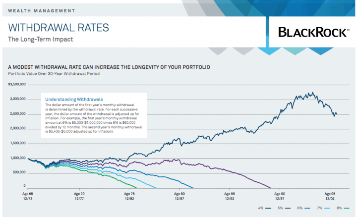
First up, this chart shows how a $1 million portfolio would have done over a 30-year period, given withdrawal rates between 4% and 8%. They specifically chose a start date of December 31, 1972 because it was right before a large drop in the stock market. Click to enlarge.
No matter what the withdrawal rate, the total balance dropped from $1,000,000 down to roughly $600,000 in the first three years. The hypothetical portfolio was 50% stocks and 50% bonds. That must have been quite stressful. The chart gives you a feel of how a lower withdrawal rate can extend the longevity of your portfolio.
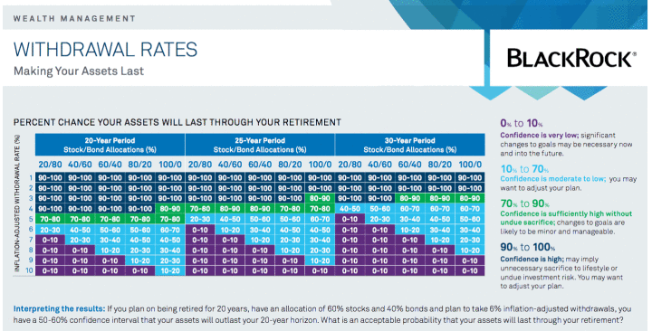
The second chart uses Monte Carlo probabilistic modeling to show you the percent chance that your assets will last for retirement, given several variables. You can adjust the time period (20 to 30 years), the portfolio asset allocation (from 20% to 100% stocks) and your withdrawal rate (1% to 10%). Click to enlarge.
I wouldn’t use these as definitive numbers, and there are other similar scenario generators out there. Just consider them another data point to add to the collection. Note that all the scenarios above assumed a fixed withdrawal strategy as opposed to a more flexible dynamic withdrawal strategy.


 The Best Credit Card Bonus Offers – 2025
 Big List of Free Stocks from Brokerage Apps
 Best Interest Rates on Cash - 2025
 Free Credit Scores x 3 + Free Credit Monitoring
 Best No Fee 0% APR Balance Transfer Offers
 Little-Known Cellular Data Plans That Can Save Big Money
 How To Haggle Your Cable or Direct TV Bill
 Big List of Free Consumer Data Reports (Credit, Rent, Work)
Great charts, and speak volumes to Sequence Risk! In my retirement, we’re targeting 3%. At current valuations, I suspect future returns will be muted. Add to that the inflation risk of health insurance (we have to buy private insurance for 10 years!), and it’s best to be conservative in your retirement income planning!